Deaflingo — Mobile Appp UI/UX Design
Client
Deaflingo
Year
2025
This case study highlights the design journey behind Deaflingo, an app that combines competition, learning, and fun within a retro-inspired interface. The design focuses on user engagement, using playful animal symbols (rhino, giraffe, and camel) to track progress and motivate users. With a carefully chosen color palette, modern typography, and intuitive layout, Deaflingo aims to deliver a visually engaging, easy-to-navigate experience. The case study captures the design process, showcasing how every decision was made to enhance user interaction while staying true to the app's playful, competitive spirit.
Scope of Work

Project Information
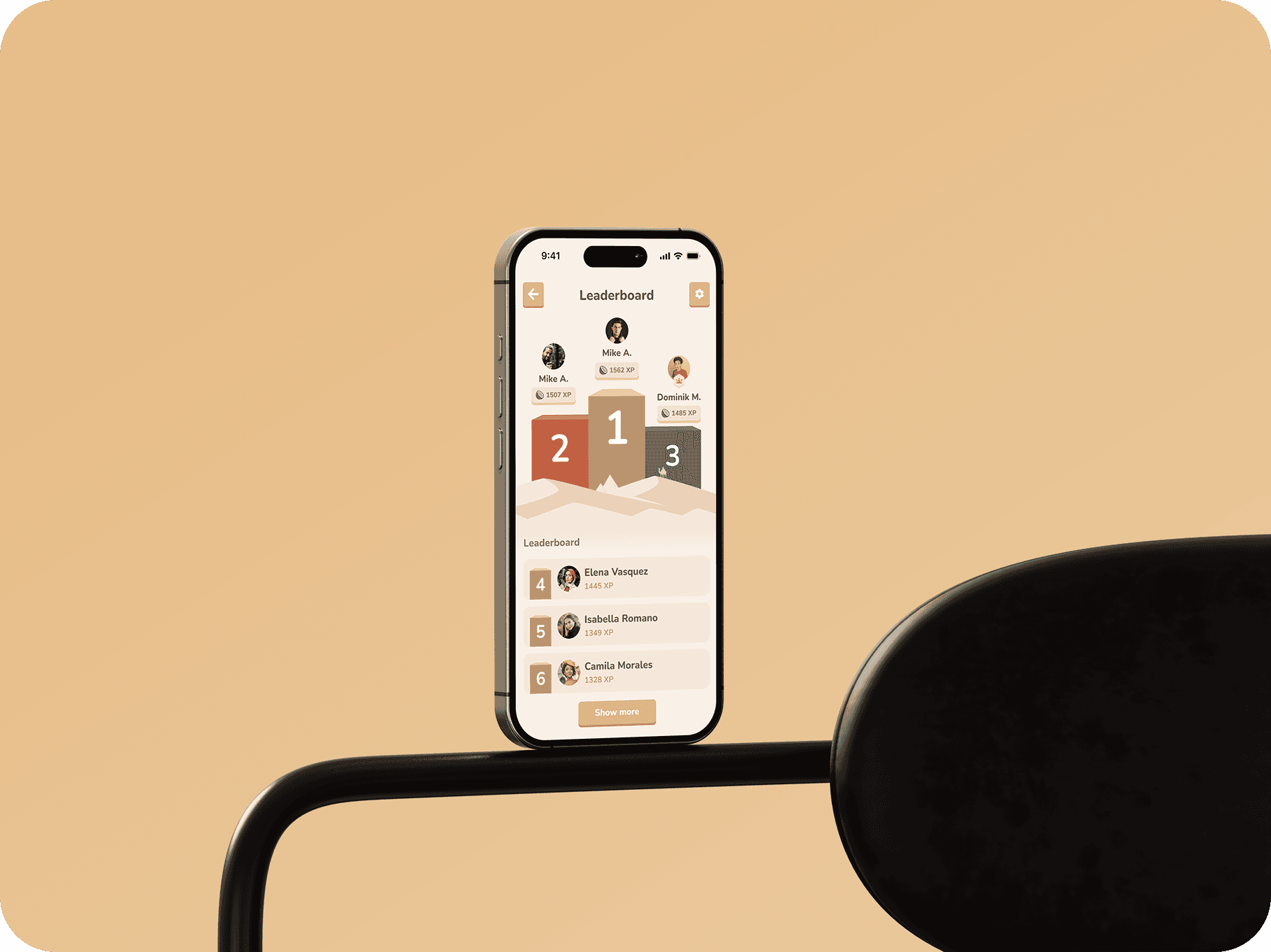
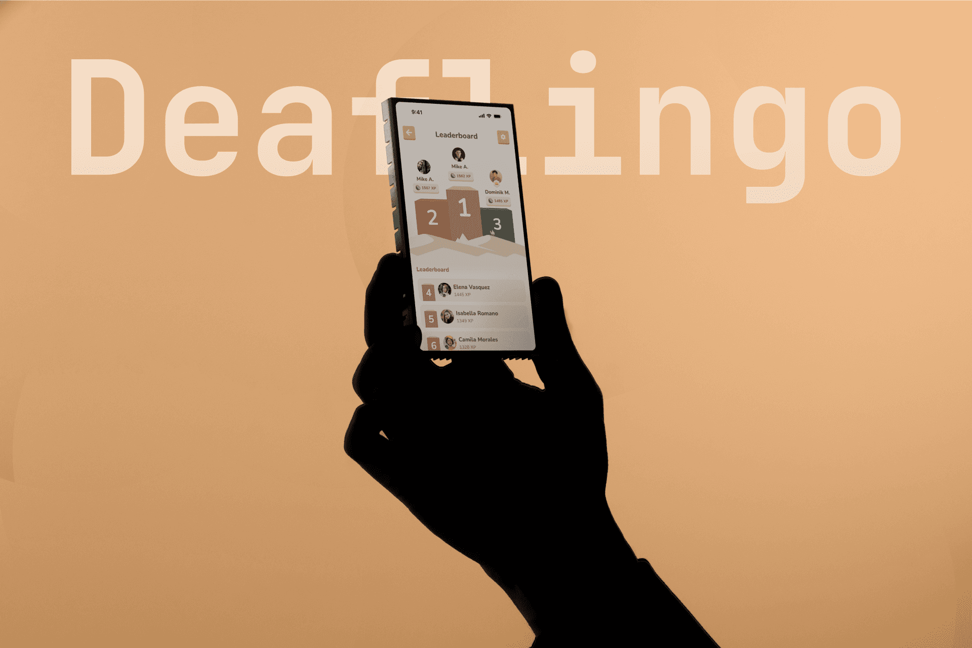
Deaflingo is a competitive learning app designed to motivate users through daily challenges and a weekly leaderboard. By integrating retro-inspired visuals with modern functionality, the app encourages continuous progress, rewards achievement, and creates an engaging environment for learning. The design uses animal symbols—rhino, giraffe, and camel—to represent user milestones, providing a fun and meaningful way to track growth.
Project Overview
Deaflingo is an app designed to keep users motivated with daily challenges, tracking, and rewards. The design incorporates a retro theme with modern elements, using playful animal symbols to mark progress. Focused on simplicity and engagement, the app is designed to keep users coming back, with an interface that’s both visually appealing and easy to use, ensuring a smooth experience from start to finish.
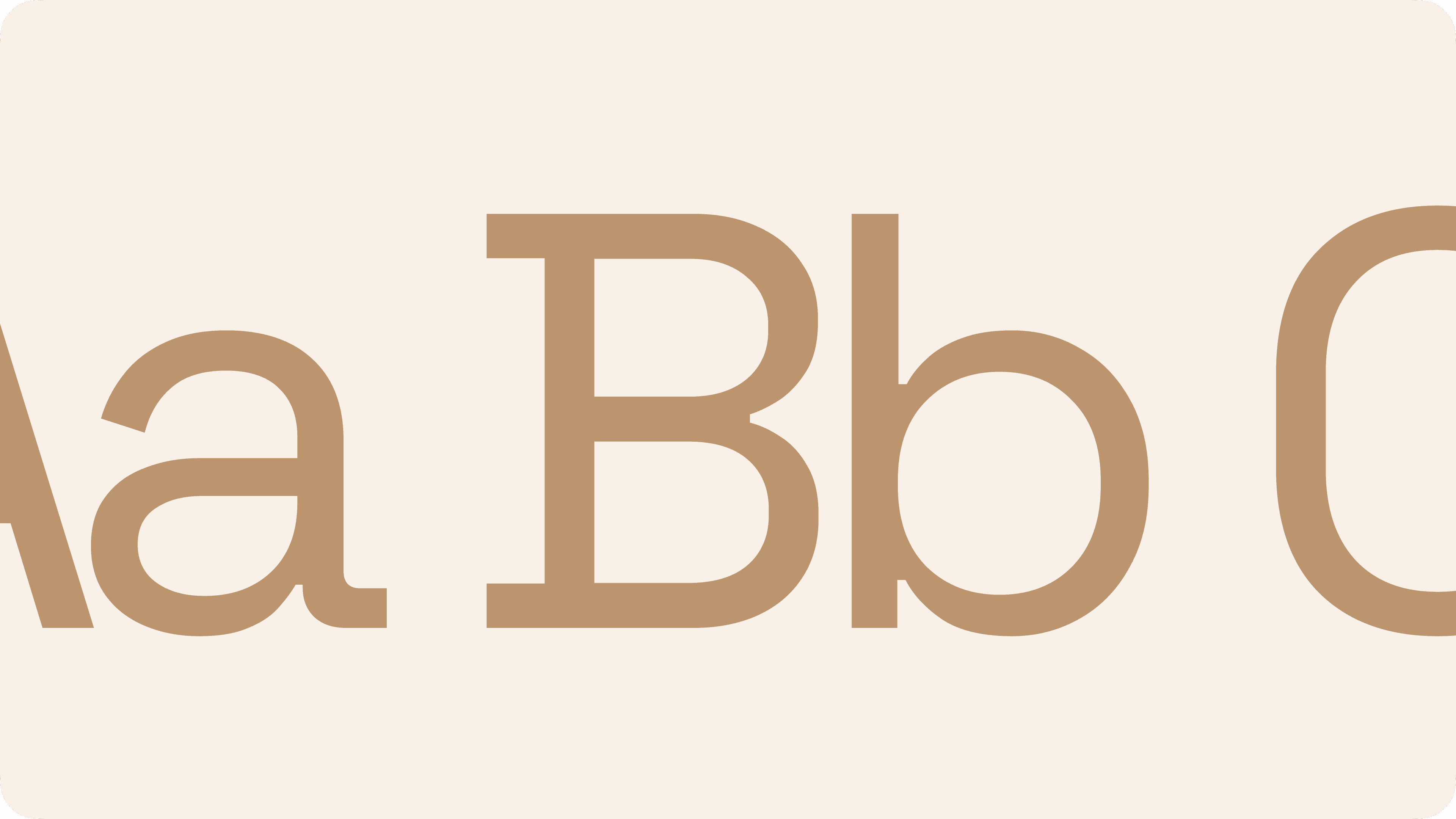

Typography
The font selection for Deaflingo was made with user experience and visual appeal in mind. Every character is designed to be clear and easy to read, ensuring a smooth navigation experience. By using a modern, legible typeface, we prioritize both functionality and style, allowing text to remain prominent without overpowering other design elements.

User Experience
The user experience of Deaflingo is centered around simplicity, engagement, and motivation. With an intuitive interface and clear navigation, users can easily track their progress, participate in daily challenges, and view their position on the leaderboard. The integration of animal symbols adds an extra layer of excitement, with each user milestone represented by a new animal, creating a visual sense of accomplishment. The retro-inspired design enhances the playful vibe, ensuring that users enjoy their journey every step of the way.
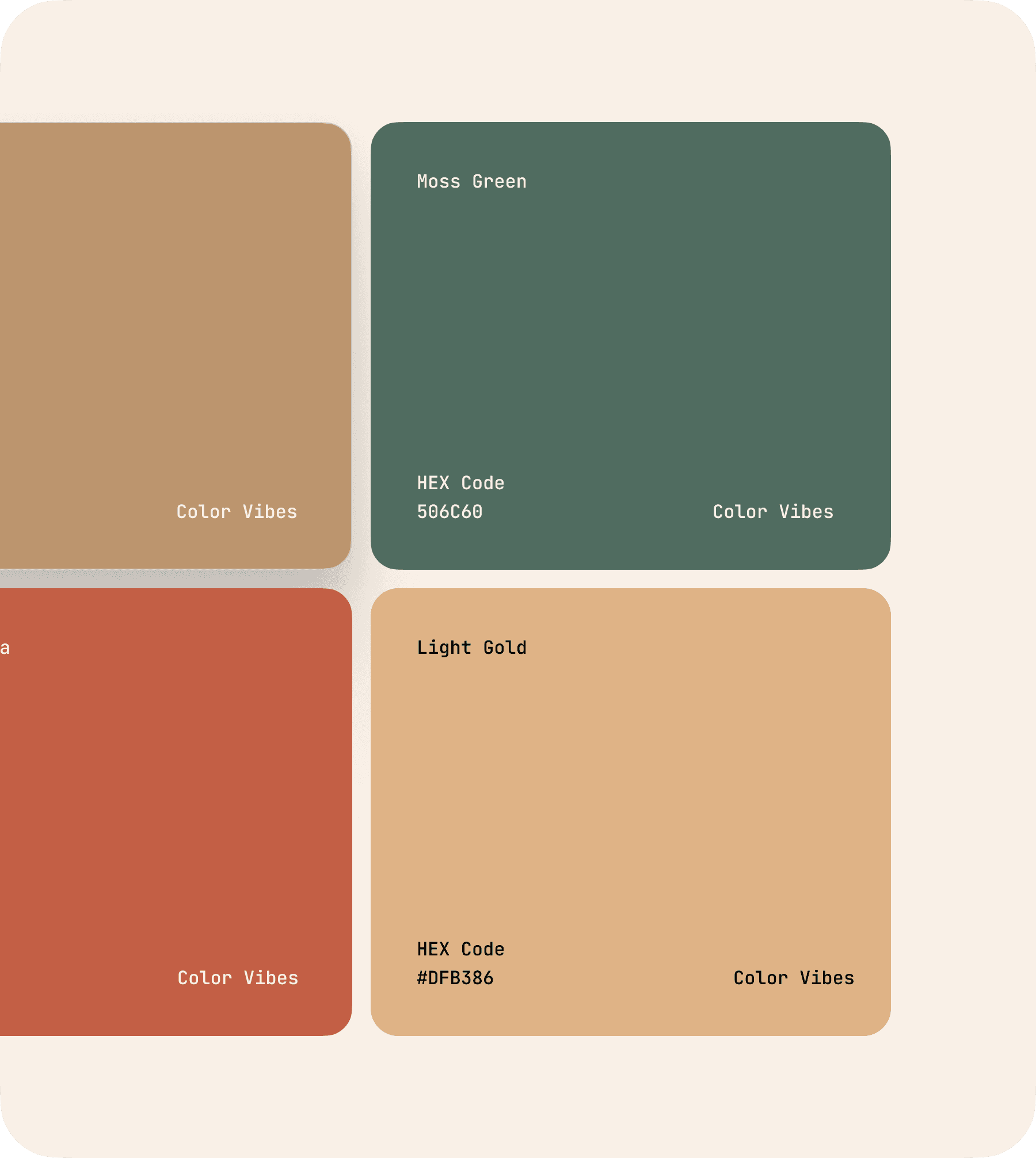

Color Scheme
The color palette for Deaflingo was carefully selected to evoke energy, excitement, and a sense of playfulness while maintaining clarity. Bold, contrasting colors are used to highlight important elements like buttons and progress trackers, ensuring they stand out to users. Softer background tones allow the vibrant colors to pop, creating a balanced and visually engaging interface that is easy on the eyes and motivates users to interact.

The Retro Revival
The overall design of Deaflingo evokes a sense of nostalgia through its retro-inspired elements, blending modern functionality with vintage charm. The bold color choices and playful typography give the app a fresh yet familiar feel, drawing users into a space that feels both fun and engaging. The design is intentionally vibrant and energizing, creating an atmosphere where users feel excited to track their progress, challenge themselves, and be part of an ongoing competitive experience. This mix of past and present offers a visually stimulating, immersive journey that enhances the user experience from start to finish.