Communi
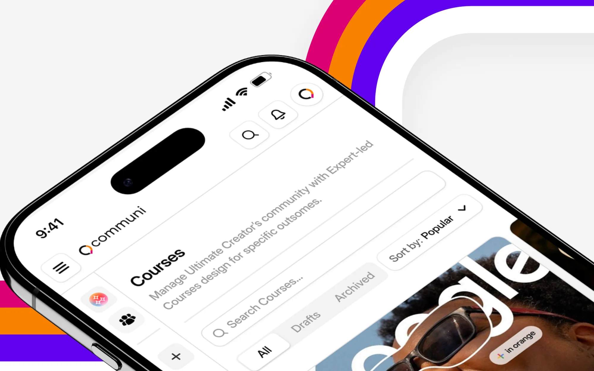
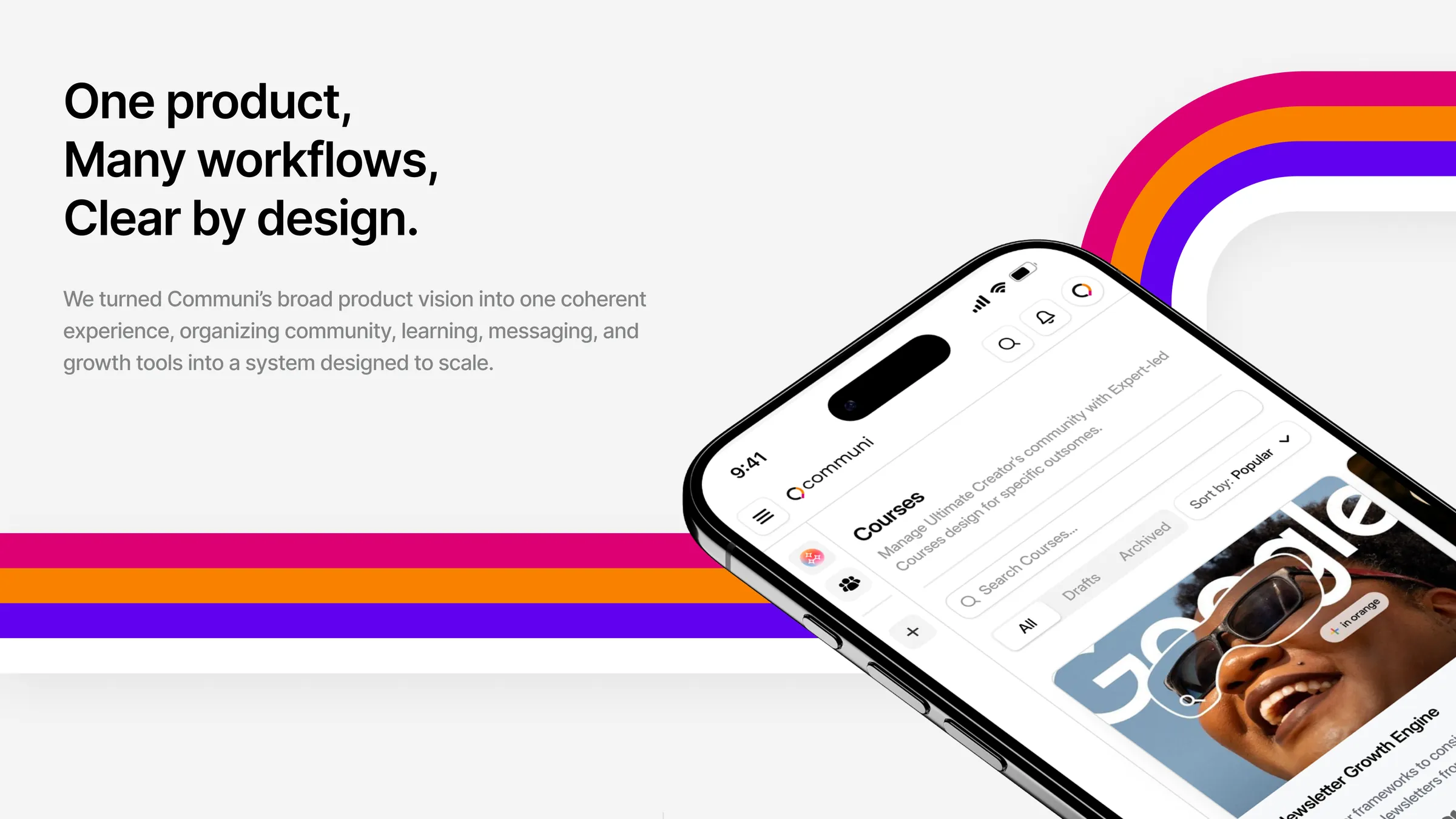
The native mobile app for Communi, carrying the creator command center to the phone so communities stay active around the clock.
One product, many workflows, clear by design
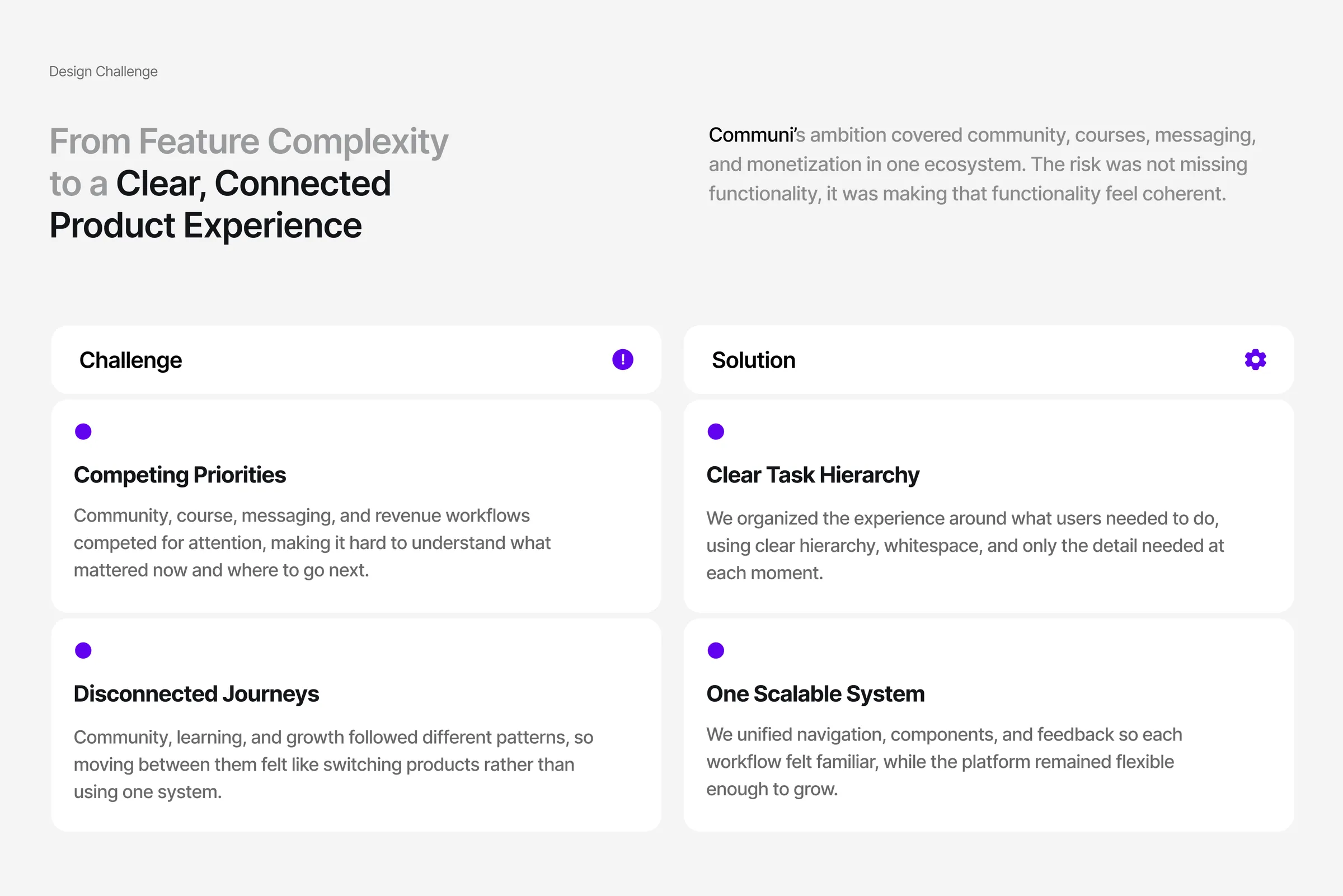
Communi's ambition covered community, courses, messaging and monetization in one ecosystem. The risk was not missing functionality, it was making that functionality feel coherent.
Competing priorities: community, course, messaging and revenue workflows fought for attention, so it was hard to tell what mattered now and where to go next. Disconnected journeys: community, learning and growth followed different patterns, so moving between them felt like switching products.
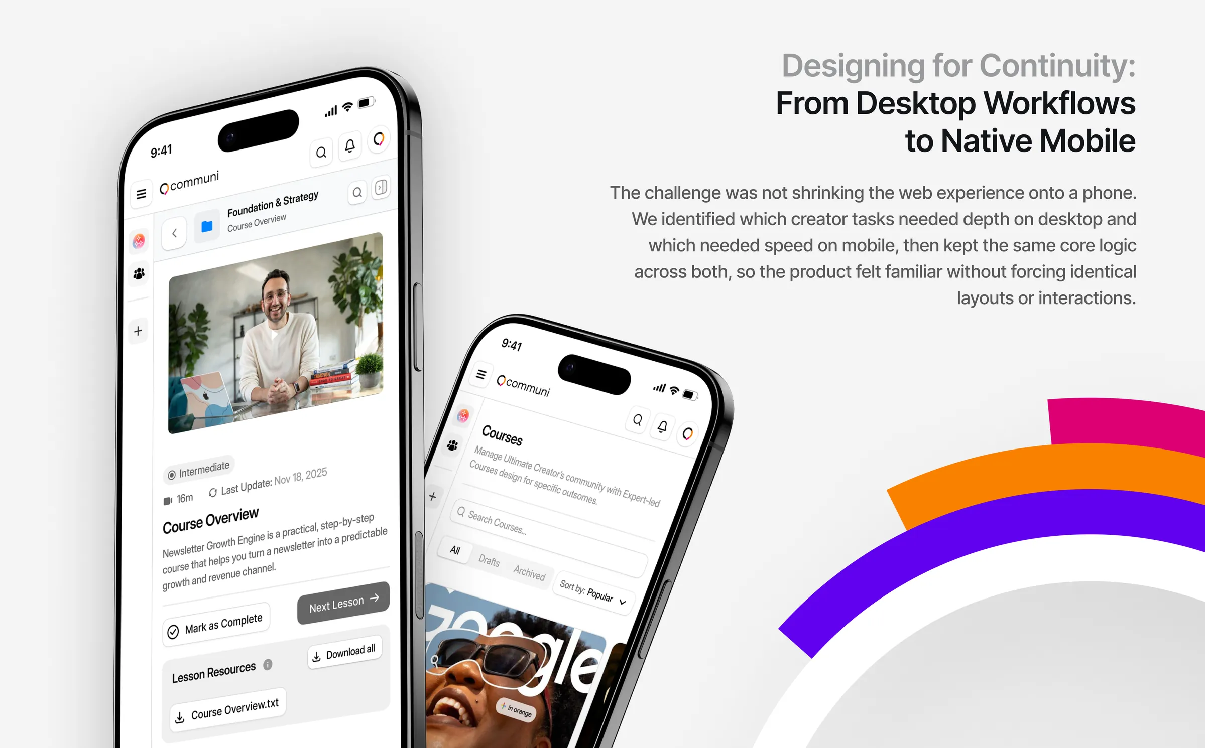
The mobile challenge was not shrinking the web experience onto a phone. We identified which creator tasks needed depth on desktop and which needed speed on mobile, then kept the same core logic across both.
A clear hierarchy and one scalable system
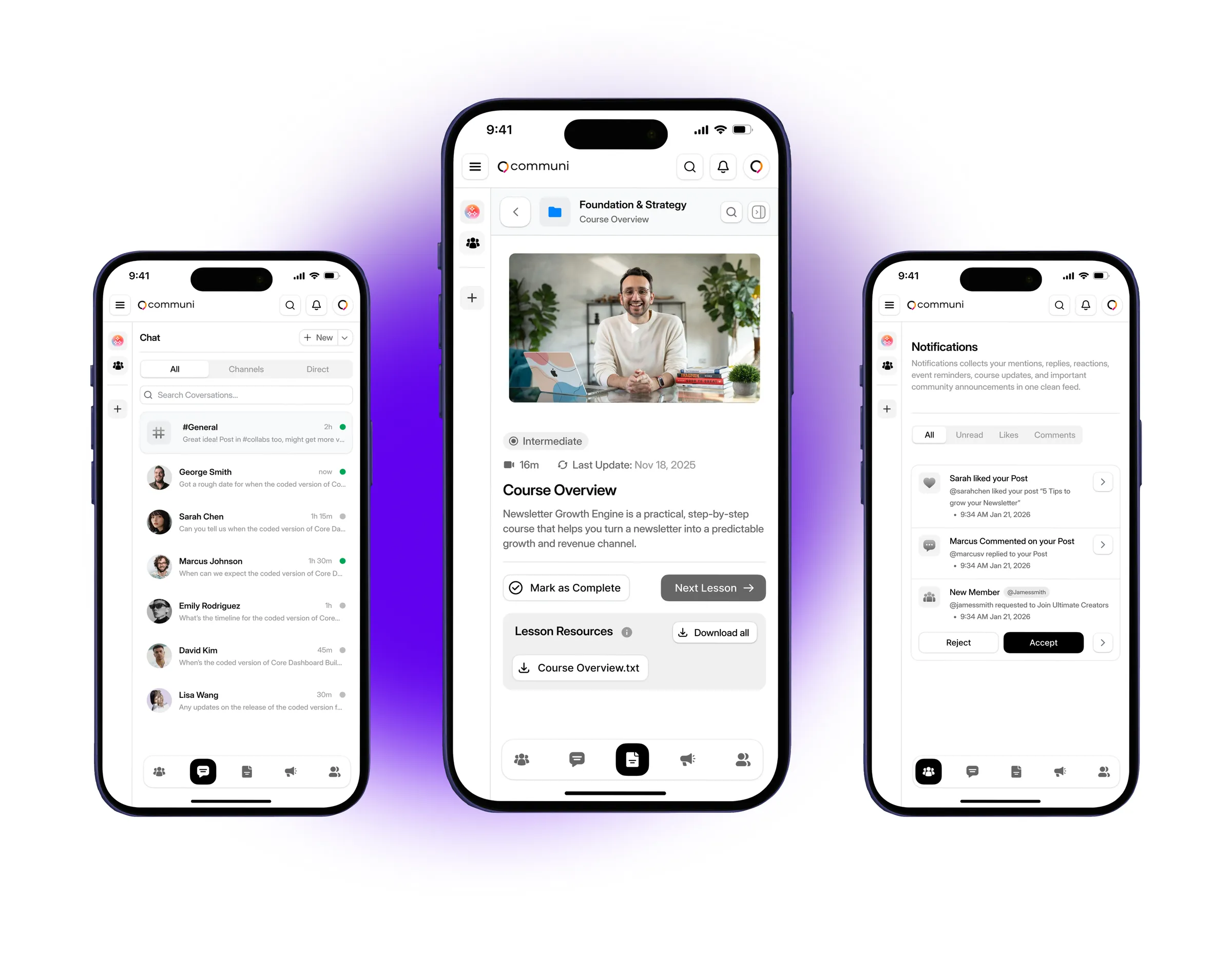
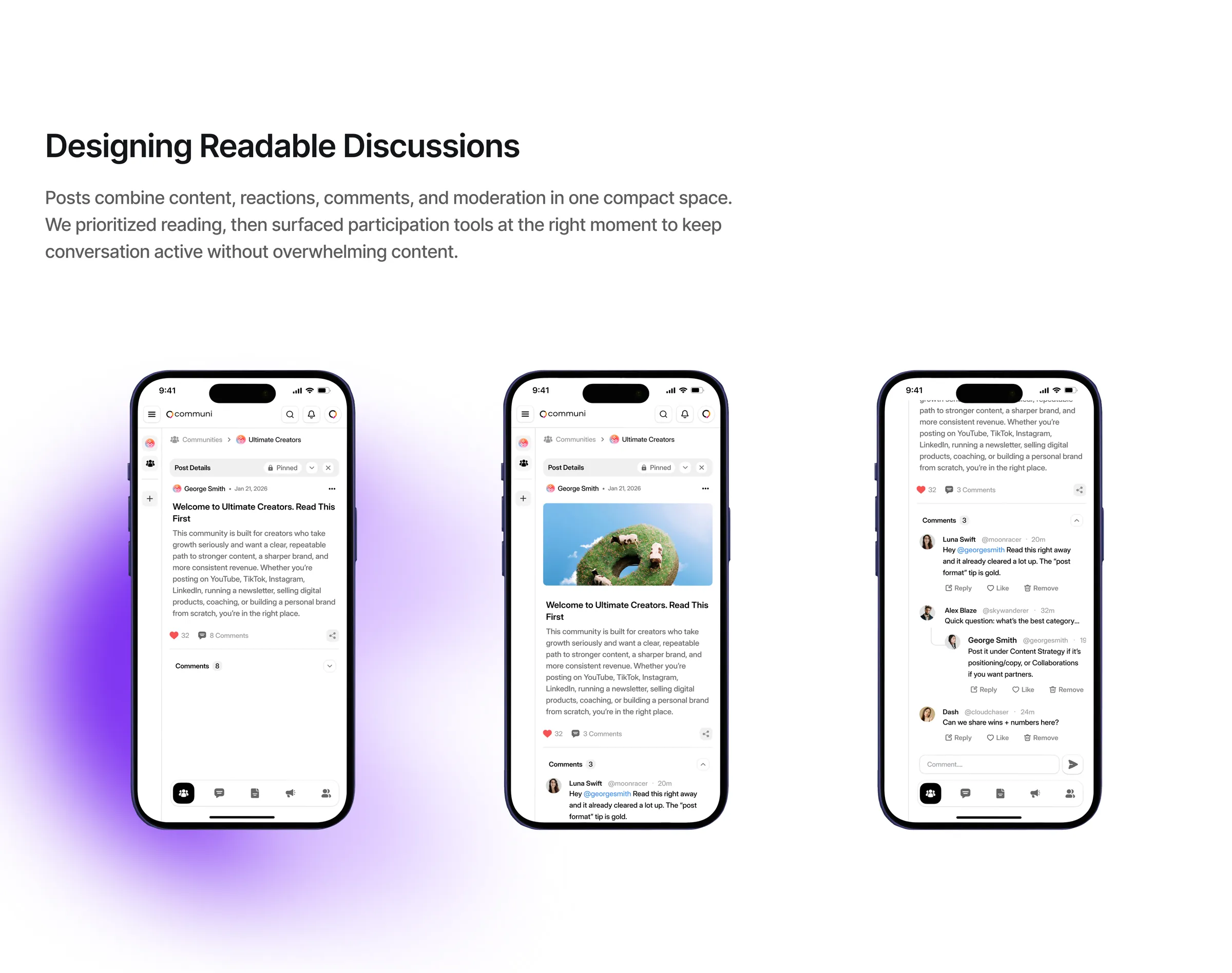
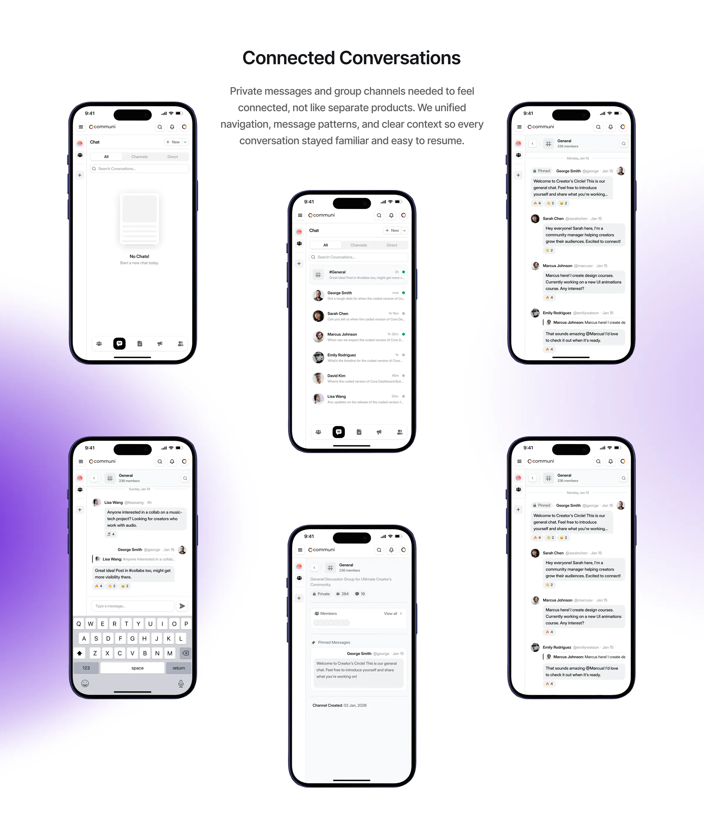
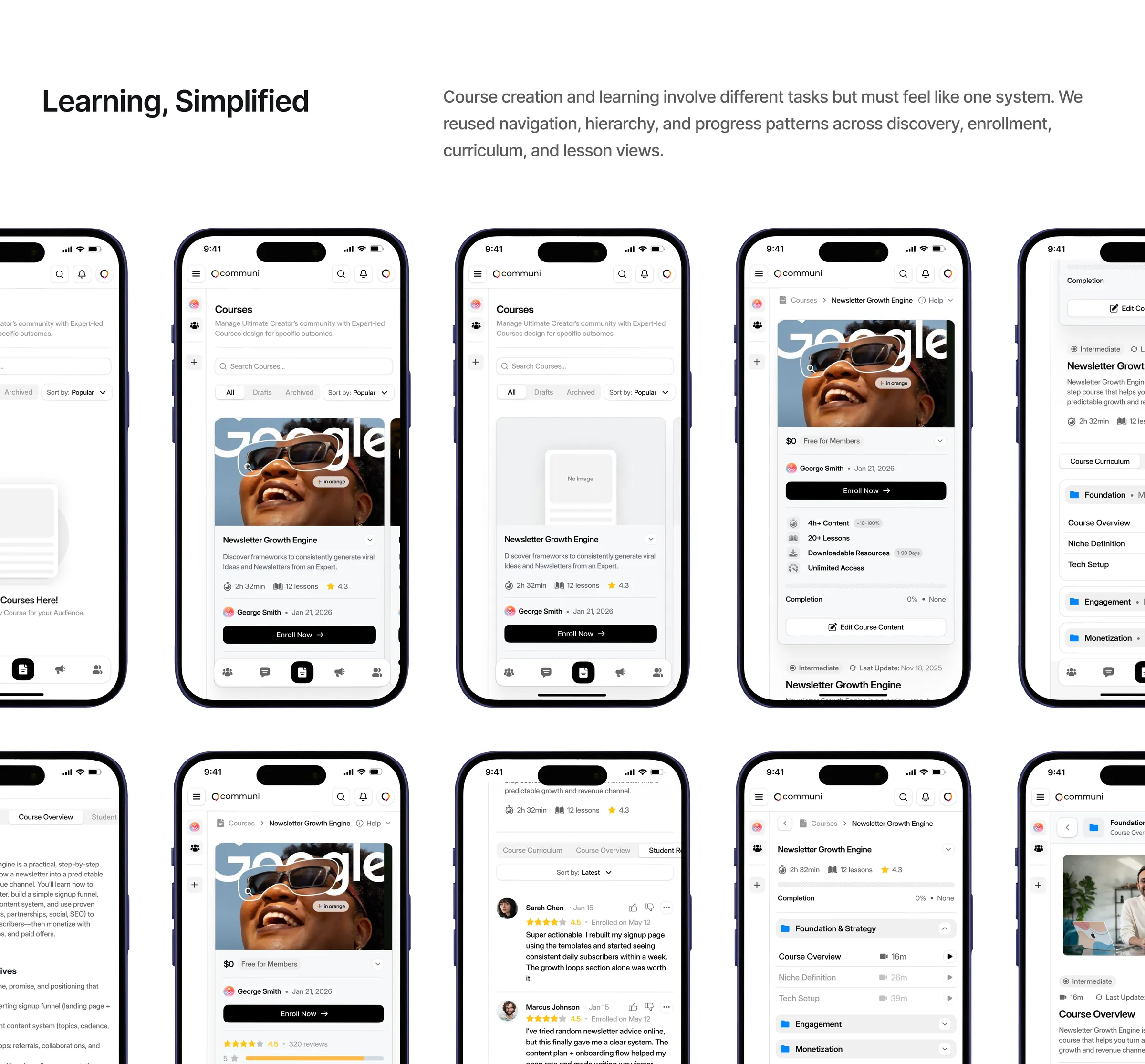
We organized the experience around what people need to do, with clear hierarchy, whitespace and only the detail each moment needs, and unified navigation, components and feedback so every workflow feels familiar while the platform stays flexible.
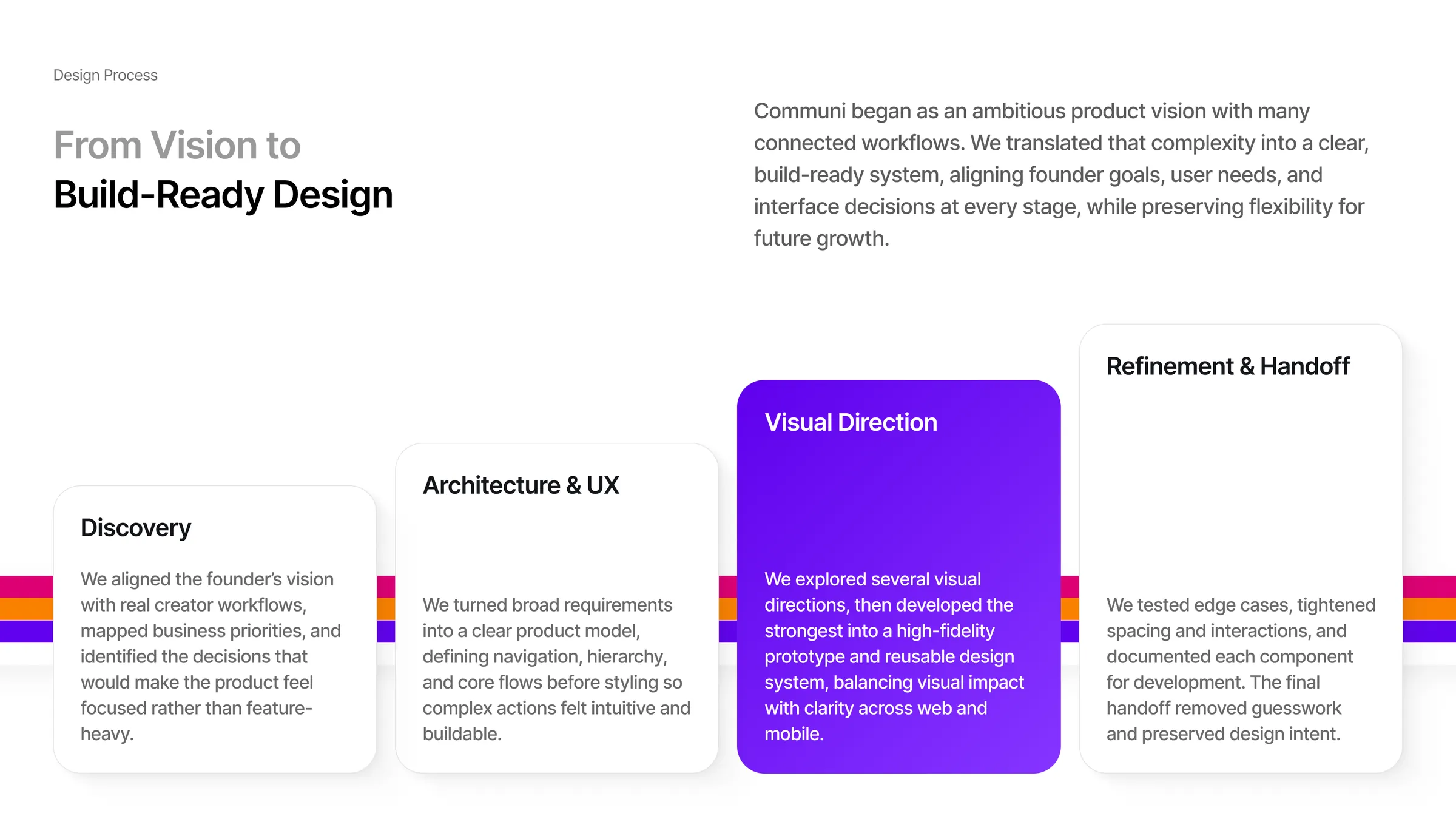
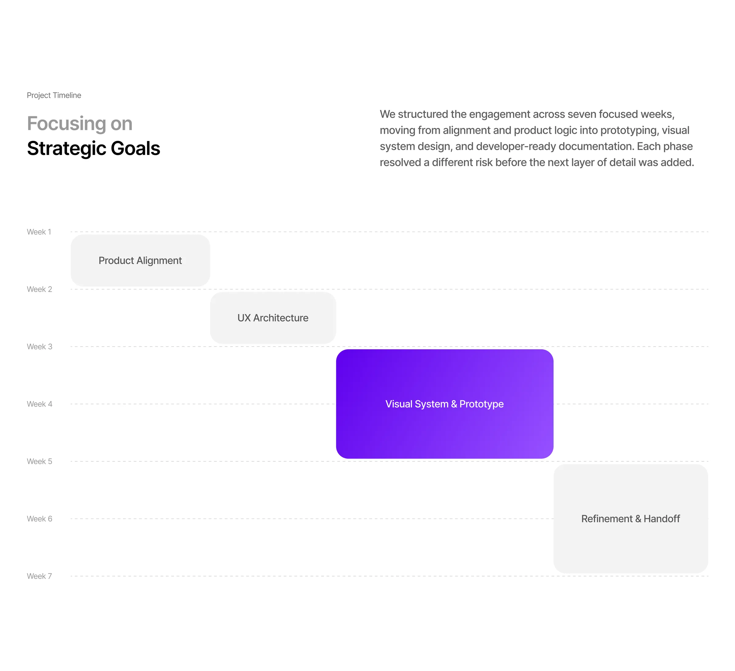
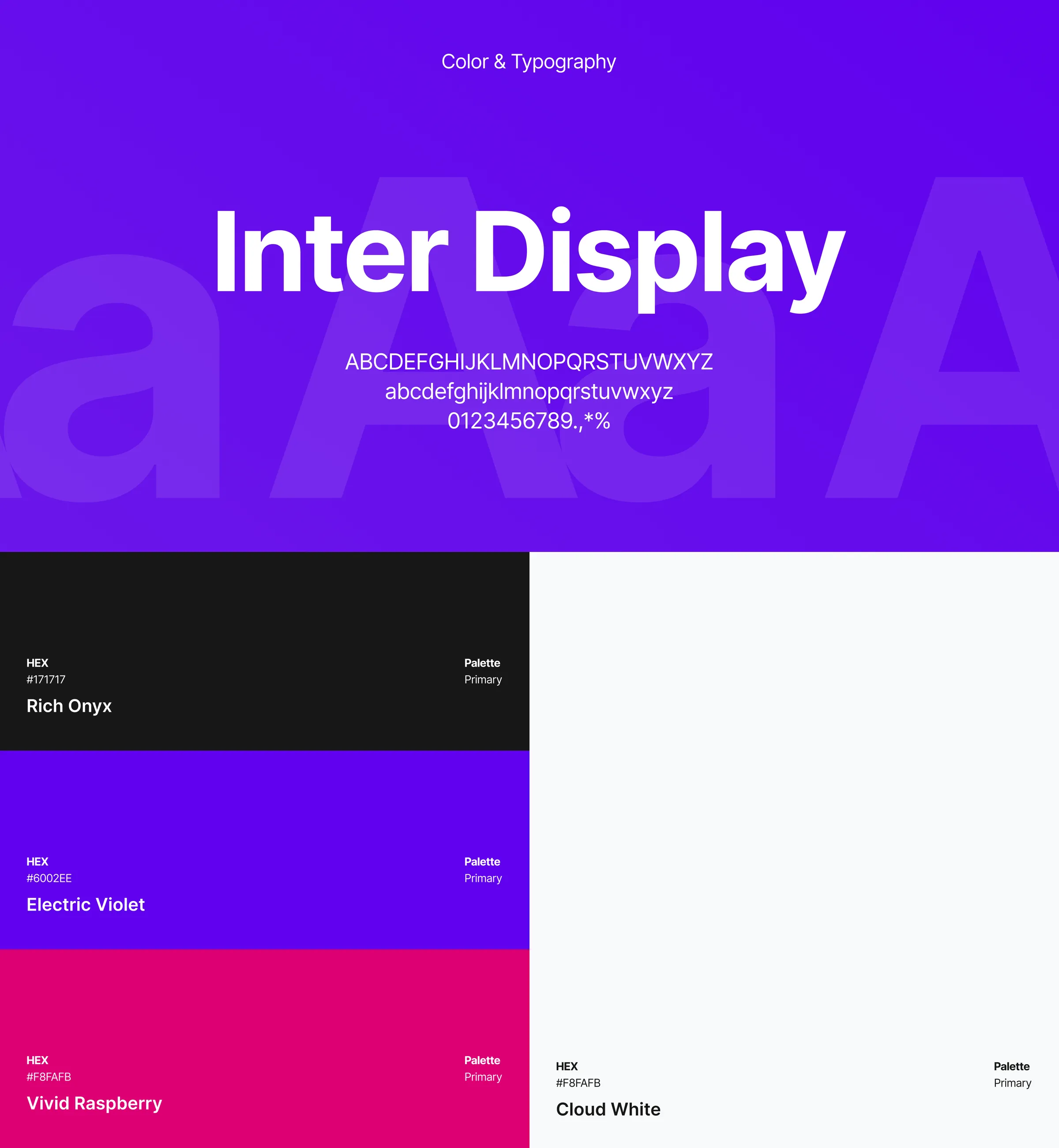
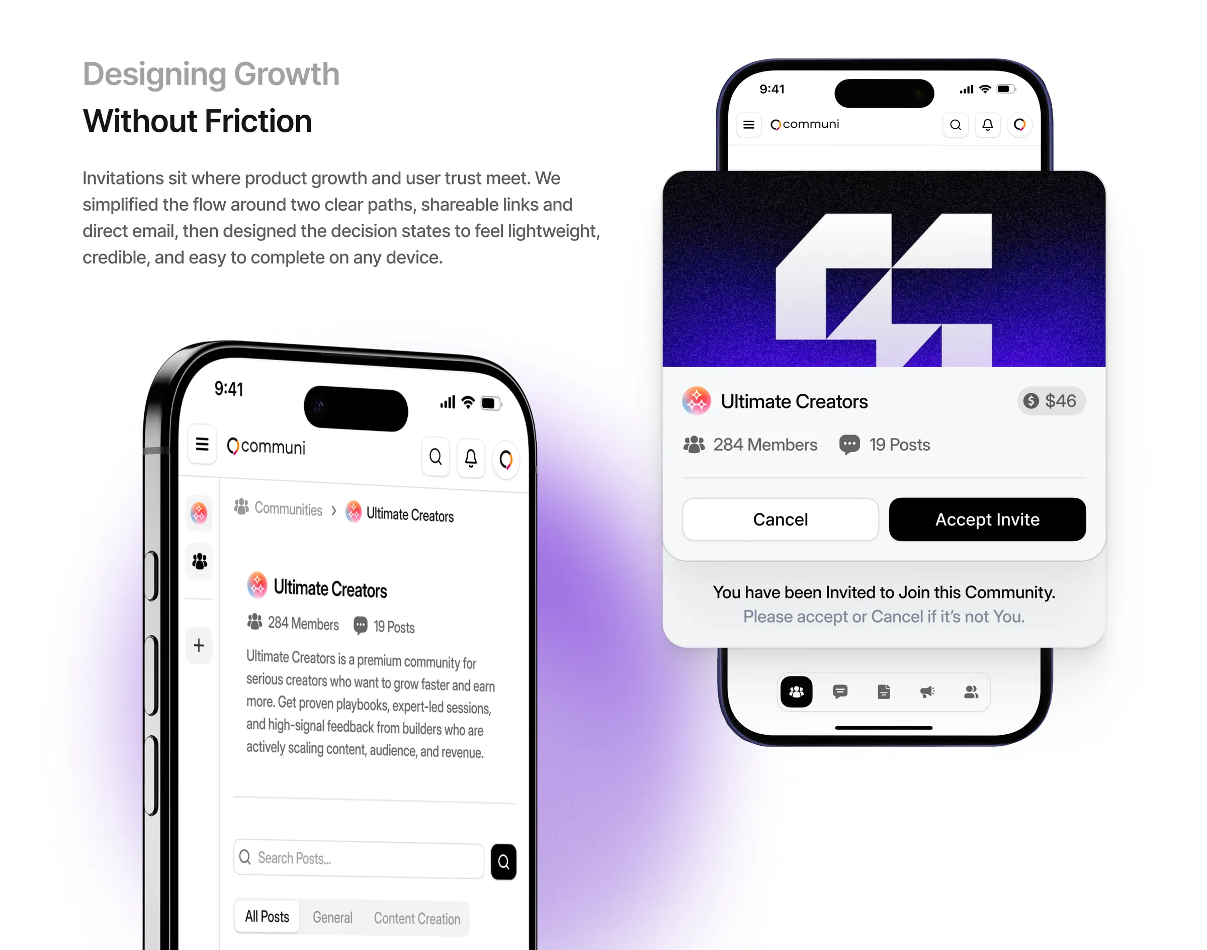
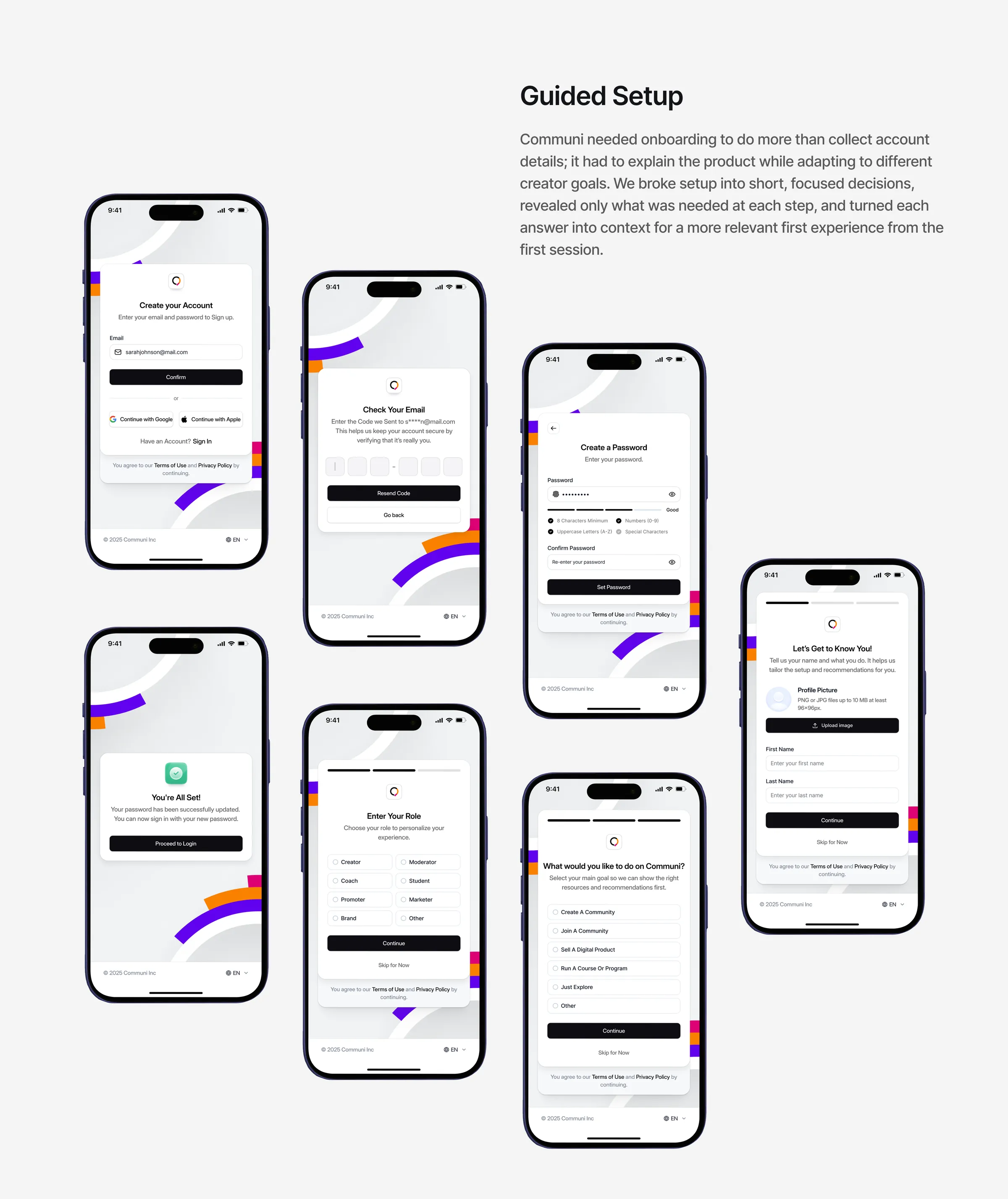
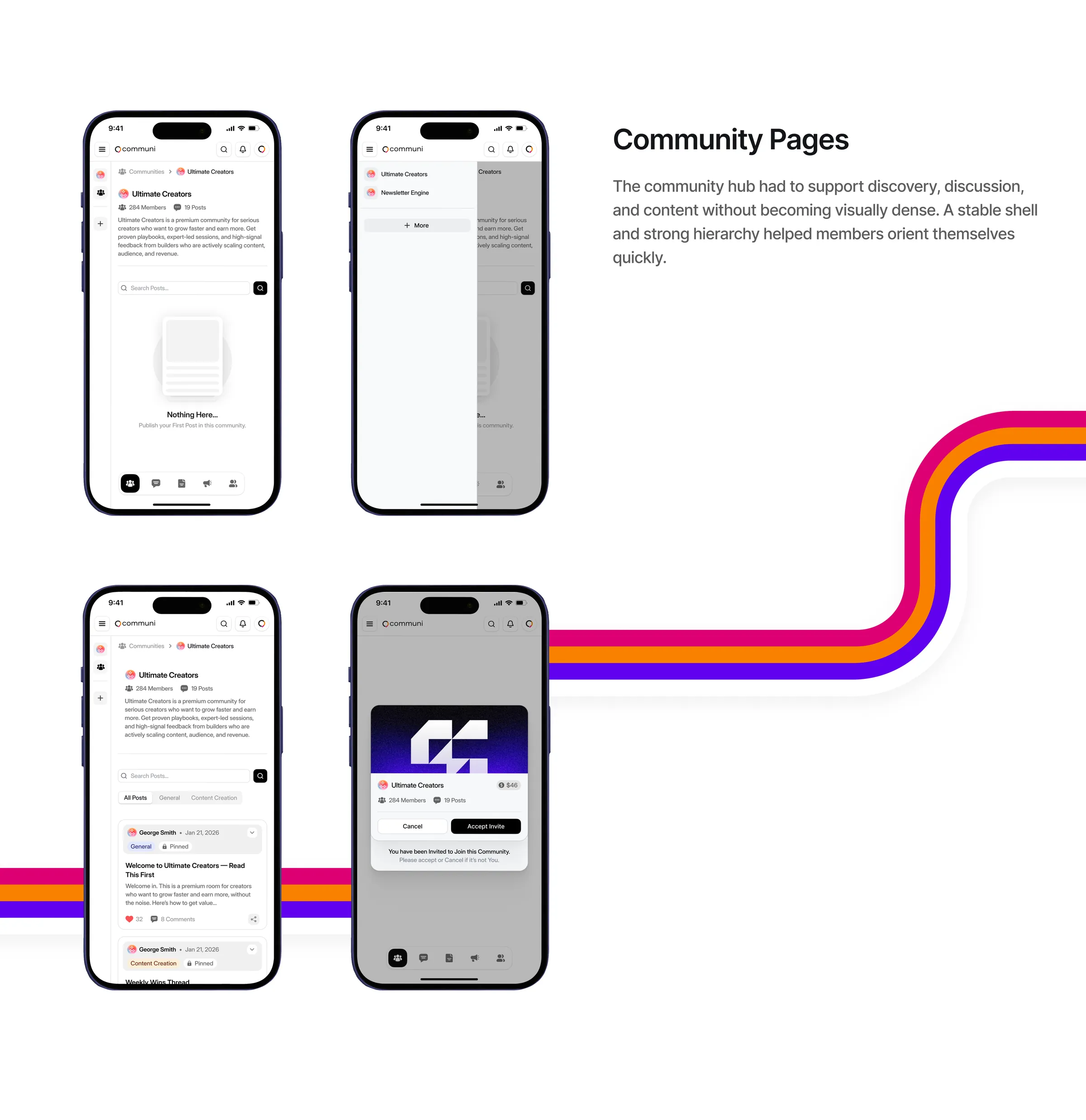
The work ran over seven focused weeks: discovery with real creator workflows, architecture and UX before any styling, a visual direction developed into a high-fidelity prototype and reusable design system, then refinement and a handoff that documented every component. Along the way we designed guided onboarding that turns each answer into context, invitations built around shareable links and email, community pages with a stable shell, readable discussions, connected messaging and simplified learning, all set in Inter Display with Electric Violet and Vivid Raspberry.
Sam B., Founder at Communi
Want results like this?
Book a free 30 minute strategy call with Dom, or get a free audit of your product first.