Shredder
A social app for skiers and snowboarders, designed across two eras, from the first logo sketch and a mascot to a full relaunch as a dating app for people who live for the mountain.
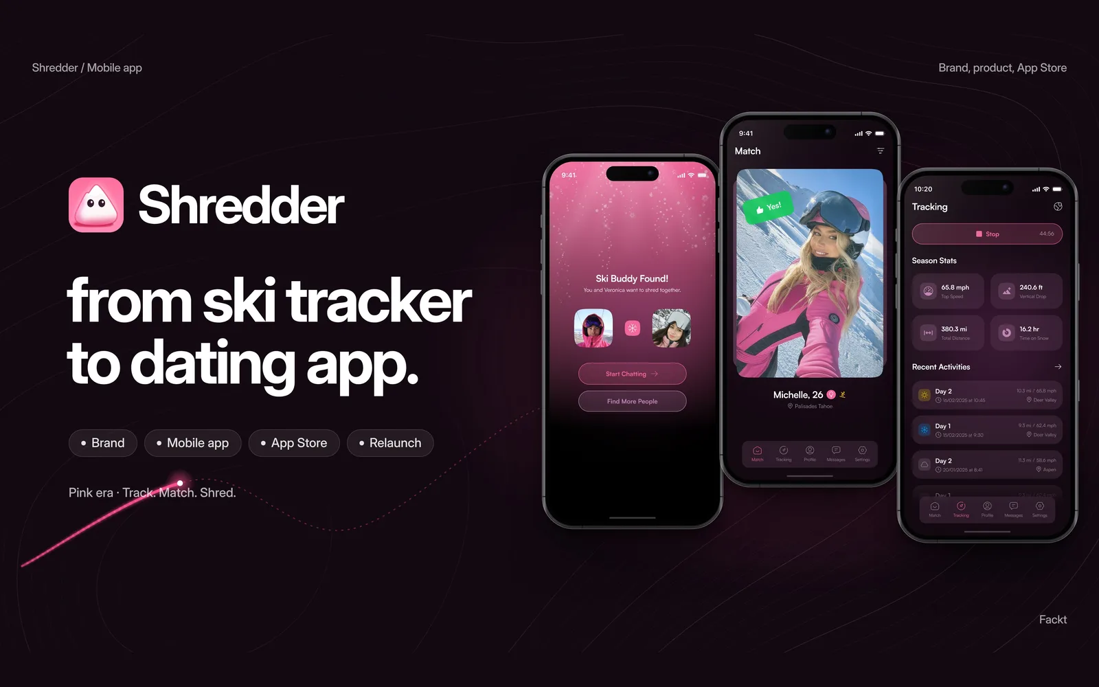
One product, two different apps
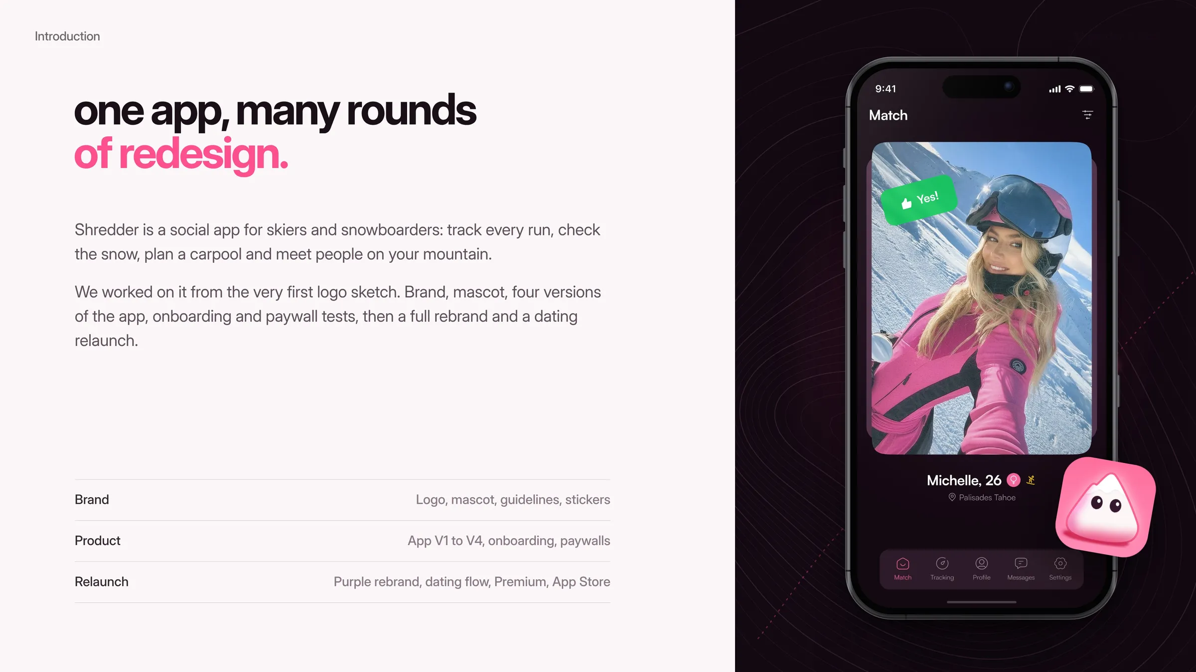
Shredder started as a ski tracker with a social side: track every run, check the snow, plan a carpool and meet people on the mountain. It grew fast, and every few months the product found a new focus.
So the design could not be a one-off. It had to keep up with a product that kept learning what it was, and in the end turned from a tracker into a dating app, without losing the people who already loved it.
Redesign in rounds, keep what works
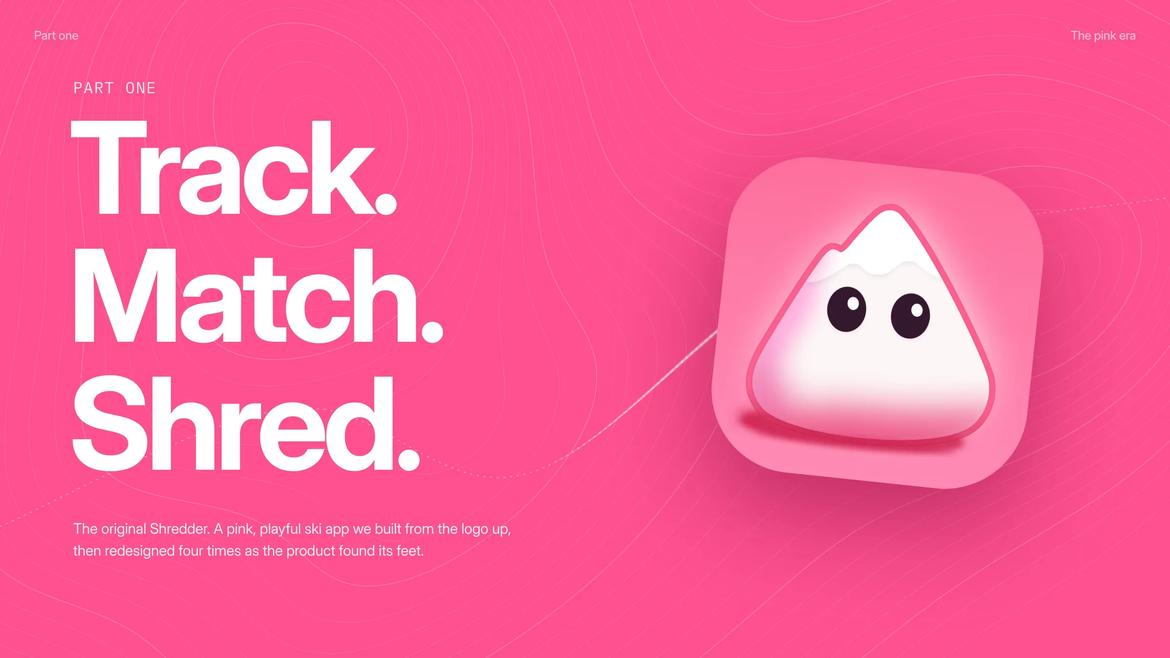
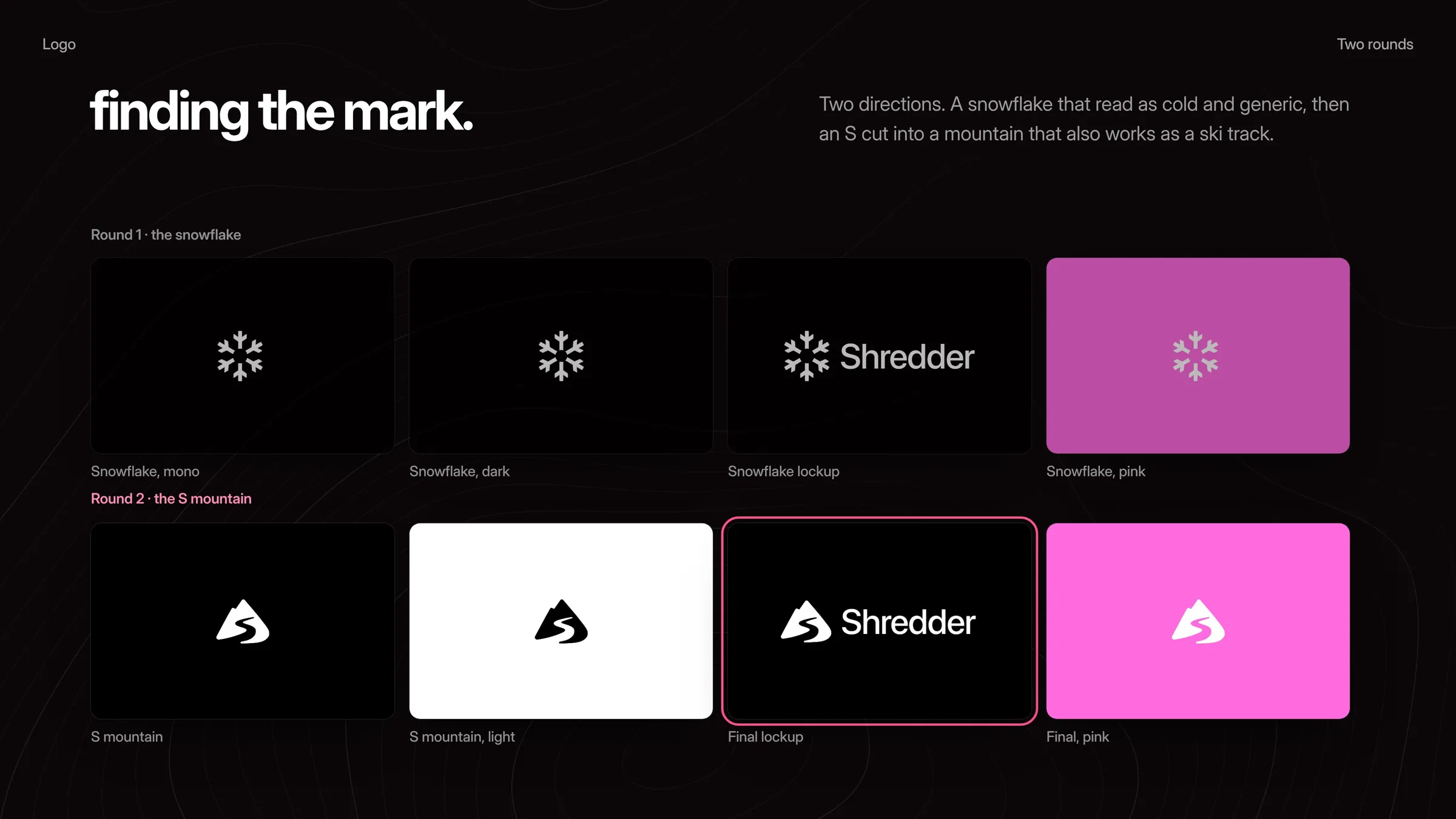
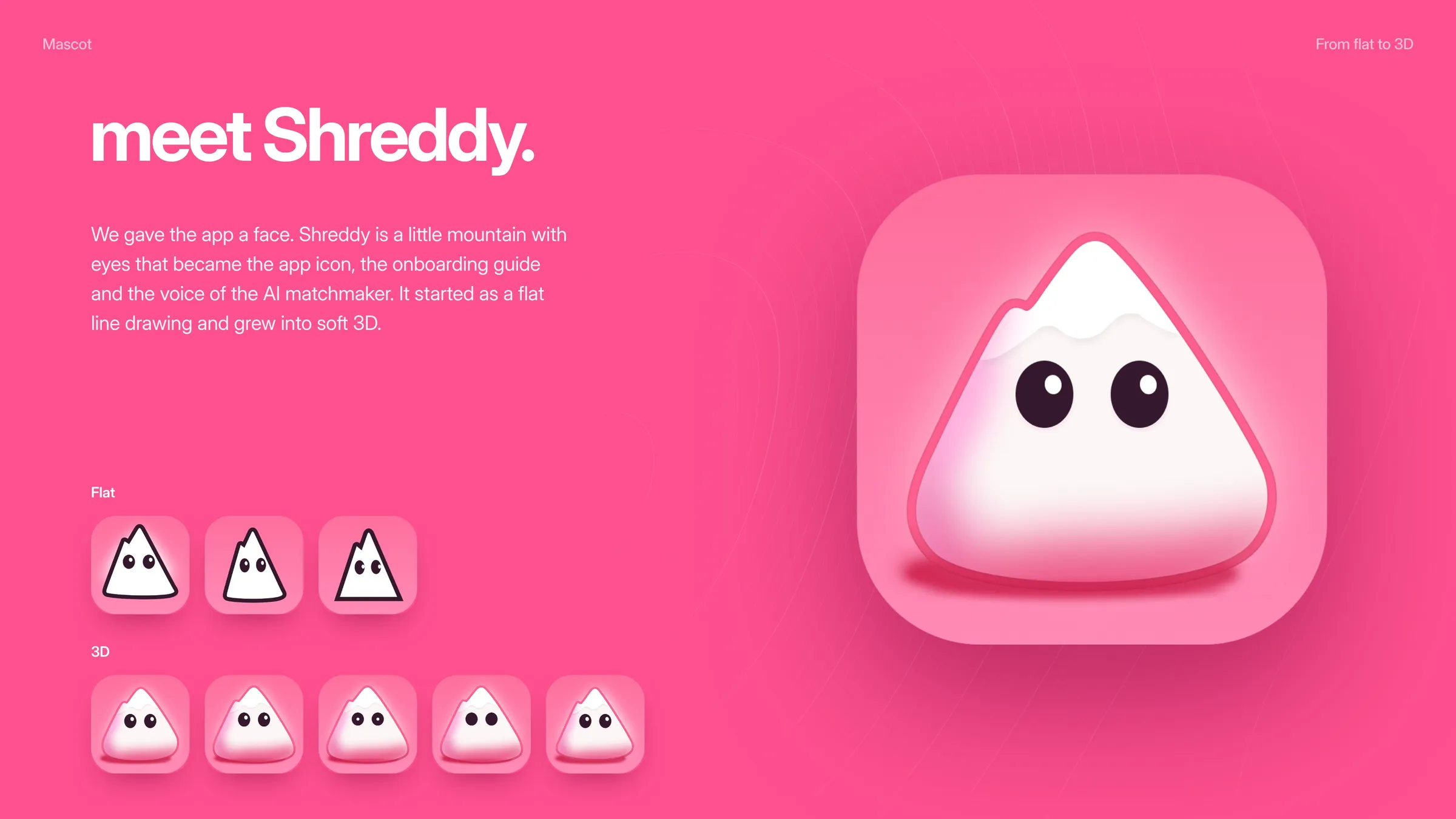
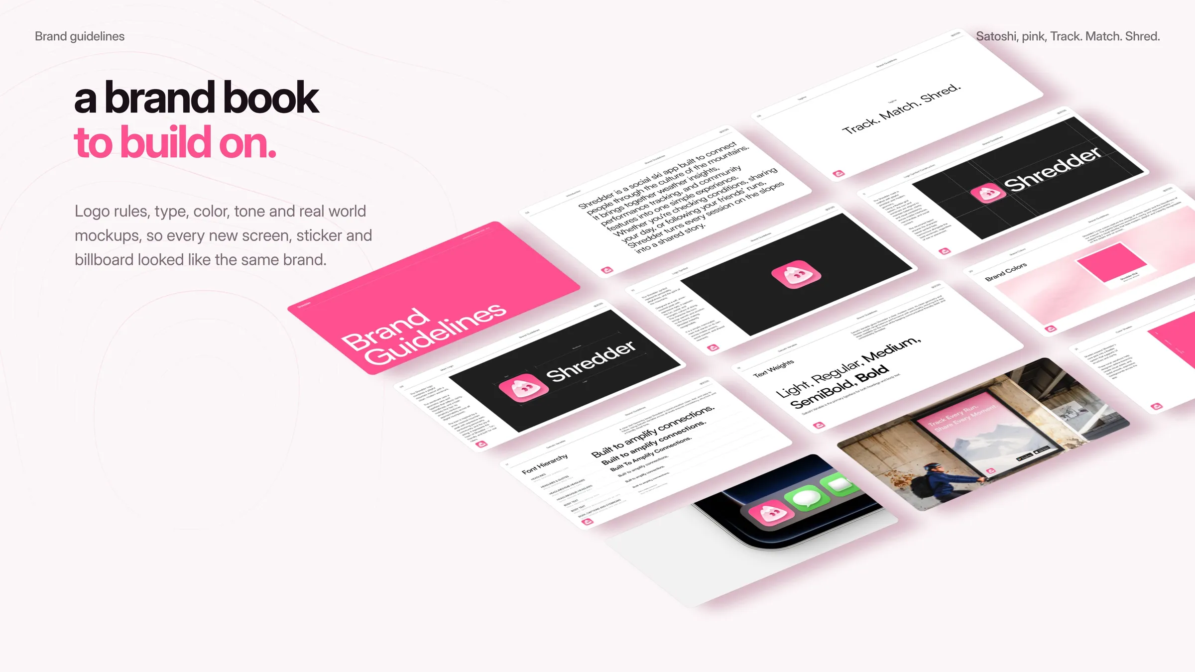
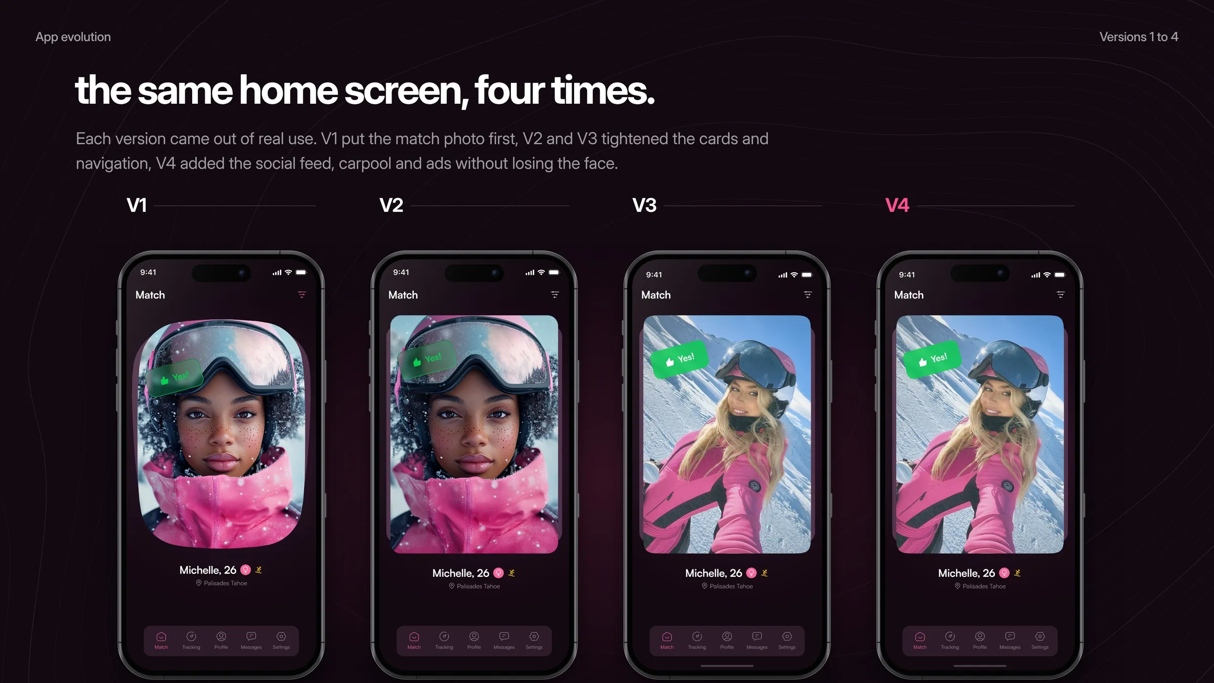
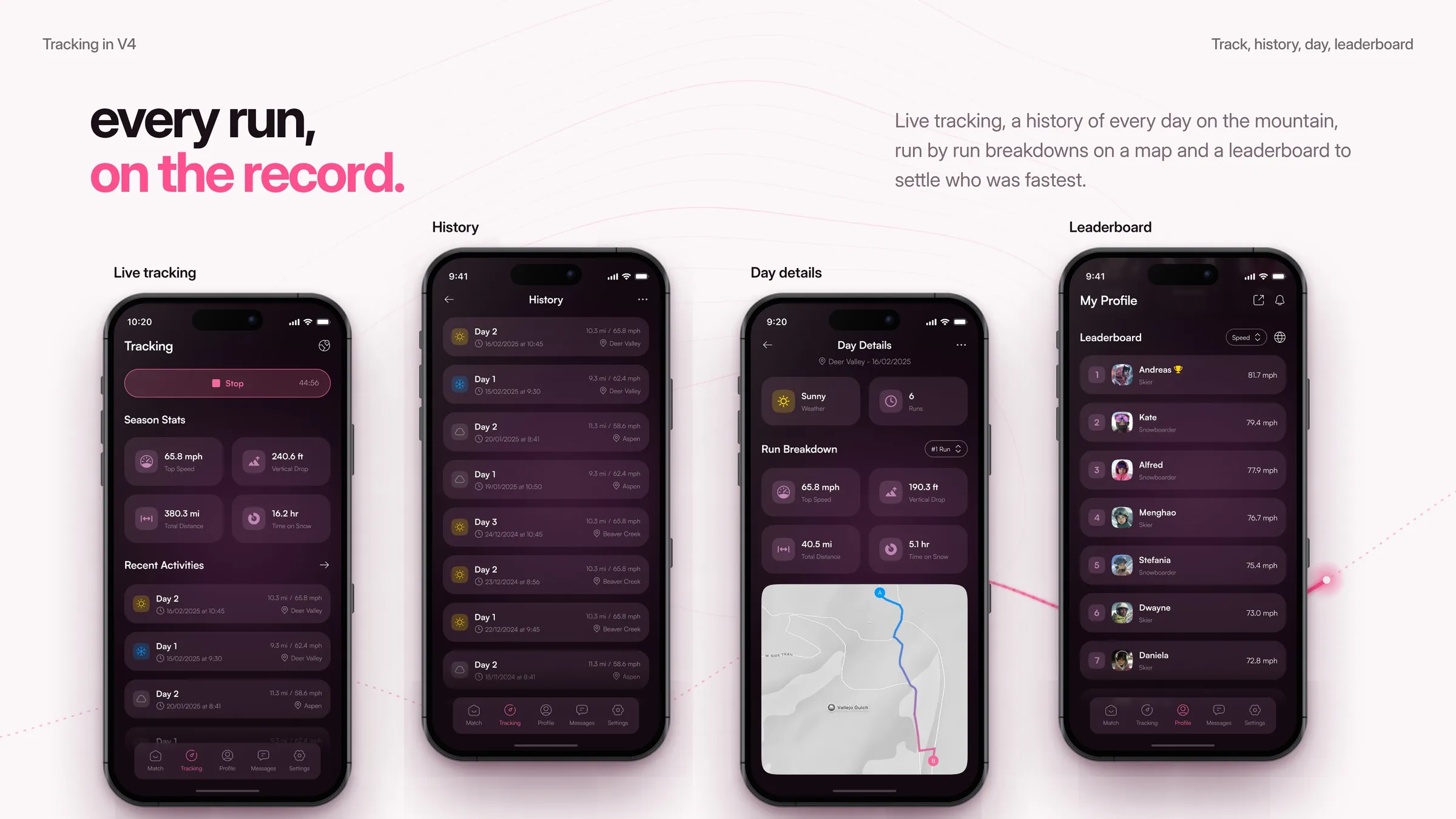
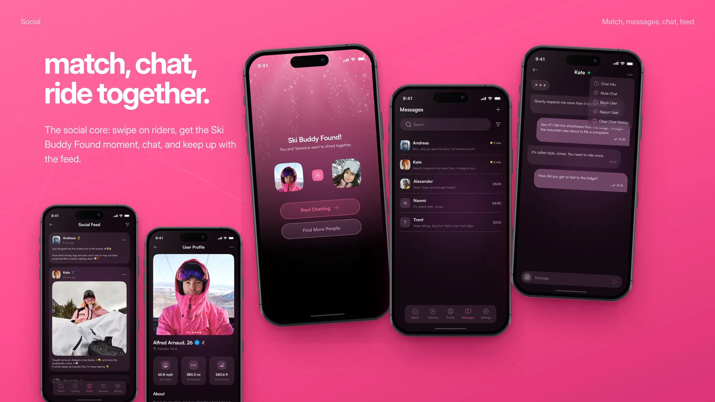
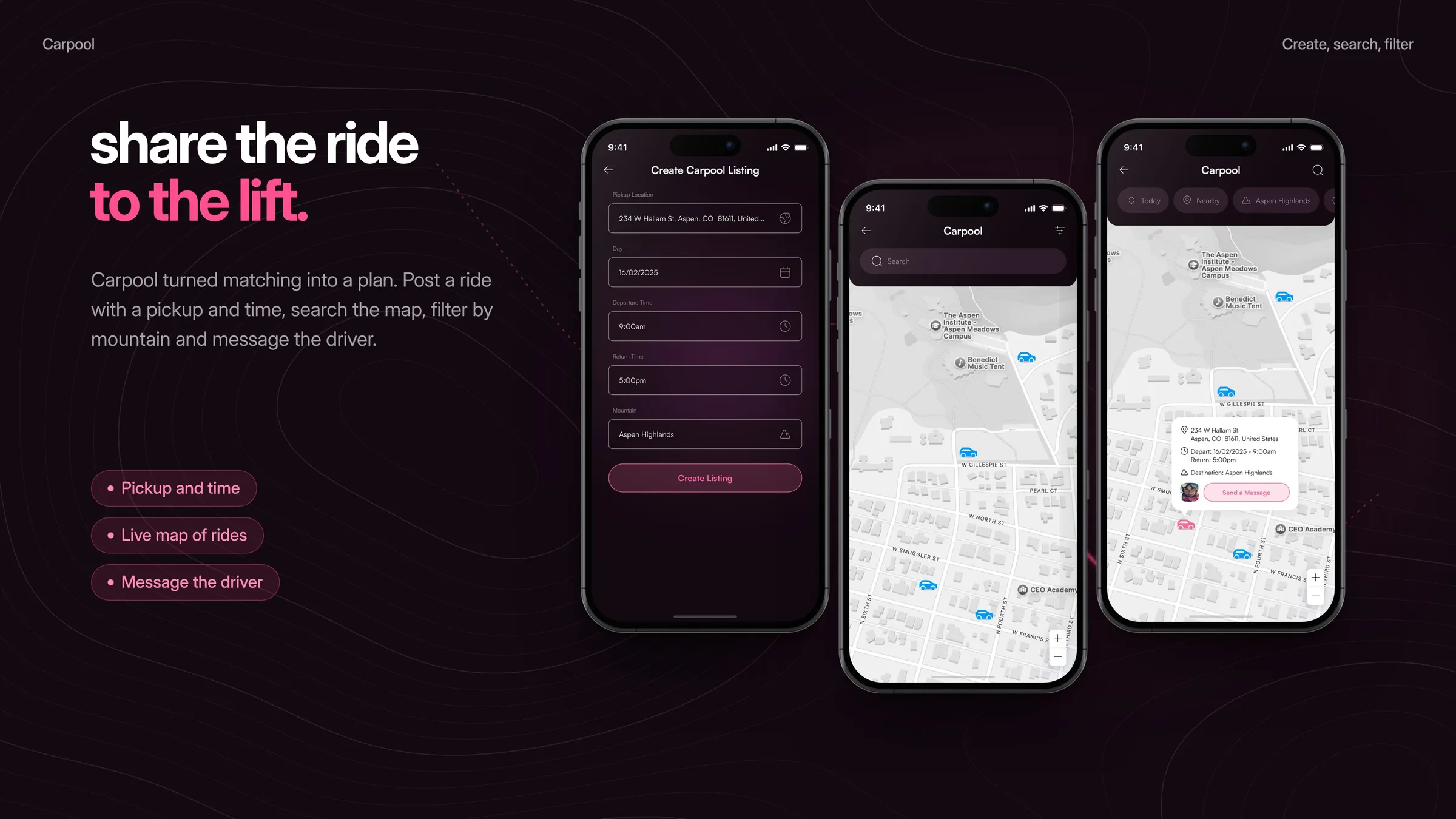
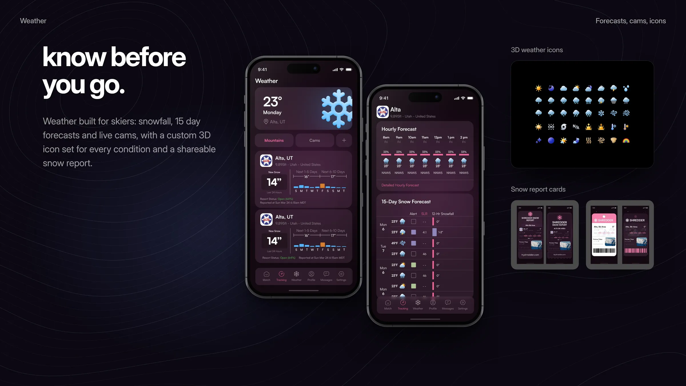
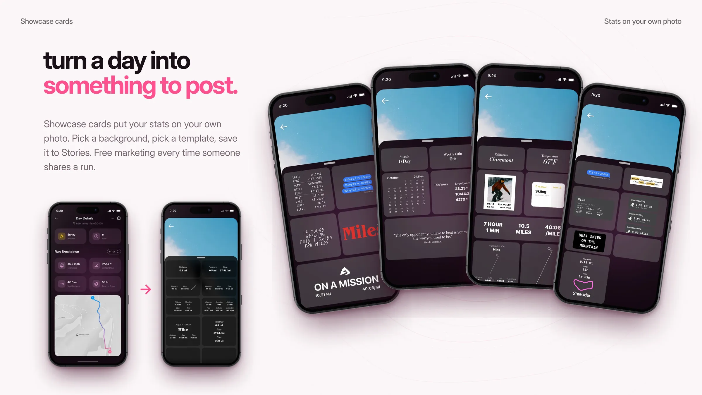
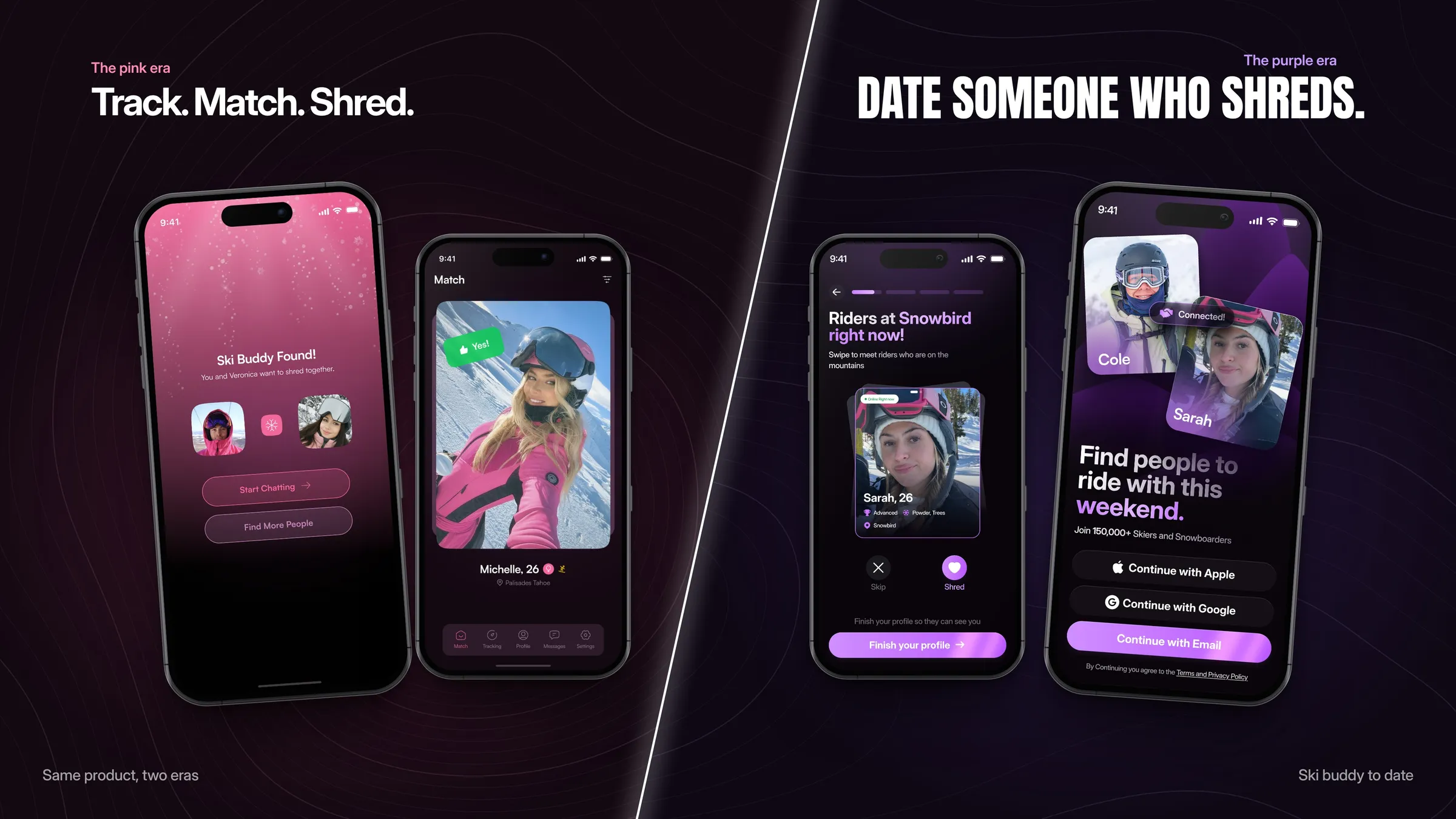
Part one was the pink era. We explored the mark (a snowflake, then an S cut into a mountain), drew Shreddy, the mascot that became the app icon and the voice of the AI matchmaker, and wrote the brand guidelines. Then we designed four versions of the app: match, tracking, history, leaderboard, chat, social feed, carpool and weather, with a custom 3D icon set and showcase cards for sharing a day on the mountain.
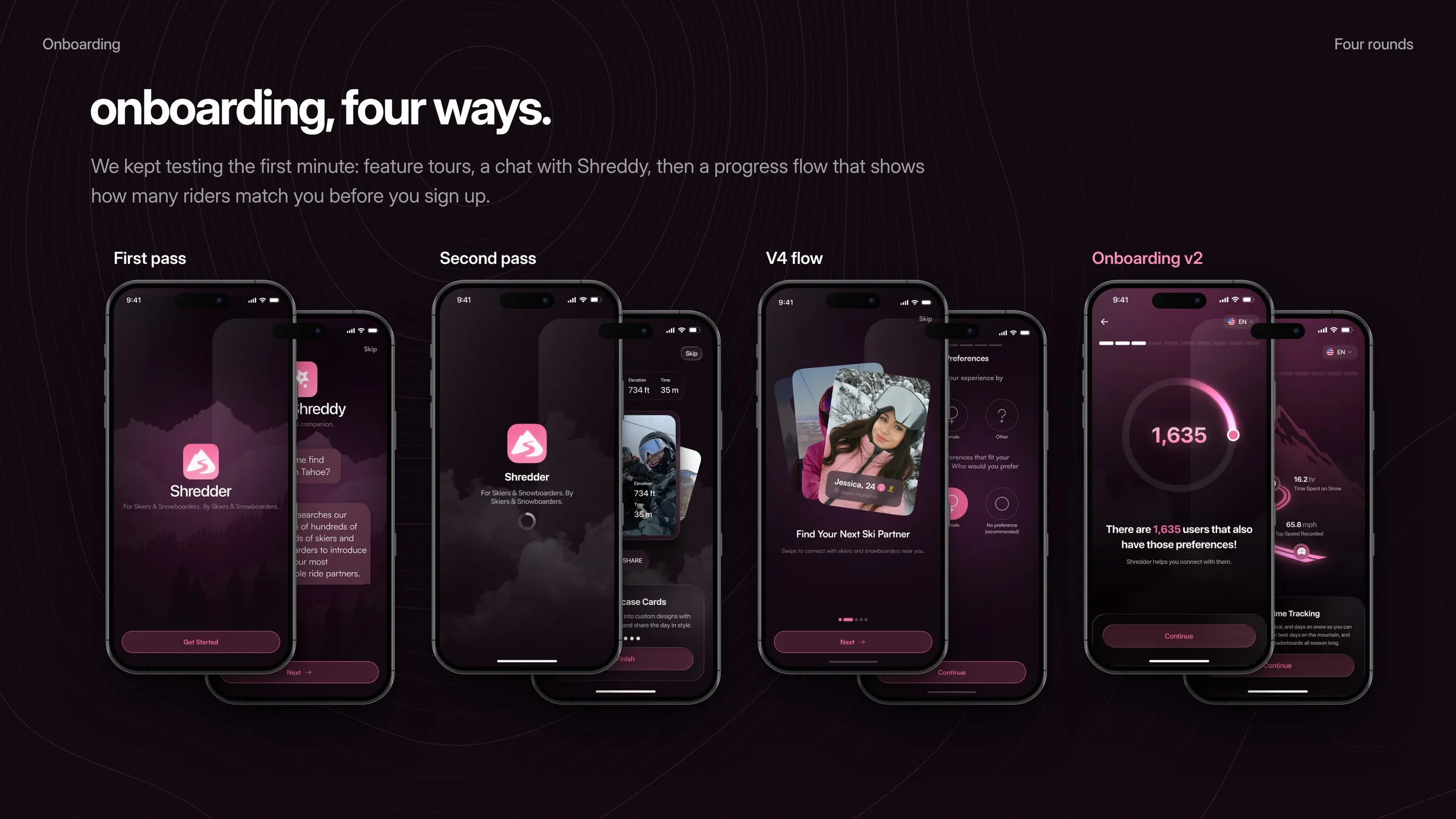
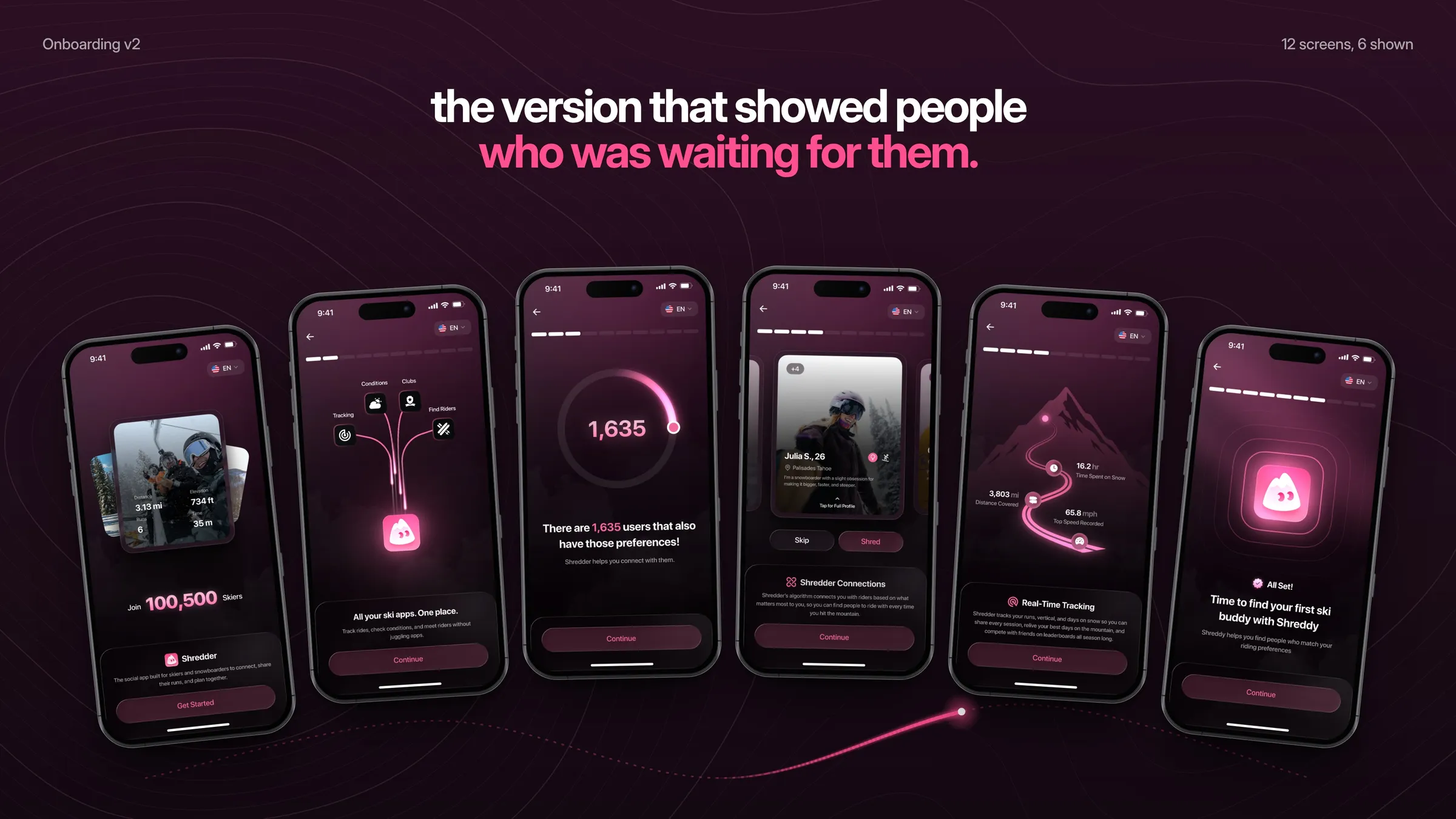
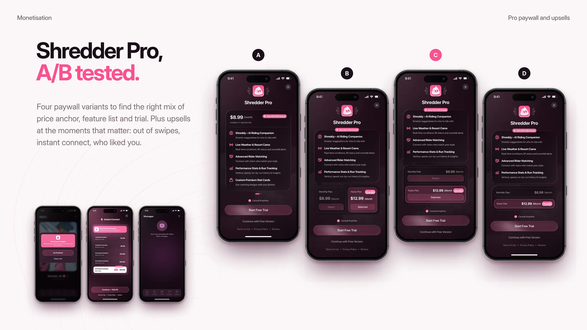
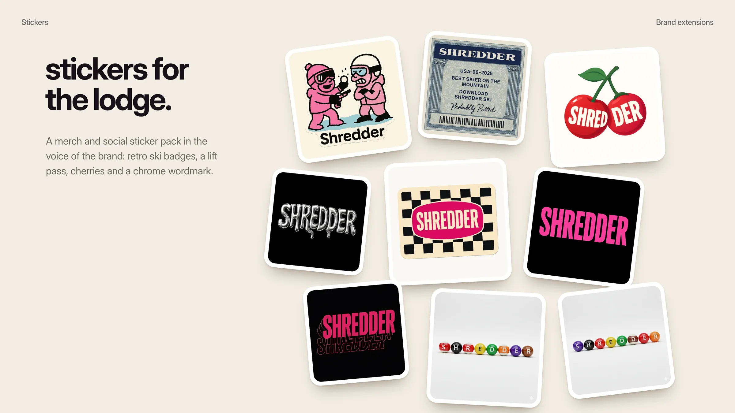
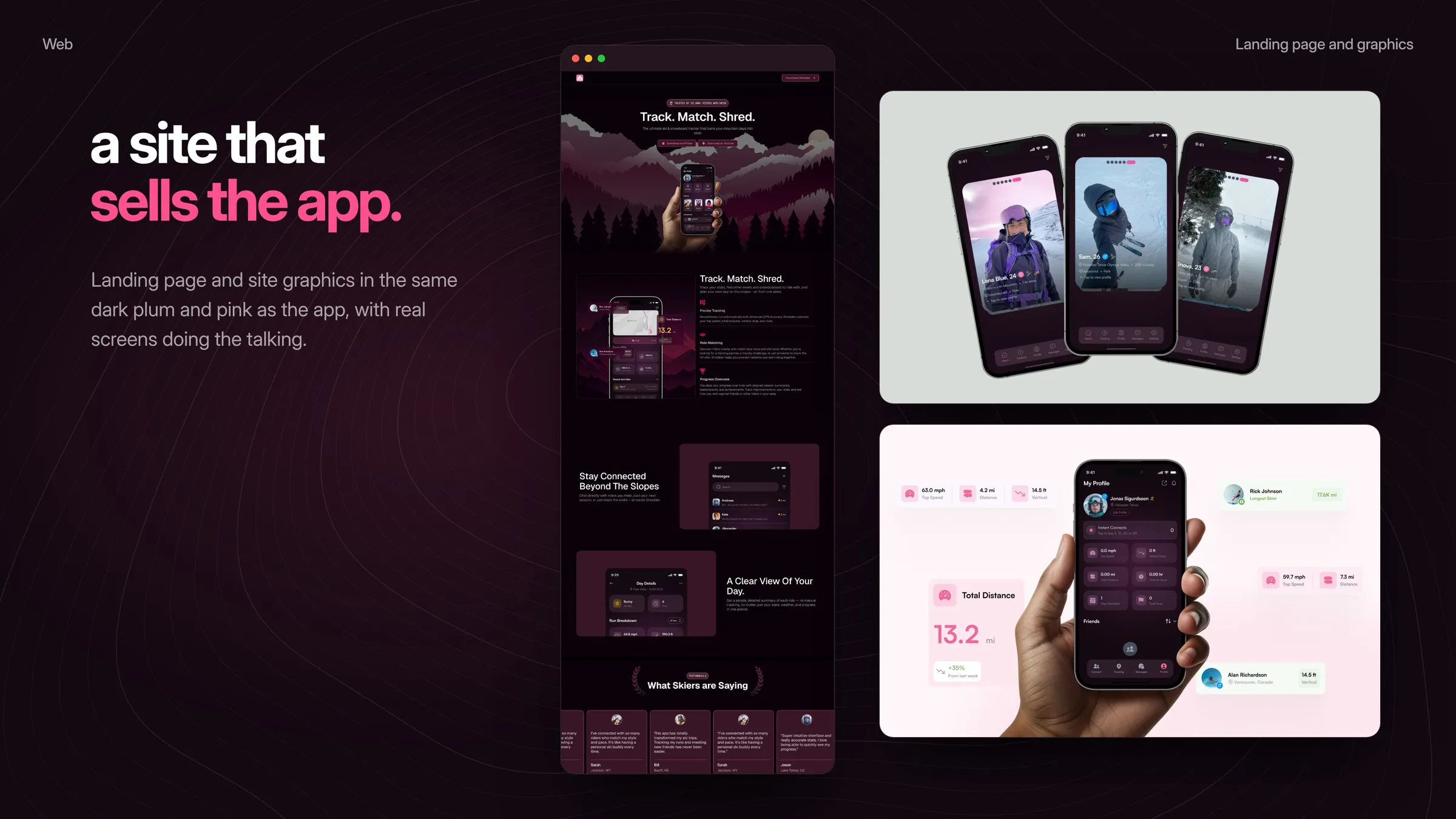
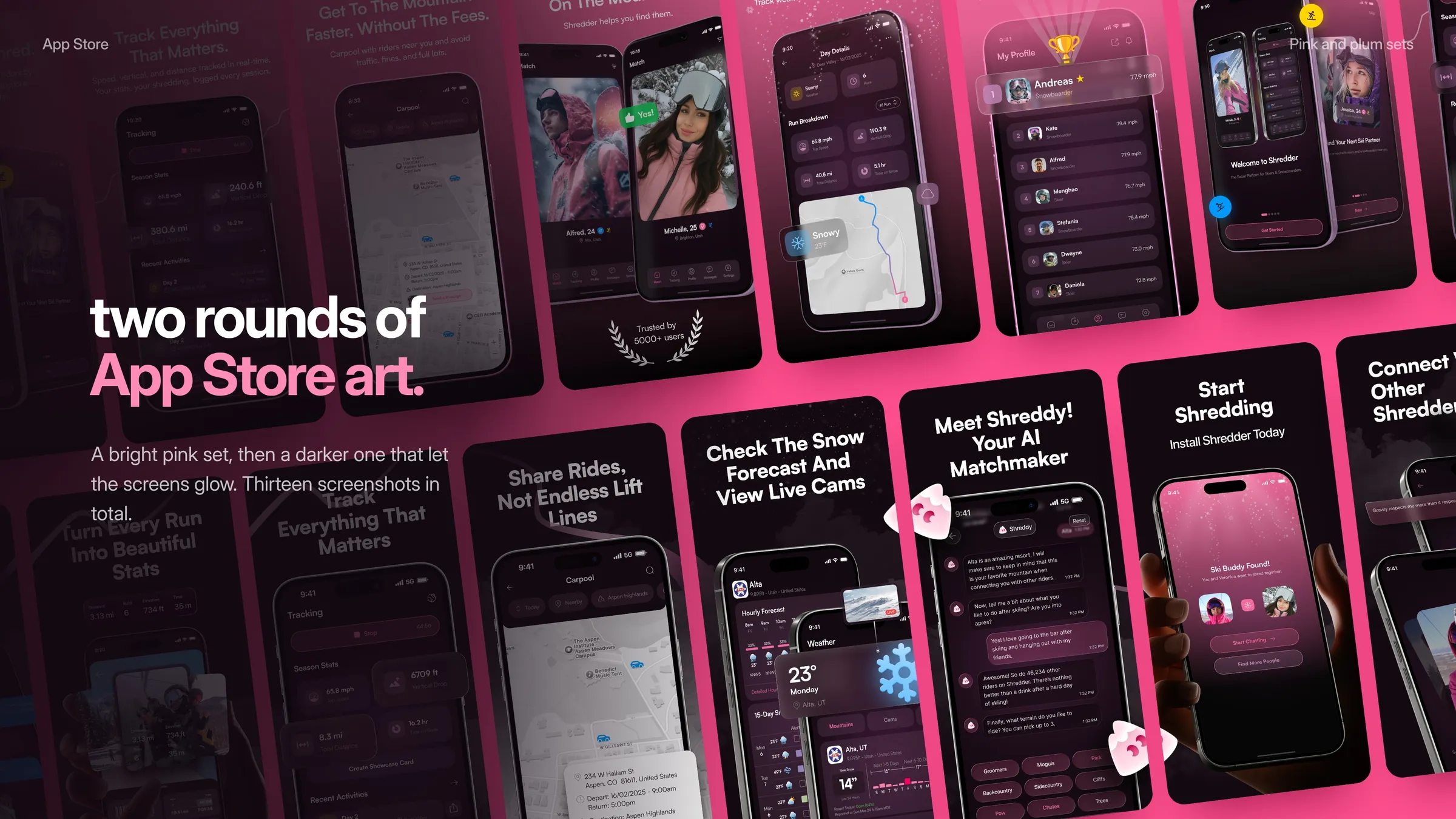
Around the app we ran four rounds of onboarding, A/B tested the Shredder Pro paywall, and made a sticker pack, the landing page and two sets of App Store screenshots. Each version came out of real use, so every round kept what worked and fixed what did not.
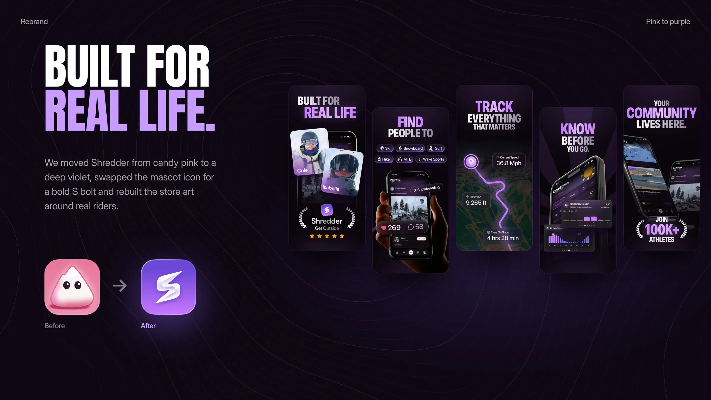
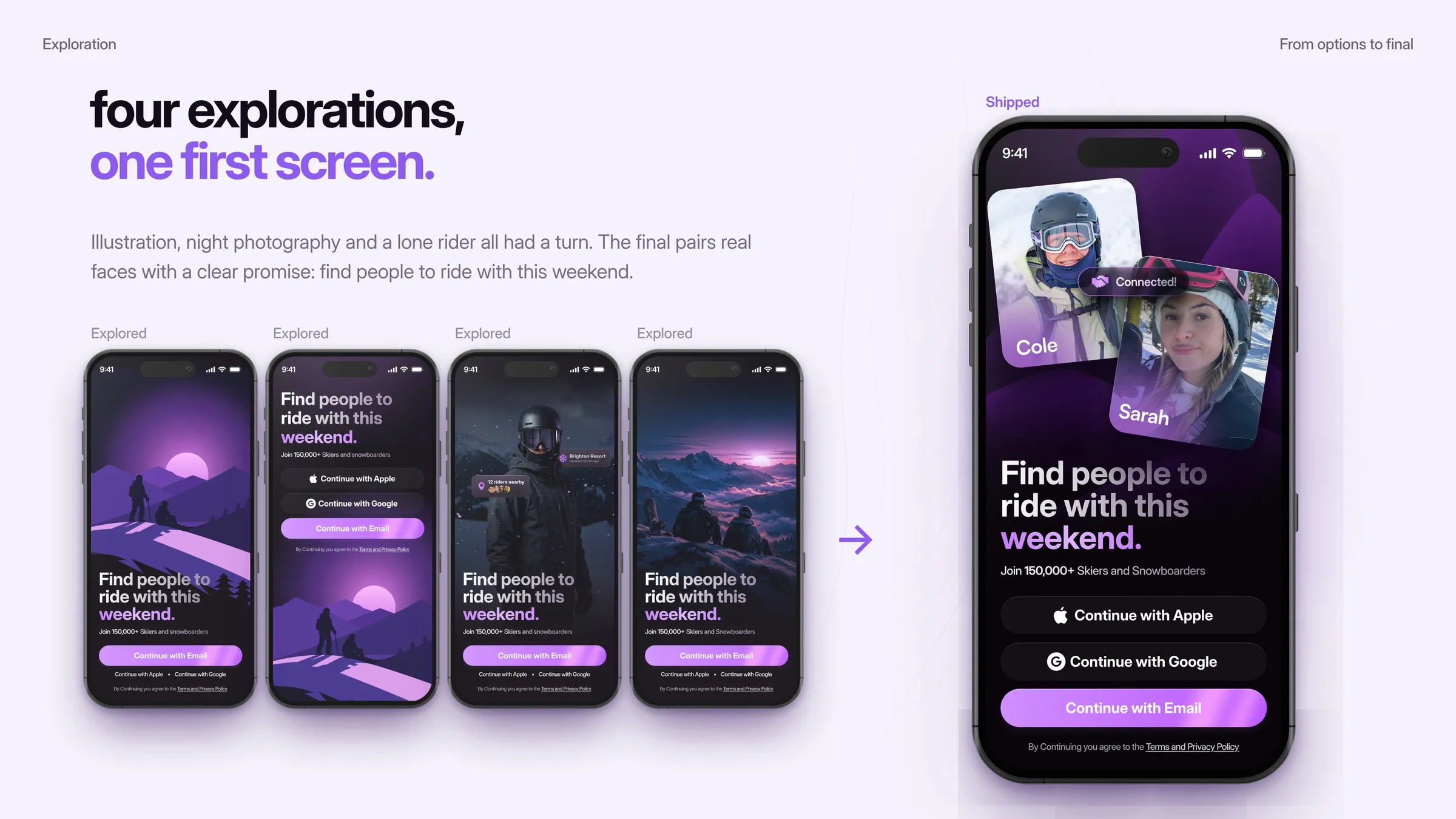
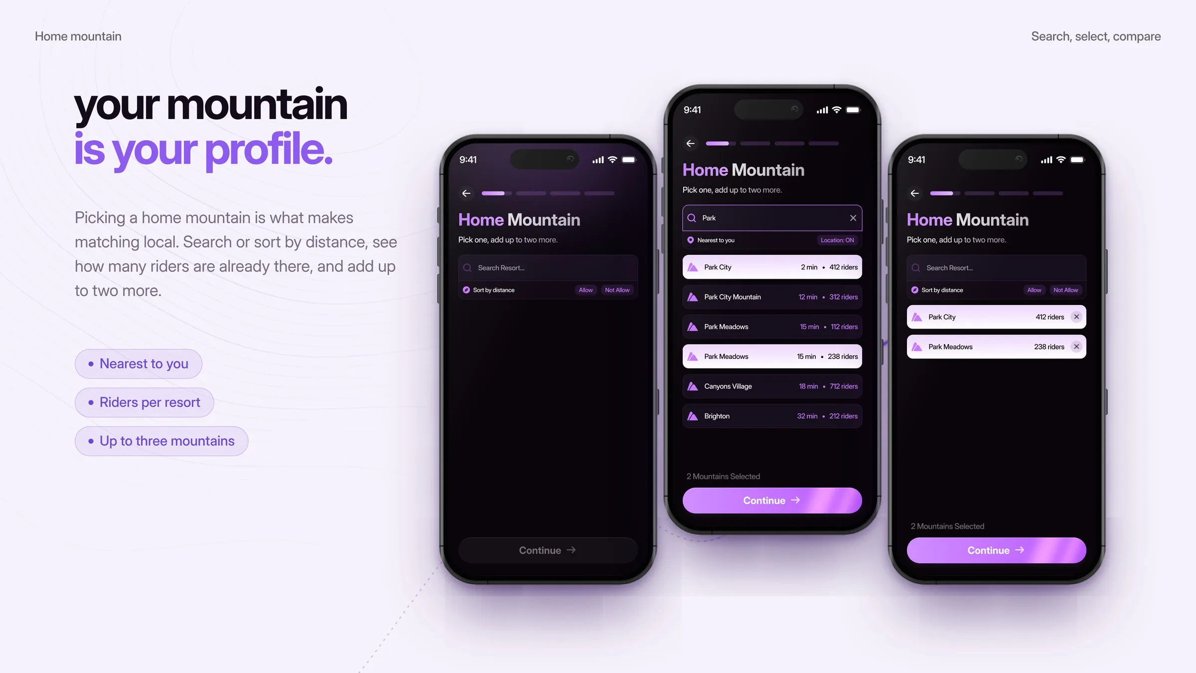
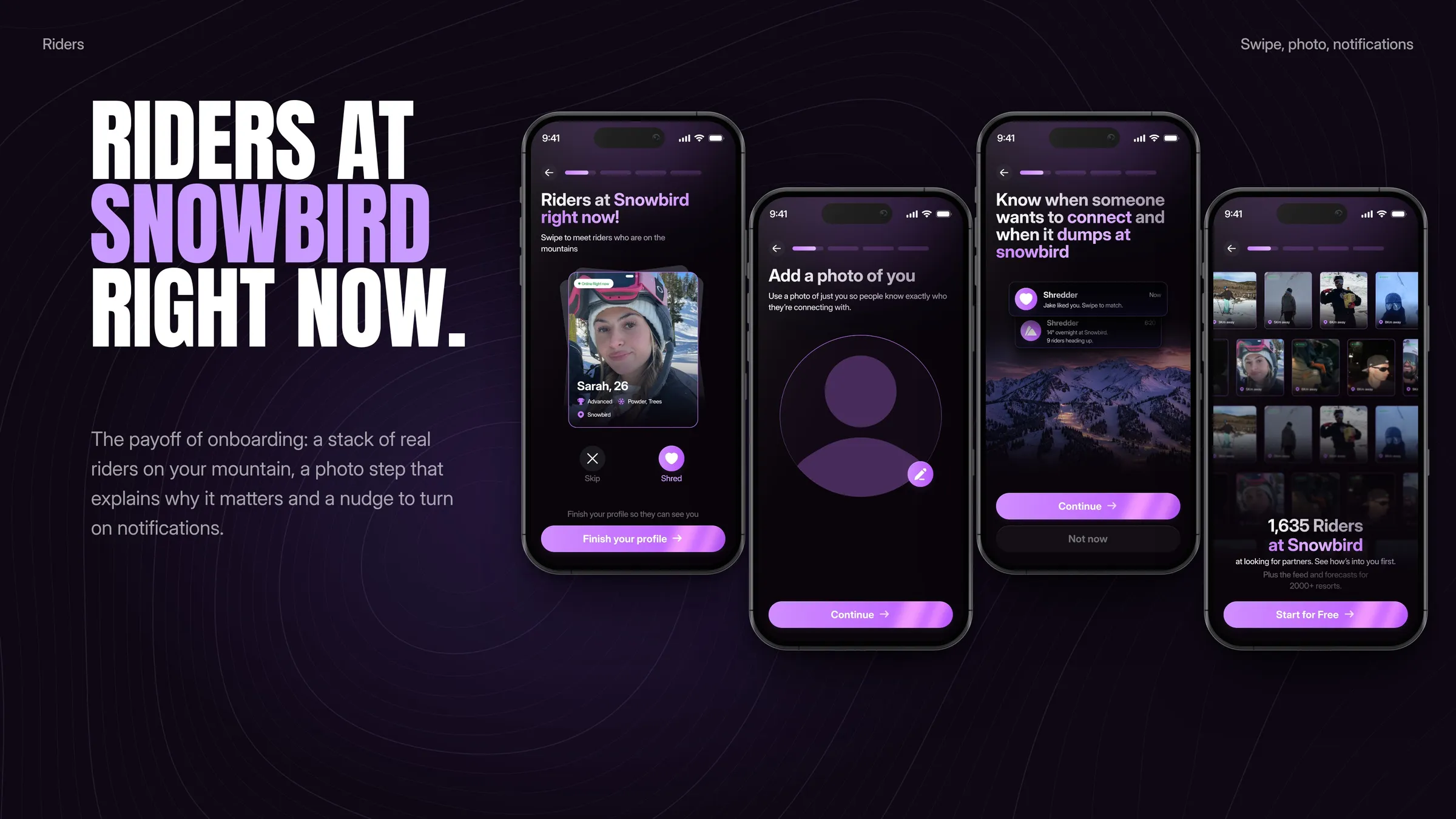
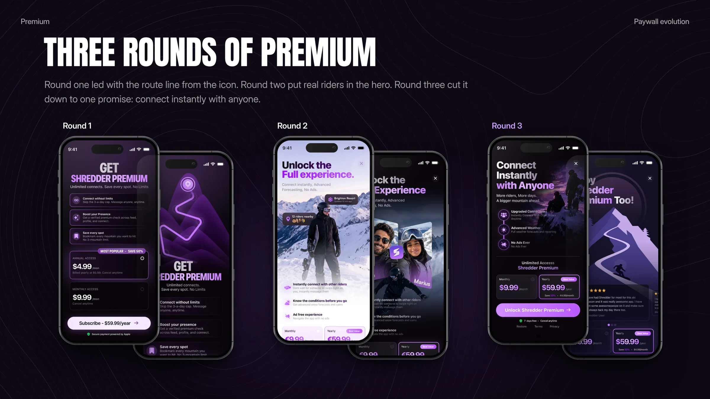
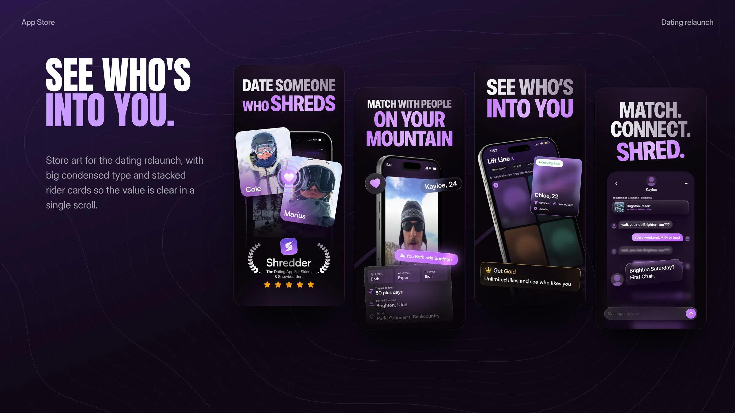
Part two was the purple era. We rebranded Shredder in deep violet with a new S bolt icon and rebuilt it as a dating first product: a 14 step dating onboarding (explored, then shipped), matching by home mountain, three rounds of Premium paywalls and new App Store art.
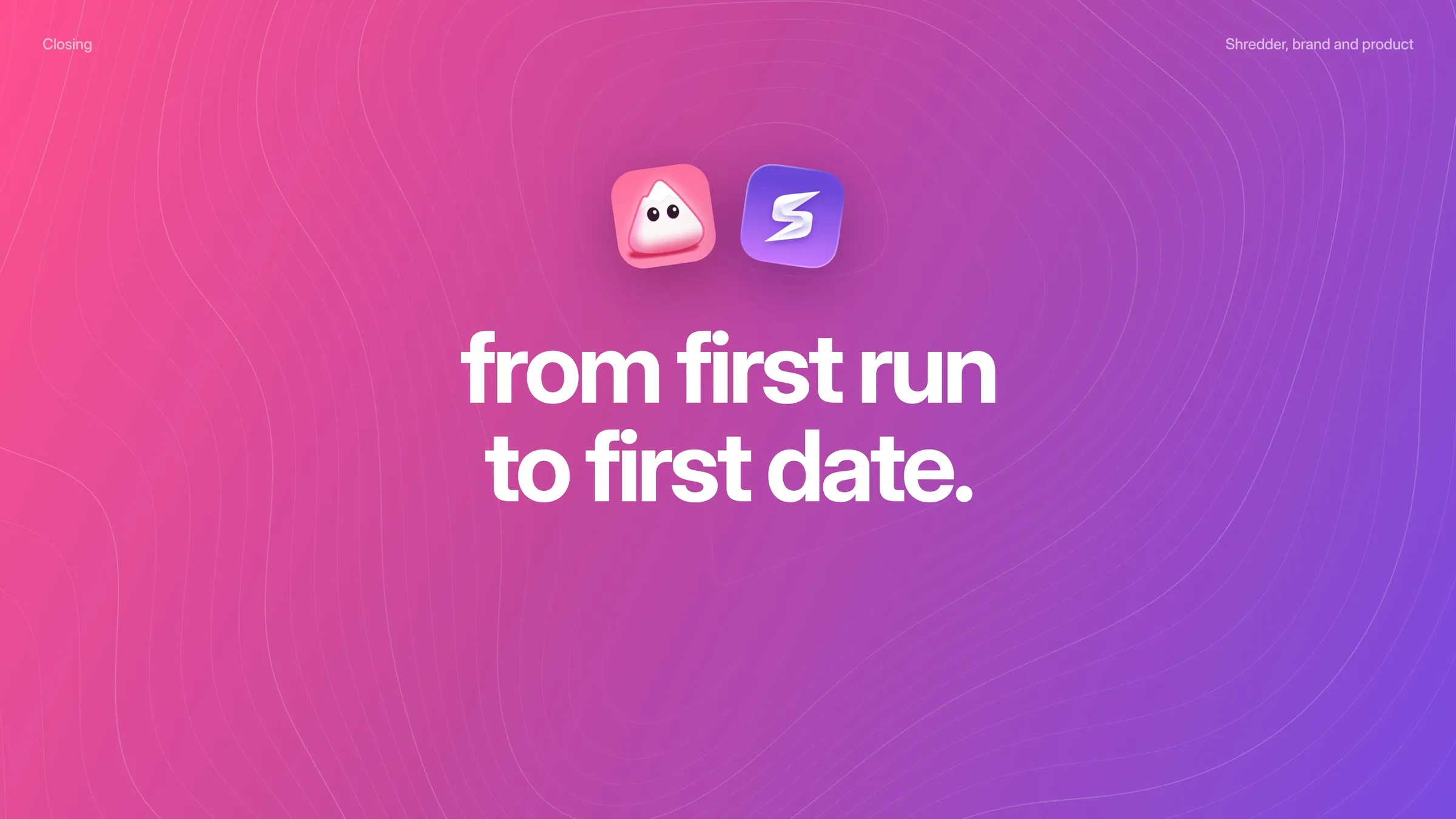
From first run to first date
Want results like this?
Book a free 30 minute strategy call with Dom, or get a free audit of your product first.