Floxy
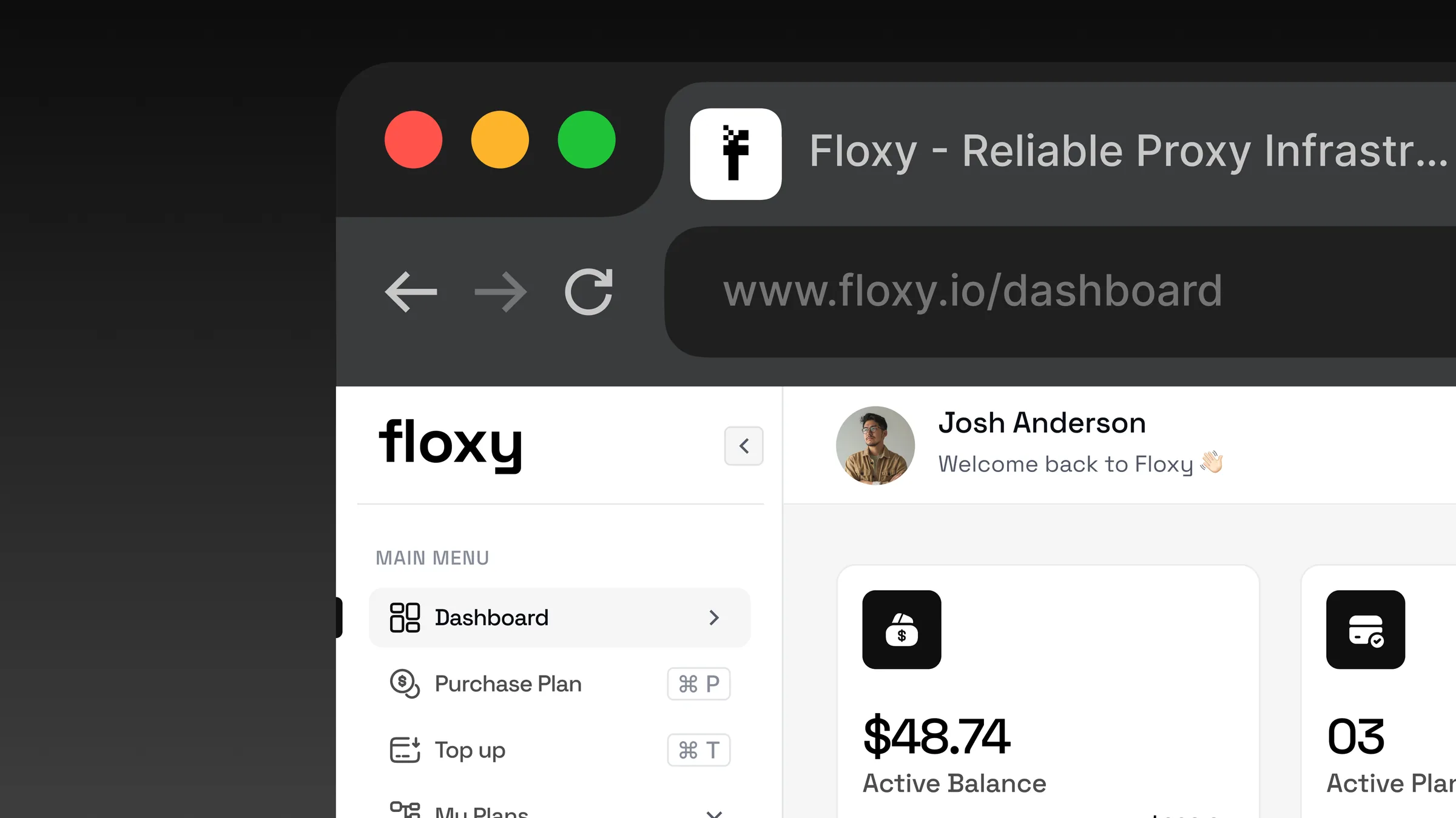
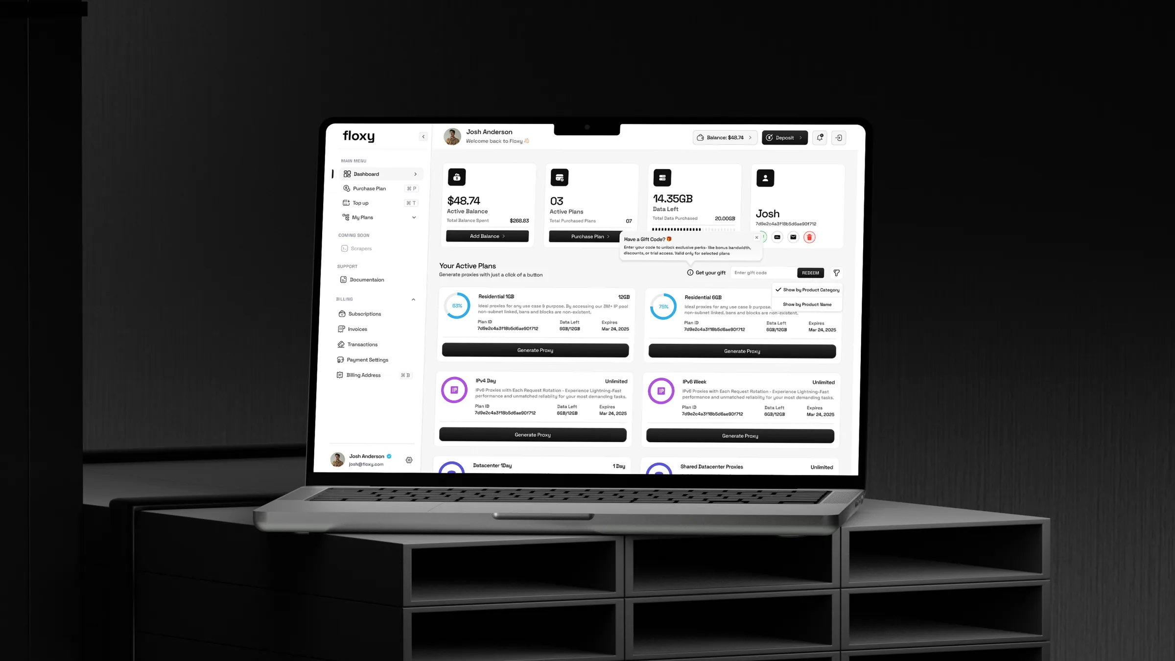
A proxy dashboard that turns a network of 30M+ residential and 500K+ datacenter proxies into a clear, fast workspace.
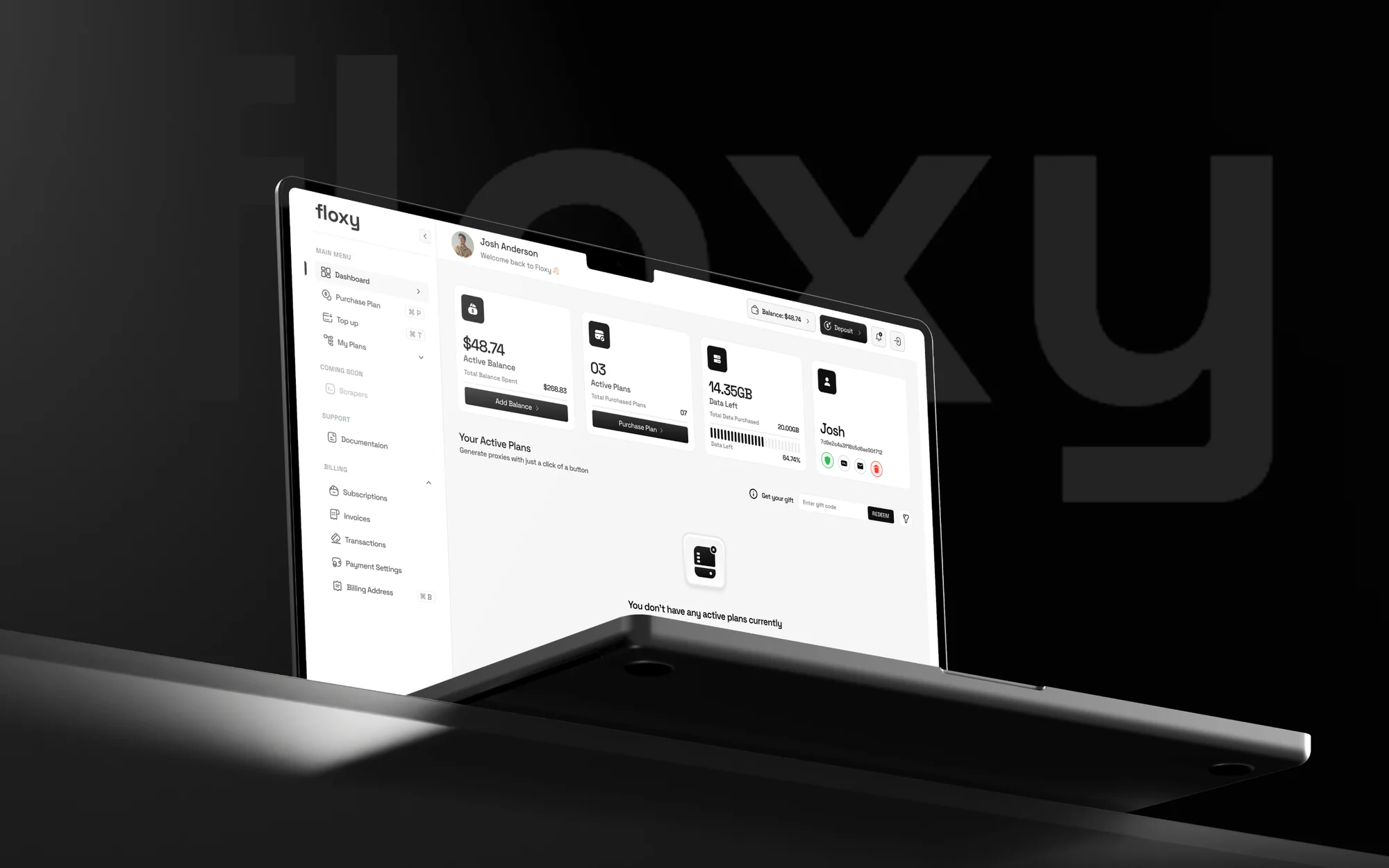
Great power, too much complexity
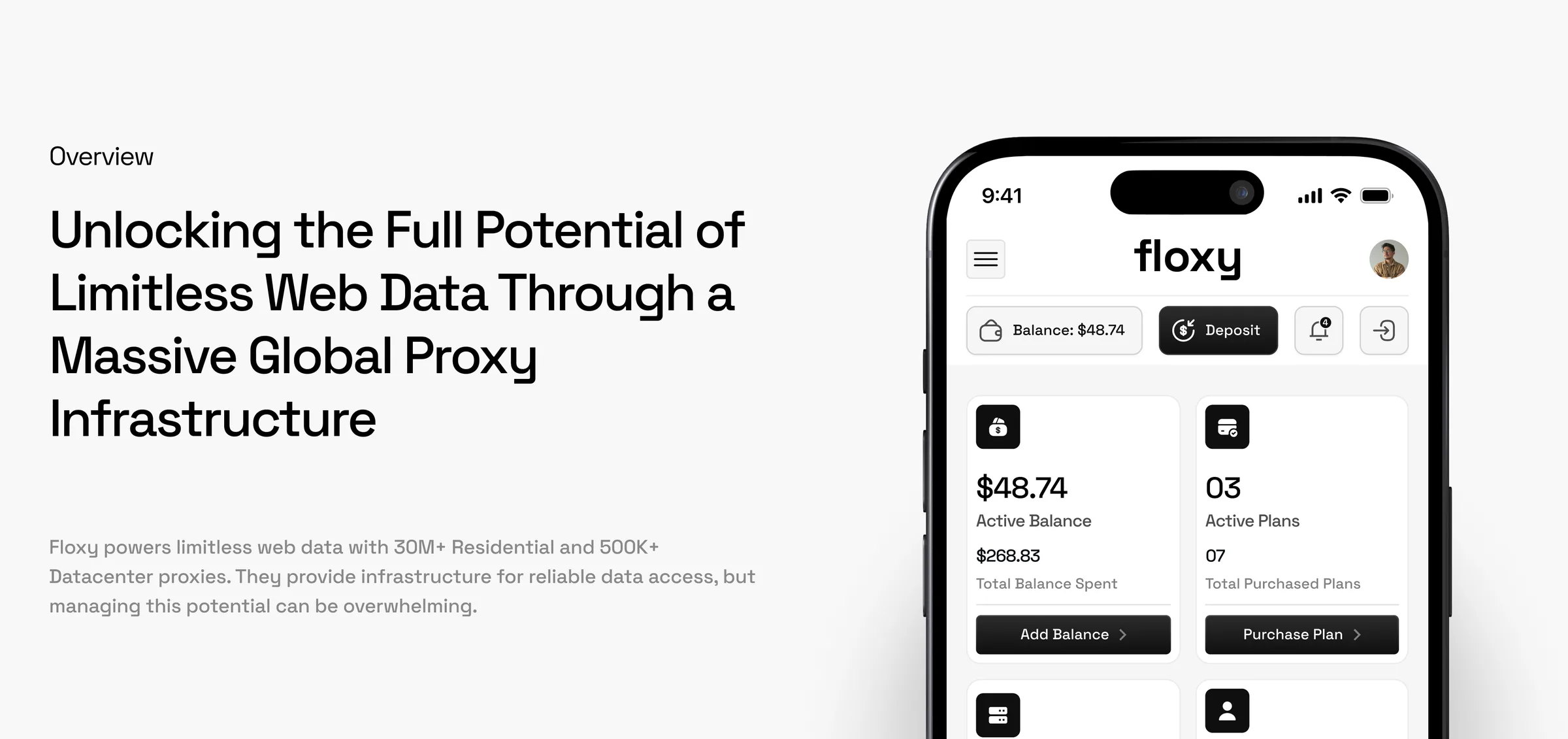
Floxy powers limitless web data with 30M+ residential and 500K+ datacenter proxies. The infrastructure was industry leading, but the user experience was not keeping up, and the sheer scale of the network had become a bottleneck for users.
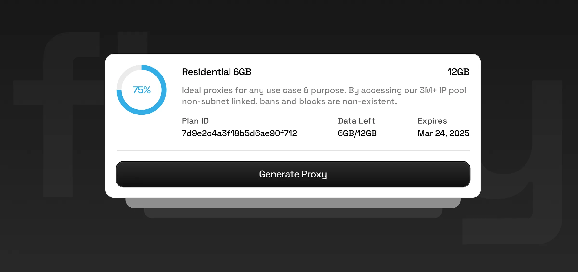
Monitor consumption. Tracking real-time bandwidth usage across millions of IPs was difficult, leading to budget anxiety.
Execute quickly. Simple tasks like generating a specific proxy list or whitelisting an IP took too many clicks, adding friction to the daily workflow.
Visualize data. Critical metrics were buried in dense tables, making it hard to get a clear snapshot of connection health.
Spot trends. Important performance indicators were hidden in complex reports, so usage patterns were hard to see.
A high-performance interface for the whole network
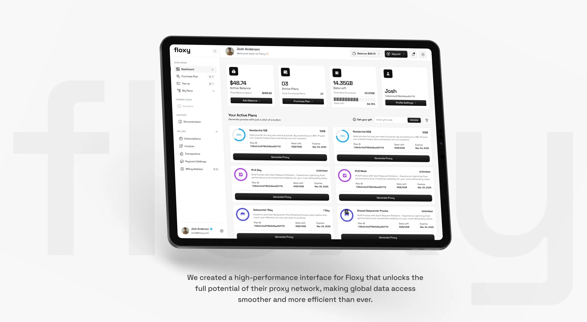
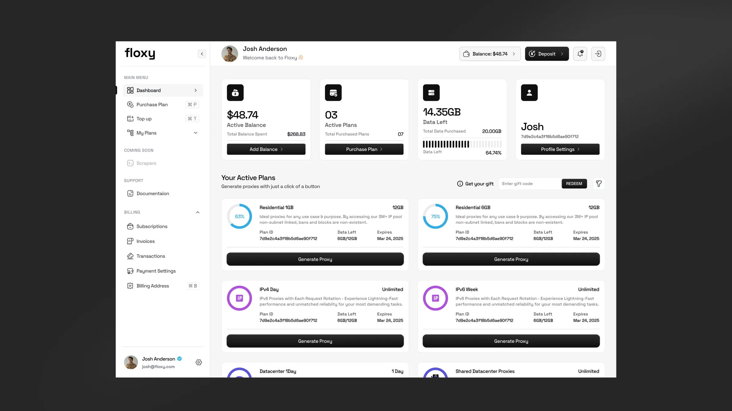
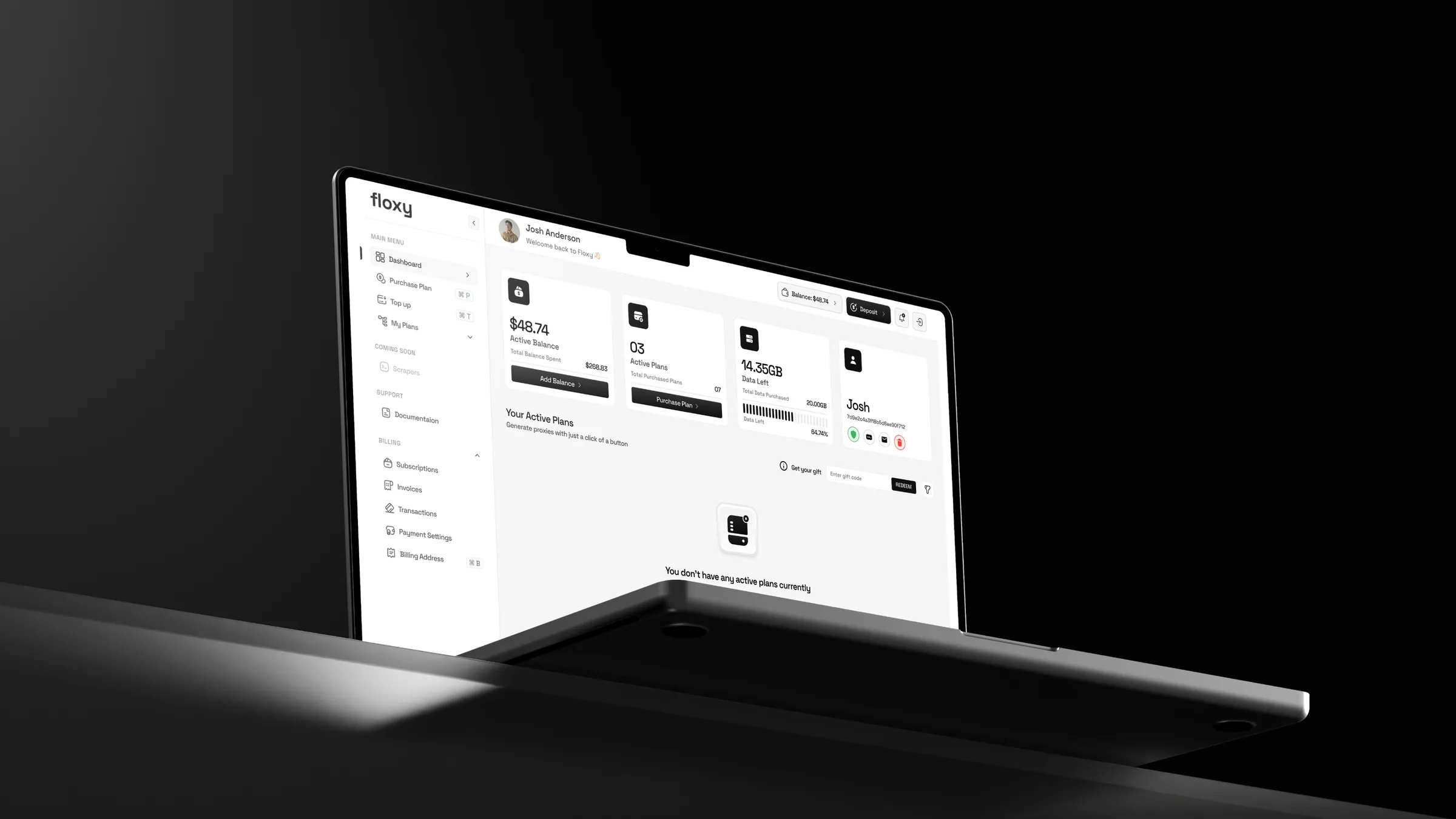
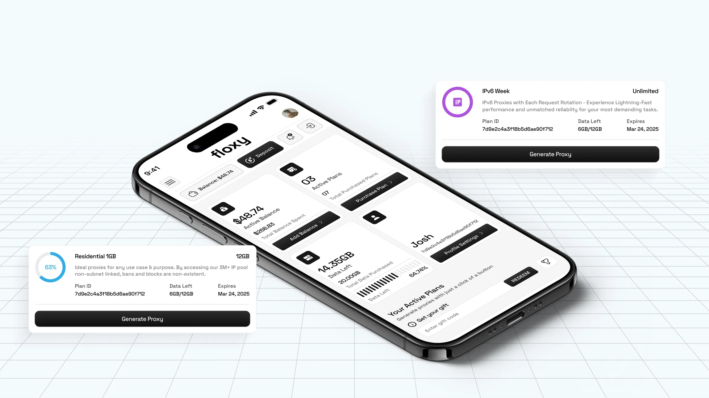
We designed an interface that unlocks the full potential of Floxy's proxy network and makes global data access smoother and more efficient.
Discovery and definition: we audited the existing platform, found the technical bottlenecks and defined the core user flows. UX and wireframes: we mapped the information architecture and tested the layout and navigation in low fidelity before any styling. Visual design: a sleek, information-rich interface with strong contrast to highlight analytics and keep everything readable, set in Space Grotesk for a sharp, technical feel. Prototyping and handoff: interactive prototypes and a complete design system for a smooth, pixel-perfect handoff to engineering.


Want results like this?
Book a free 30 minute strategy call with Dom, or get a free audit of your product first.