Glowtify
A redesign of an AI marketing platform's knowledge experience, with a modern design system and workflows rebuilt from written documentation.
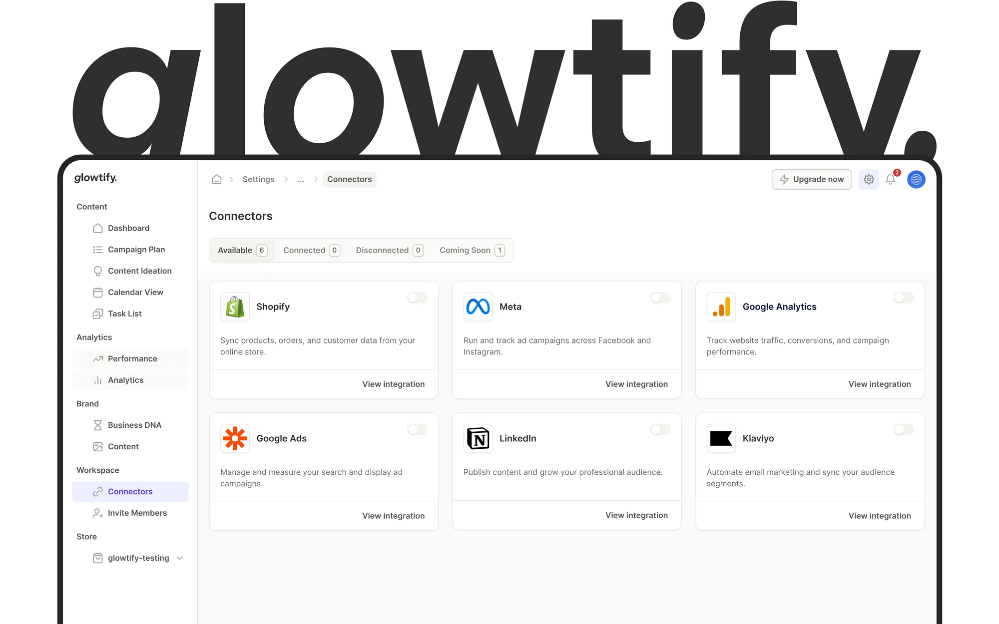
A legacy experience, documented only in writing
Glowtify is an AI-powered marketing platform that helps businesses build, manage and execute their marketing strategy from a single workspace. Beyond campaign execution, it includes a knowledge experience with educational resources, structured documentation and strategic guidance.
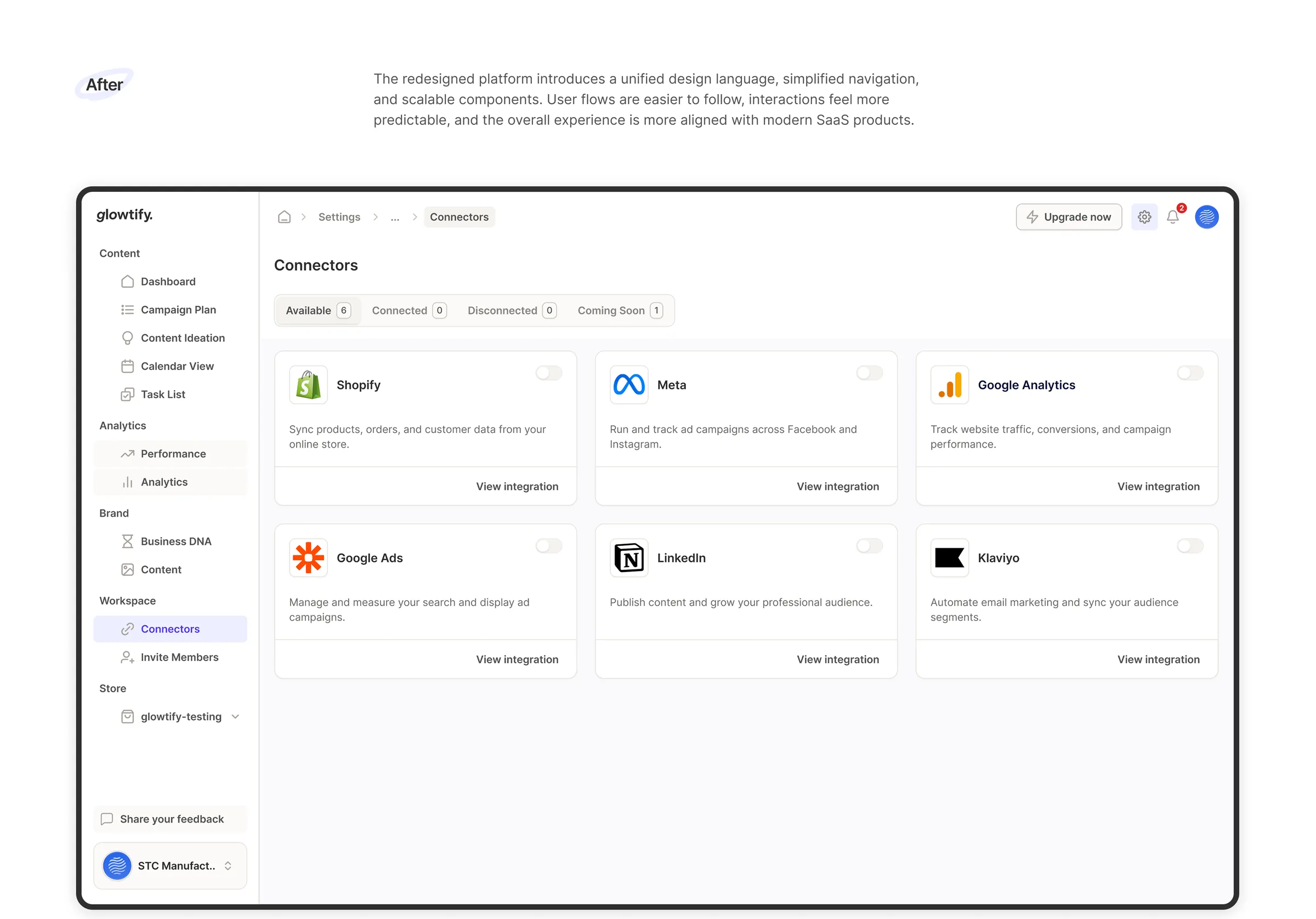
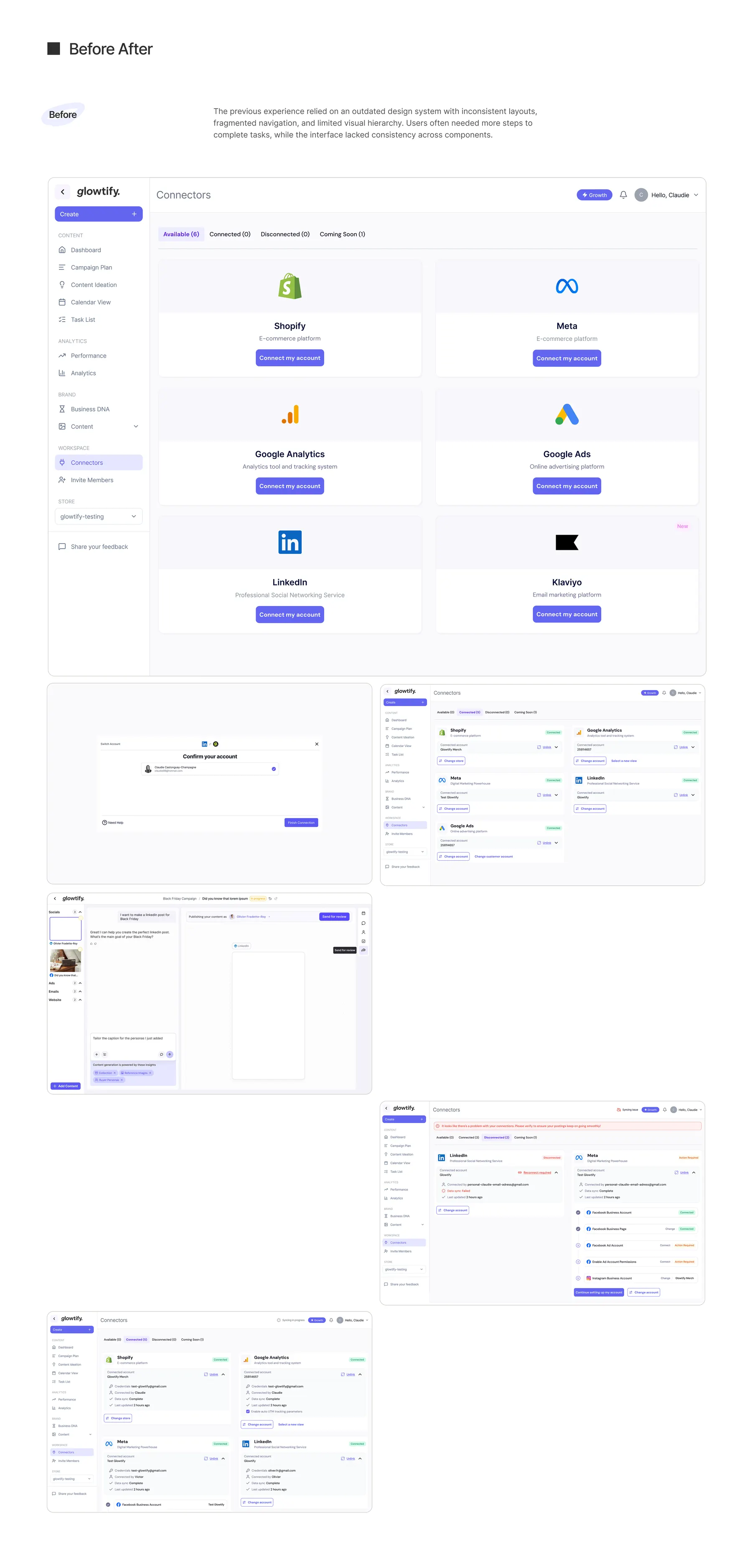
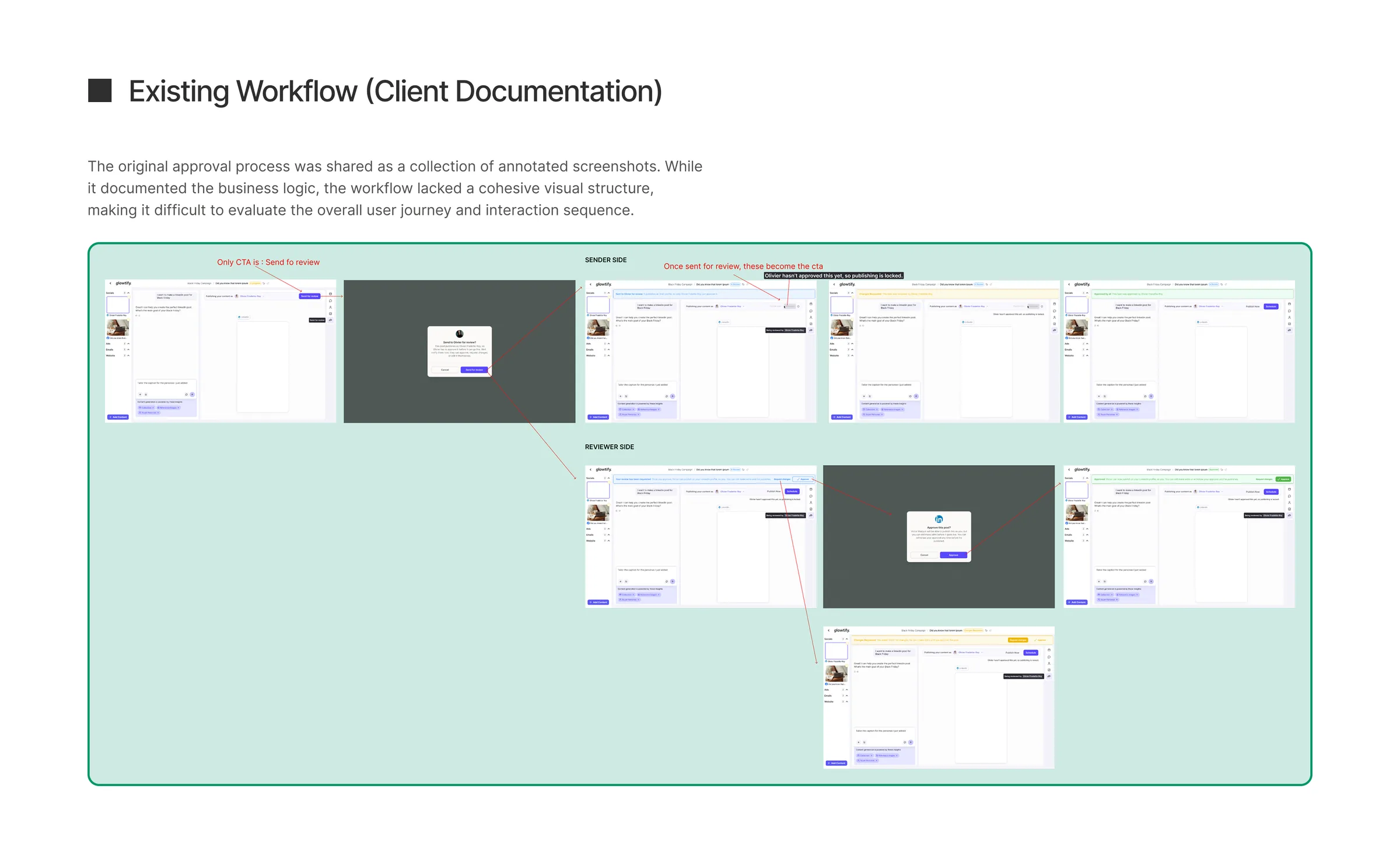
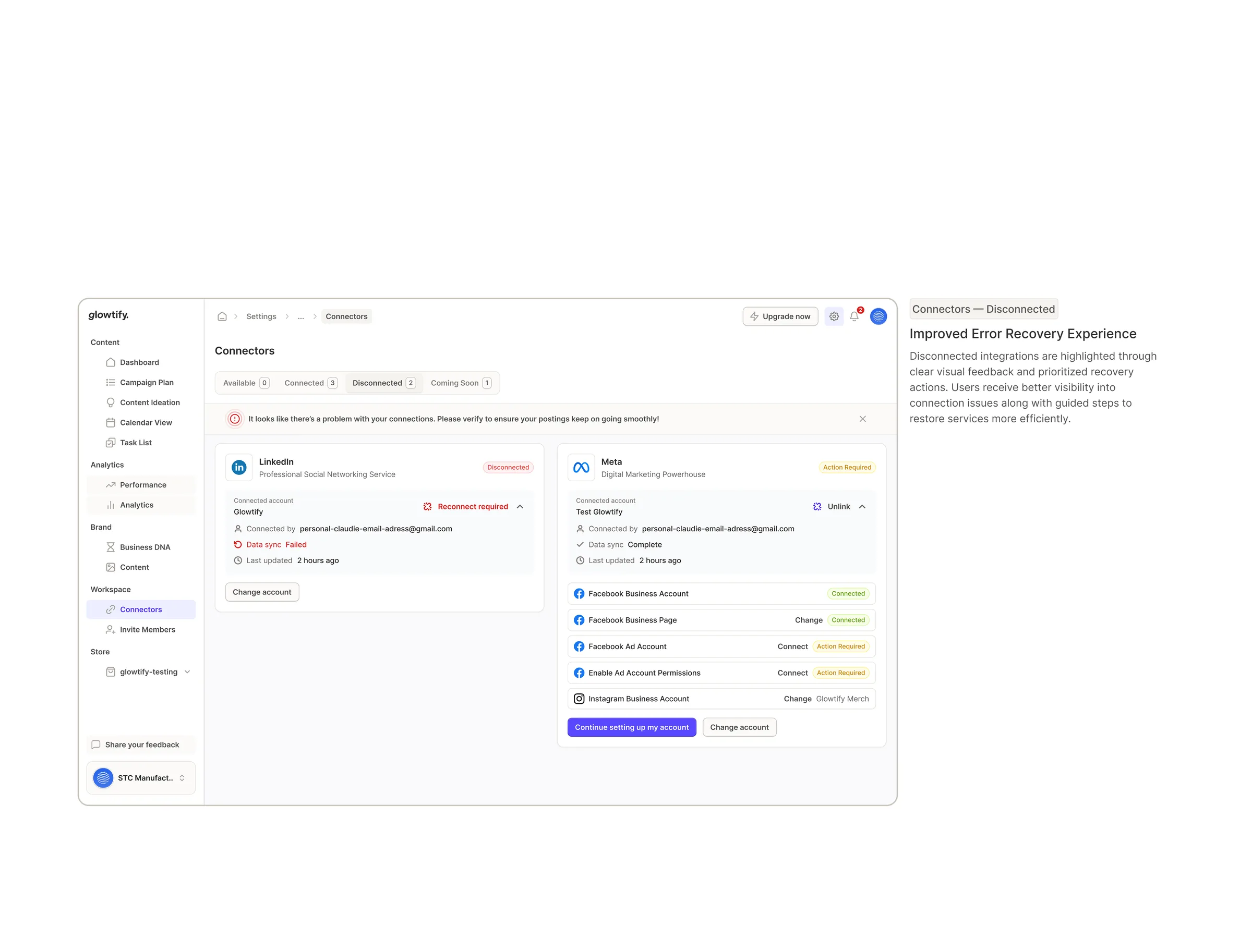
The existing platform had been built on an outdated design system, and over time inconsistencies had piled up across components, layouts, spacing, typography and interaction patterns. Instead of high-fidelity designs, we were handed documentation describing the existing flows, so written requirements had to become complete user experiences while keeping the platform's business logic intact.
Key challenges: a legacy design system with inconsistent UI, workflows that existed only as documentation, a complex information hierarchy, limited component reuse and inconsistent interaction patterns.
Rebuilding the foundation, not just refreshing the surface
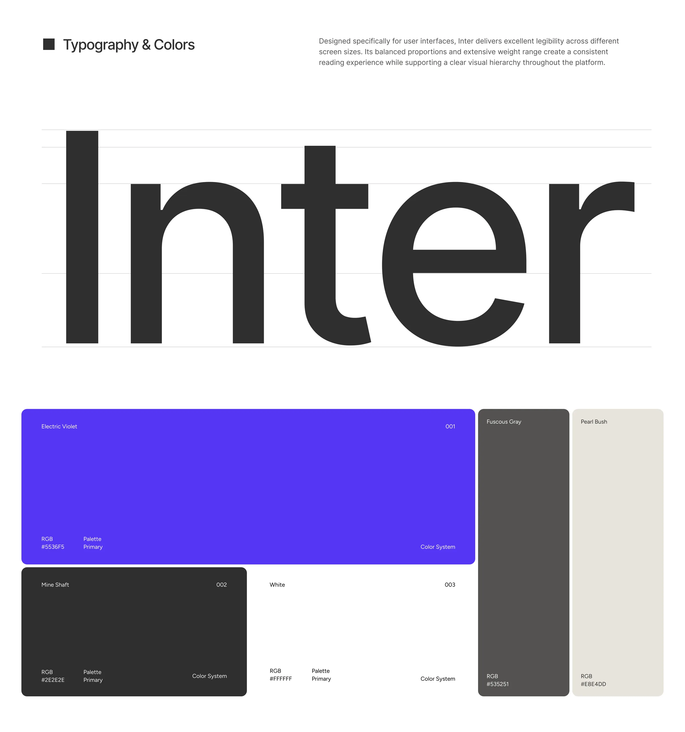
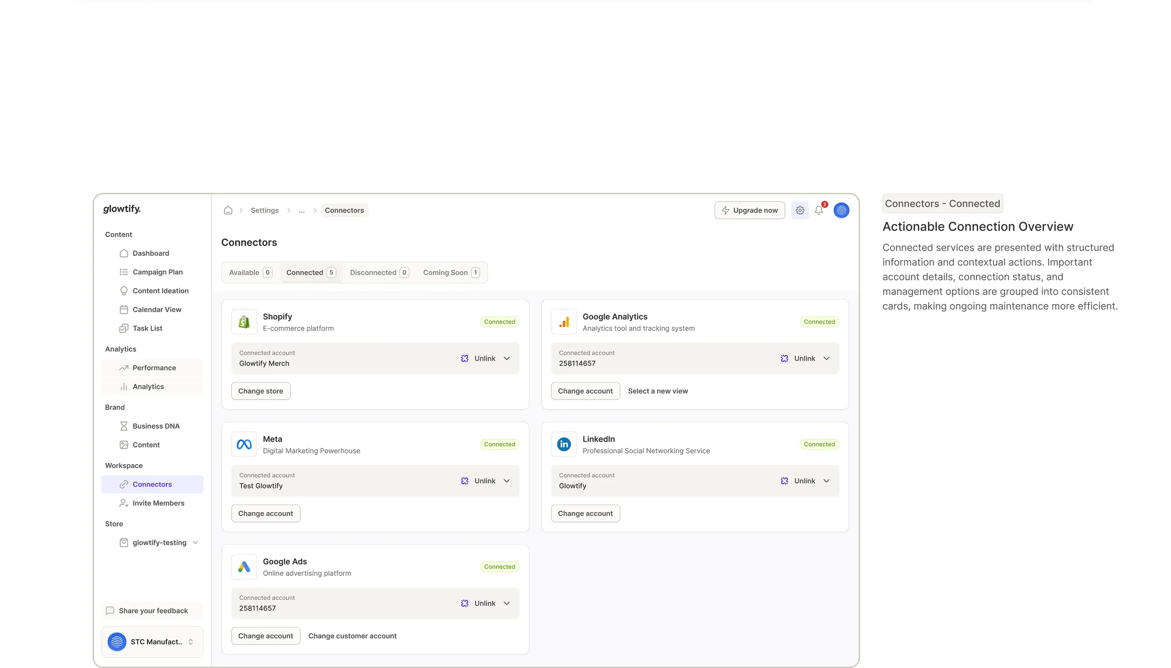
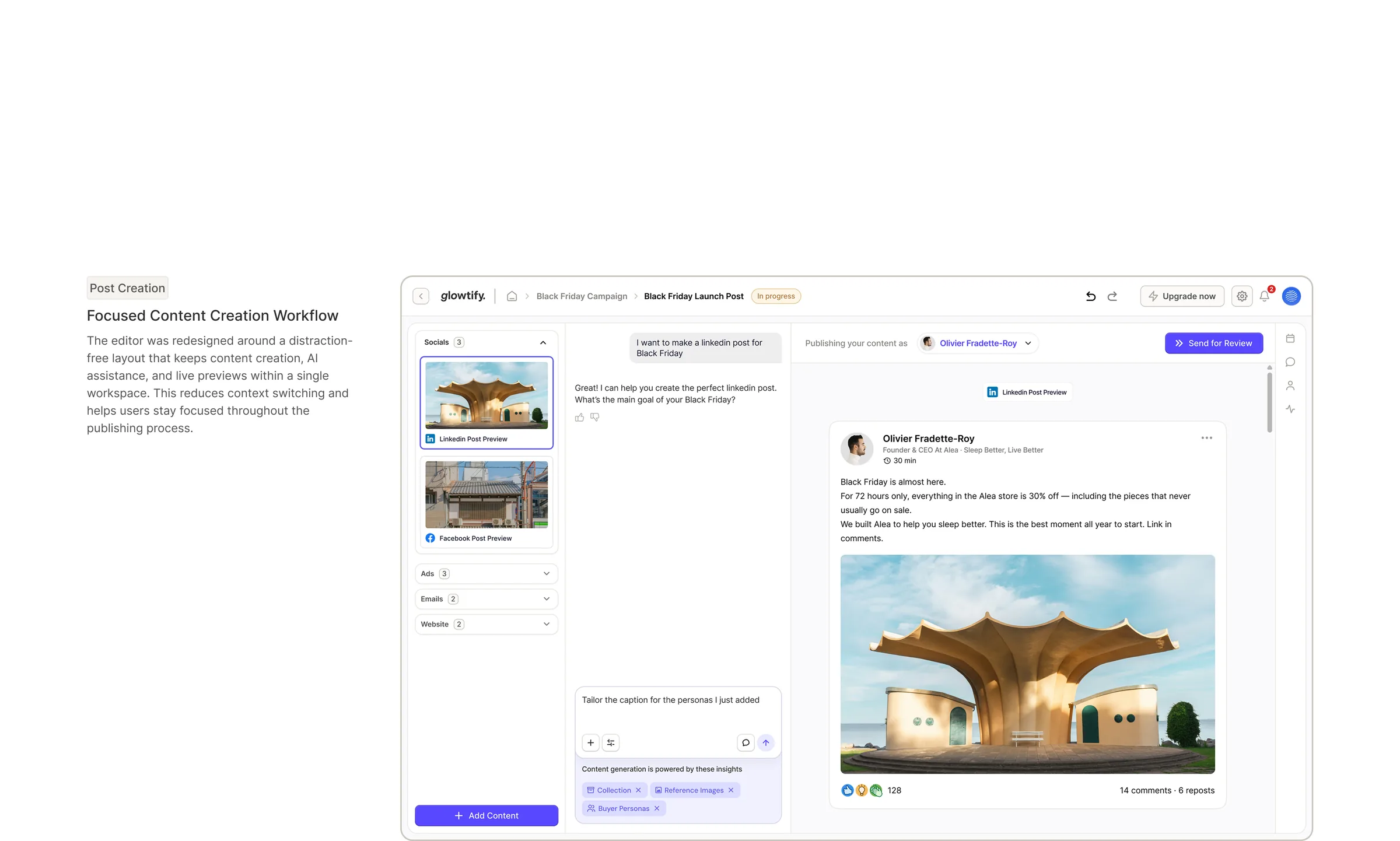
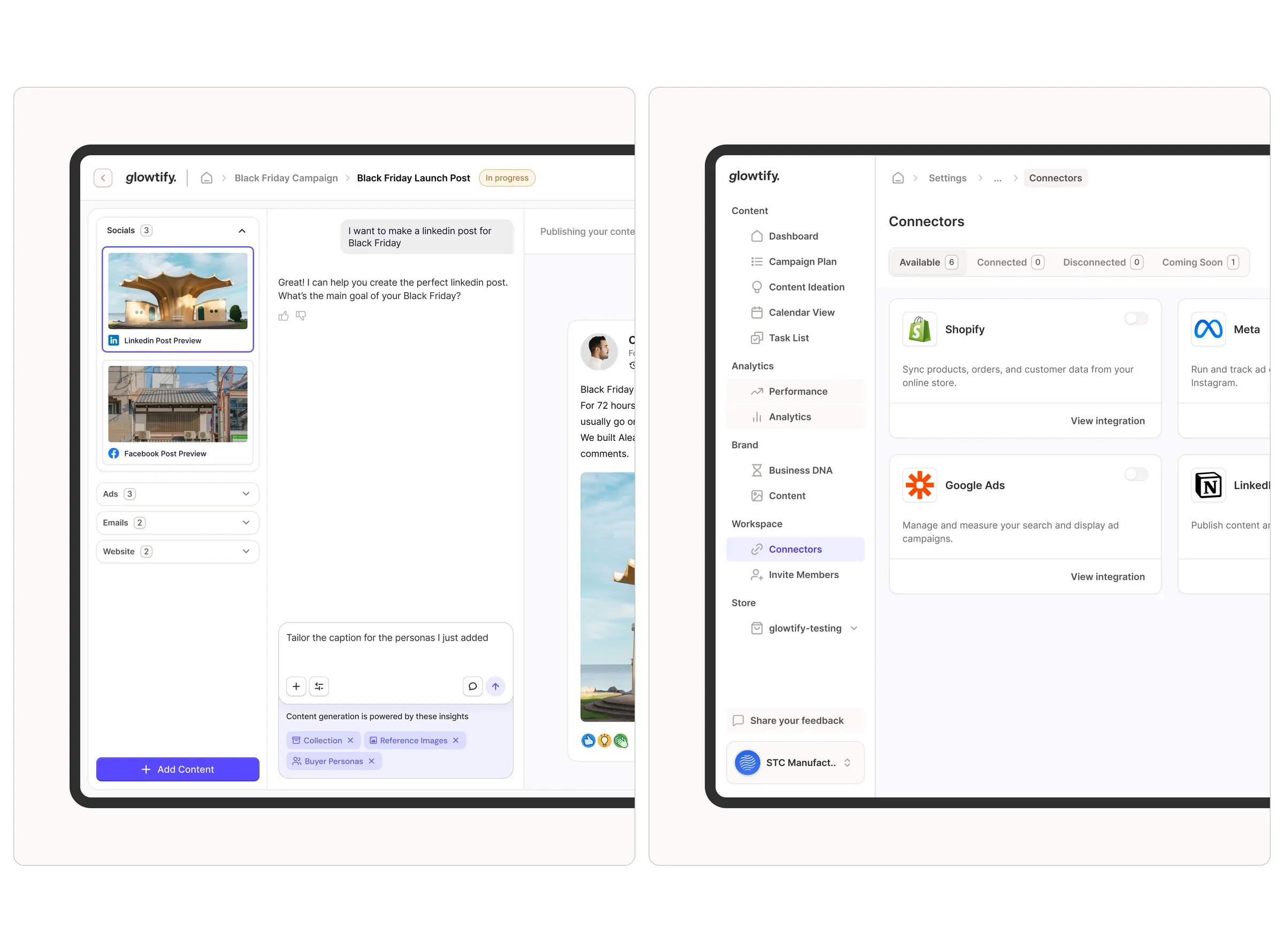
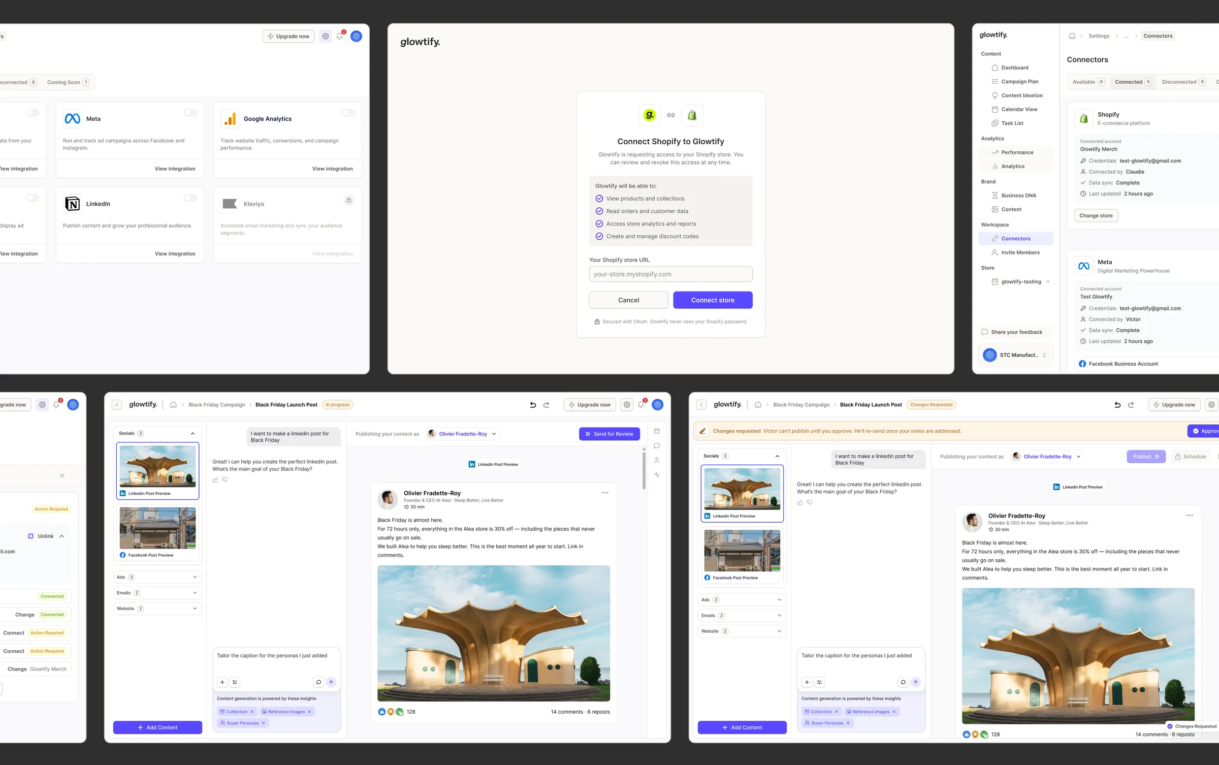
We approached the redesign from both a UX and a design system perspective. Rather than repainting the interface, we rebuilt the foundation: a scalable component library, better navigation patterns and simpler user journeys, with the original functionality intact.
The goals were a modern design system, documented workflows turned into intuitive experiences, a clearer information architecture, consistency across screens, less cognitive load and a product ready to scale.
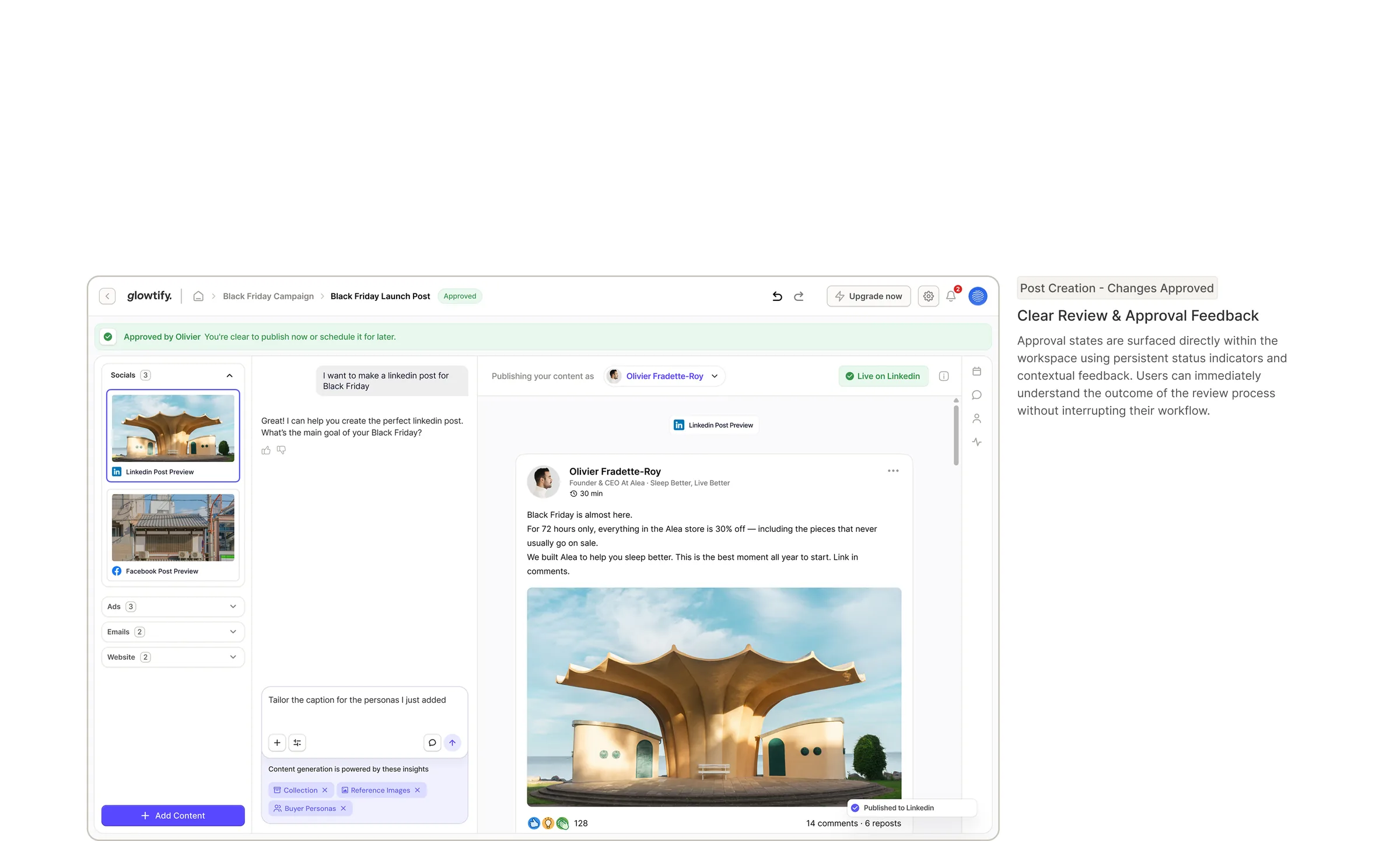
The work ran in four steps: discovery of the legacy interfaces and documentation, UX mapping of the existing flows, a UI redesign on the new design system, and review and handoff with client feedback. Each interaction in the approval workflow was redesigned for clarity, with clearer status visibility, defined Sender and Reviewer roles, consistent decision points and one interaction model for confirmations and approvals.
Want results like this?
Book a free 30 minute strategy call with Dom, or get a free audit of your product first.