What the first win is
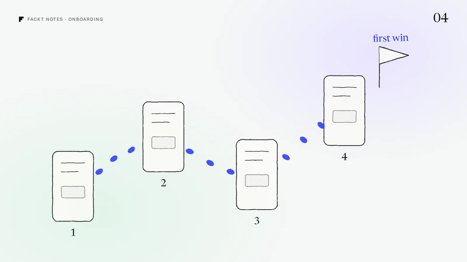
The first win is the moment a new user gets something real out of your product for the first time. Not a finished tour or a completed profile: an actual result. Their first report, their first connected data source, their first published page, their first invoice sent.
It matters because that is where people decide to stay. Before it, your product is a promise. After it, it is a tool they have used. Good onboarding has one job: get people to that moment as fast as possible, and make sure they notice it when it happens.
So start by writing it down in one sentence: “A new user has won when they ___.” If the team cannot agree on that sentence, no amount of onboarding design will fix it.
Count the steps before it
Sign up as a new user and count every screen, field and decision between “Create account” and the first win. Most teams are surprised by the number.
Then go through the list and ask one question for each step: is this needed for the first win? Company size, job title, team invites, notification settings, a profile photo, a product tour. Most of these can wait. Ask for them later, at the moment they become useful, or let people skip them.
A few common cuts:
- Ask fewer questions at signup. Every extra field is a reason to leave before you have shown any value.
- Use sample data. If the first win needs data the user does not have yet, give them a realistic example to play with, so they see the result before they do the work.
- Delay invites. Inviting the team is a great second step and a bad first one. People invite others after they have seen something worth sharing.
One clear first action
When a new user lands in the product for the first time, there should be one obvious thing to do. Not a dashboard full of options, not five cards of equal weight, but one primary action that leads toward the first win.
Pick it by working backwards from the first win: what is the single action that starts the path? Make that the biggest, clearest thing on the screen, and make everything else quieter. A checklist can help when the first win takes a few steps, as long as it is short and every item moves the user forward.
Empty states that teach
The first screen a new user sees is usually empty. That empty screen is not a gap to fill with a sad illustration: it is the best onboarding space you have.
A good empty state does three things. It says what will appear here once there is data. It shows the one action that makes it appear. And it sets an expectation, like “Connect your store and your first sales show up here in a few minutes.”
For Communi, a platform for creators to run their community, courses and payments in one place, we designed the onboarding states as actions rather than explanations, so each empty screen points to the next useful step. You can see them in the Communi case study.
Make the win visible
When the first win happens, say so. A short confirmation, a clear before and after, a number that just moved. Many products quietly complete the most important moment in the whole journey and move on.
Then point to the next win. The best onboarding does not end with a “You are all set” screen: it ends with the user already doing the second useful thing.
A quick check for your product
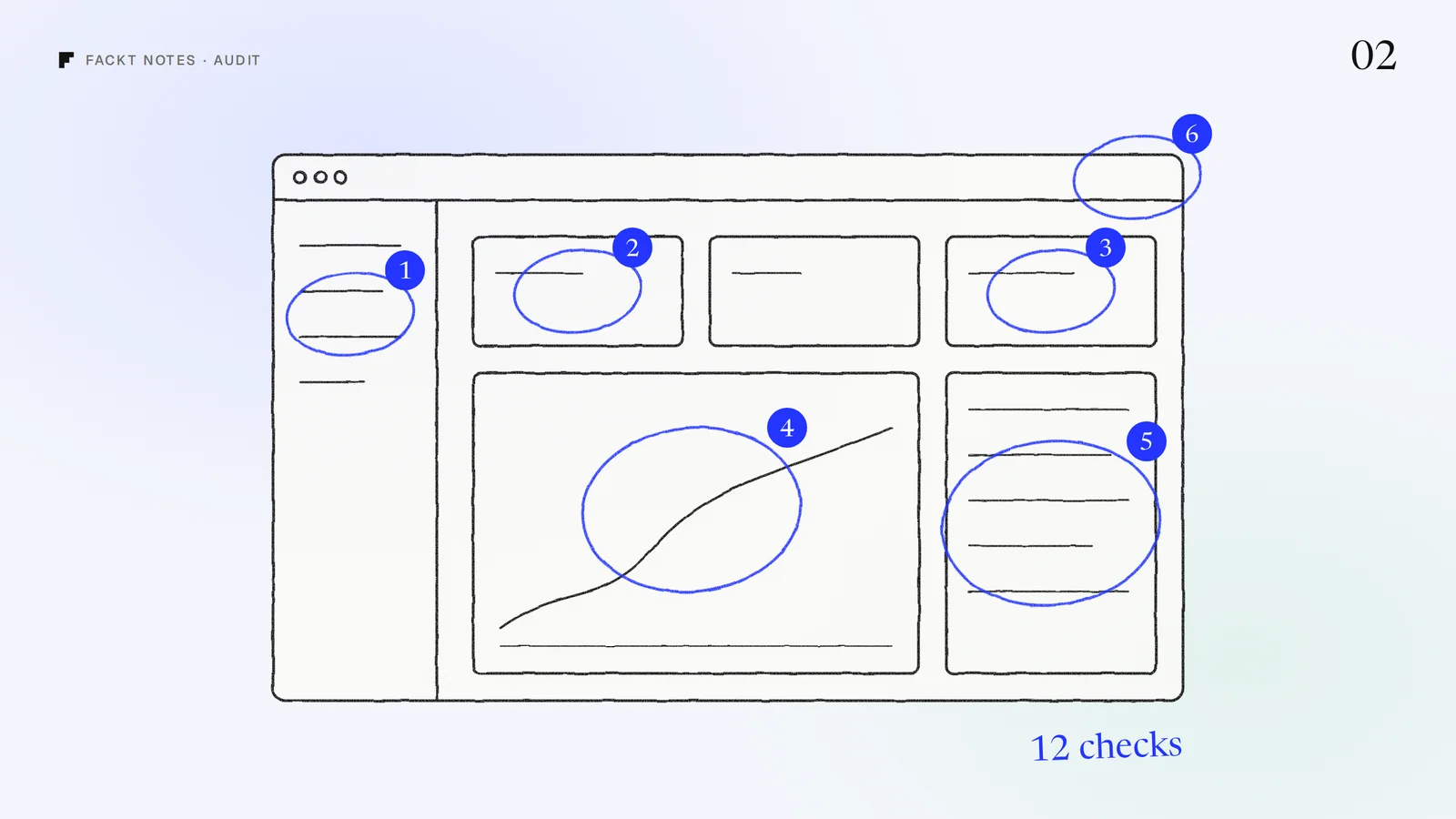
Open your product in a private window and sign up as someone new. Time how long it takes to reach the first win, count the steps, and note every moment you hesitated. That list is your onboarding roadmap.
If you would like fresh eyes on it, we review onboarding as part of the free audit: a video walkthrough and a written list of fixes, within 2 days.
 Case studyCommuni: Product designAll-in-one community platform for creators, designed end to end from the desktop command center to a native mobile app.