The question behind the question
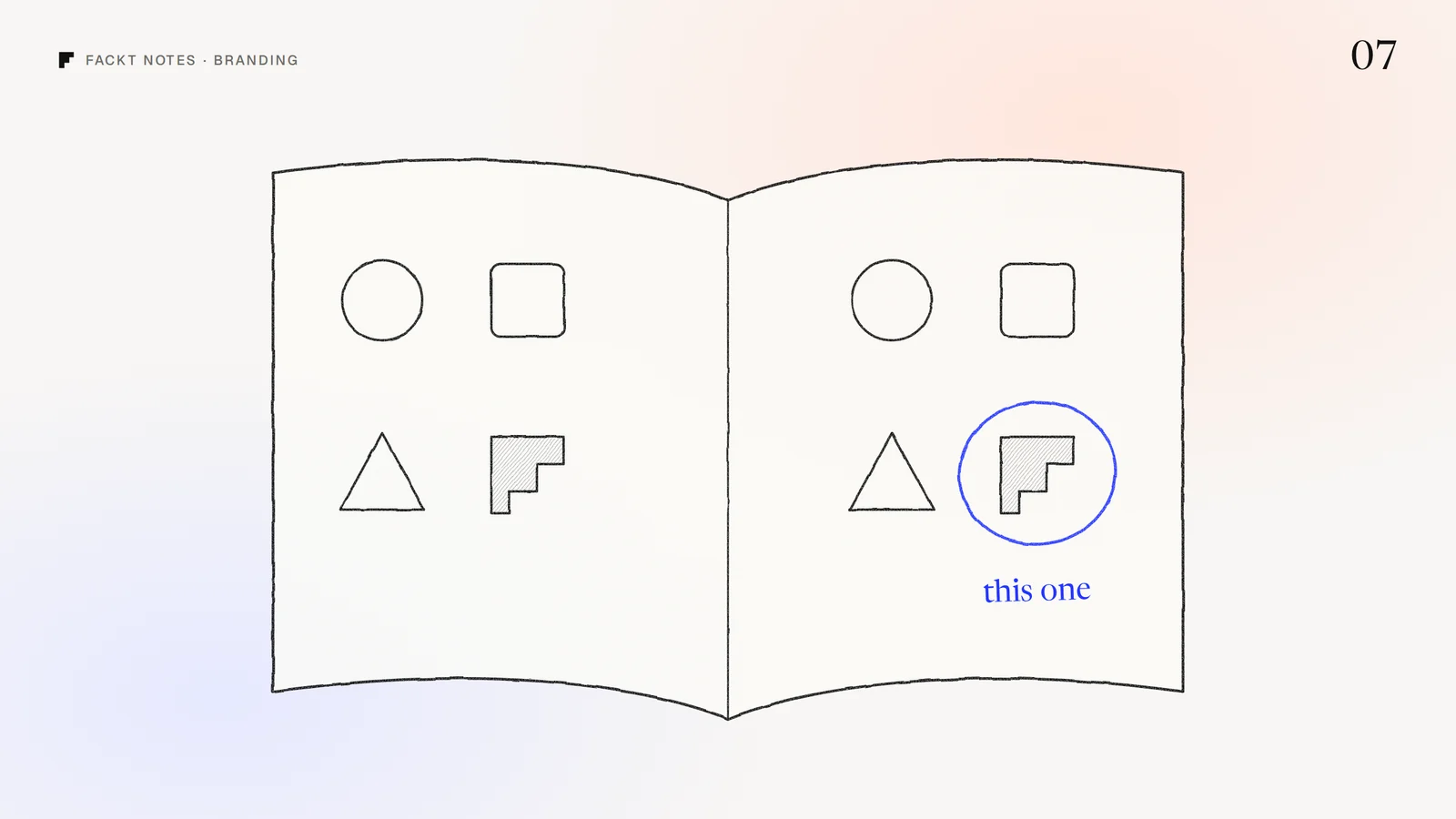
Early founders usually ask “do we need a brand?” when they mean something more practical: will people trust us, remember us, and understand what we do? Before Series A, those three things matter more than a thick guidelines document. The goal is not a finished brand. It is a small, consistent core that makes the product look credible today and does not need to be thrown away tomorrow.
Before Series A, consistency beats creativity. A simple brand used the same way everywhere builds more trust than a brilliant one that looks different on the site, the product and the pitch deck.
What early teams actually need
A name and a wordmark that work small
Most people will meet your brand as a tiny icon: a browser tab, an app icon, a Slack integration, a logo in a row of customer logos. Make sure the mark is readable at 16 pixels and works in one color. A simple wordmark set in a good typeface beats a complex symbol that falls apart when it shrinks.
A small color and type system
Two or three colors with clear jobs (a background, a text color, one accent) and one or two typefaces. That is enough to make the product, the website and a pitch deck look like they come from the same company. Write the hex codes and font names down where the whole team can find them.
One sentence that says what you do
Branding is not only visual. Agree on one plain sentence that describes what the product does and for whom, and use it everywhere: the landing page headline, the app store listing, the founder’s bio, the sales deck. Consistent words build recognition faster than any logo.
A product that looks like the brand
For a SaaS company, the product is the brand most customers spend time with. If the marketing site looks polished and the app looks like a different company built it, trust drops. Use the same colors, type and tone in the interface, even if the design system is still small.
What can wait
- A full brand book. A one-page reference with the logo, colors, type and a few do’s and don’ts is enough for a small team.
- Custom illustration and 3D. Lovely, expensive, and hard to keep consistent while the product is still changing every week.
- Brand campaigns and merch. Spend that budget on getting the product in front of the right people first.
- A big rename or rebrand. Unless the current name causes real confusion or legal trouble, keep shipping and revisit once you know who buys and why.
When to invest properly
A few signals that it is time for a full identity:
- The market got crowded. Competitors look and sound the same, and you need to be remembered, not just understood.
- You are raising or selling upmarket. Investors and larger customers judge credibility quickly, and a coherent brand removes doubt.
- Your look has drifted. The product, website, deck and social posts no longer feel like one company.
- You are about to spend on marketing. Ads, launches and events multiply whatever brand you have, so make it a good one first.
Stand out by leaving the category look behind
When you do invest, the biggest lever is refusing to look like everyone else in your category. For Nation, an AI platform for launching an online store, we moved away from the usual SaaS visuals (gradients, glowing orbs and predictable layouts) toward a warm, textured, editorial identity inspired by screenprinted posters, built around an open doorway symbol. See it in the Nation case study.
Two tests you can run today
- The 16 pixel test. Shrink your logo to favicon size next to five competitors in a browser tab bar. Can you still tell which one is yours?
- The one sentence test. Ask three people on your team to write what the company does in one sentence, without looking. If you get three different answers, your brand problem is words, not visuals.
What is hard to see from the inside
Founders live with their brand every day, so they stop seeing it the way a first-time visitor does. An outside look often finds the gap in minutes: the logo that disappears at small sizes, the product that does not match the site, the sentence nobody agrees on.
When we built the identity for Floxy, a proxy infrastructure platform, the goal was a mark and system that felt precise and technical without falling back on the usual cybersecurity cliches, and that carried across web, mobile and print. You can see it in the Floxy brand case study.
If you are not sure what your brand needs right now, the free audit covers how your product and website come across to a first-time visitor, within 2 days.
Quick answers
Do I need a brand identity before Series A?
You need a small, consistent core: a clear name and wordmark, a simple color and type system, and one sentence that says what you do. A full identity with guidelines, campaigns and illustration can usually wait until you know who buys and why.
What is the minimum brand a seed-stage SaaS needs?
A logo that works small, two or three colors, one or two typefaces, a product UI that uses them consistently, and a landing page that explains the product in plain words.
When should a startup invest in a full brand identity?
When the market gets crowded and you need to stand out, when you are raising or selling to larger customers who judge credibility, when your look has drifted across product, site and sales decks, or when you are about to spend real money on marketing.
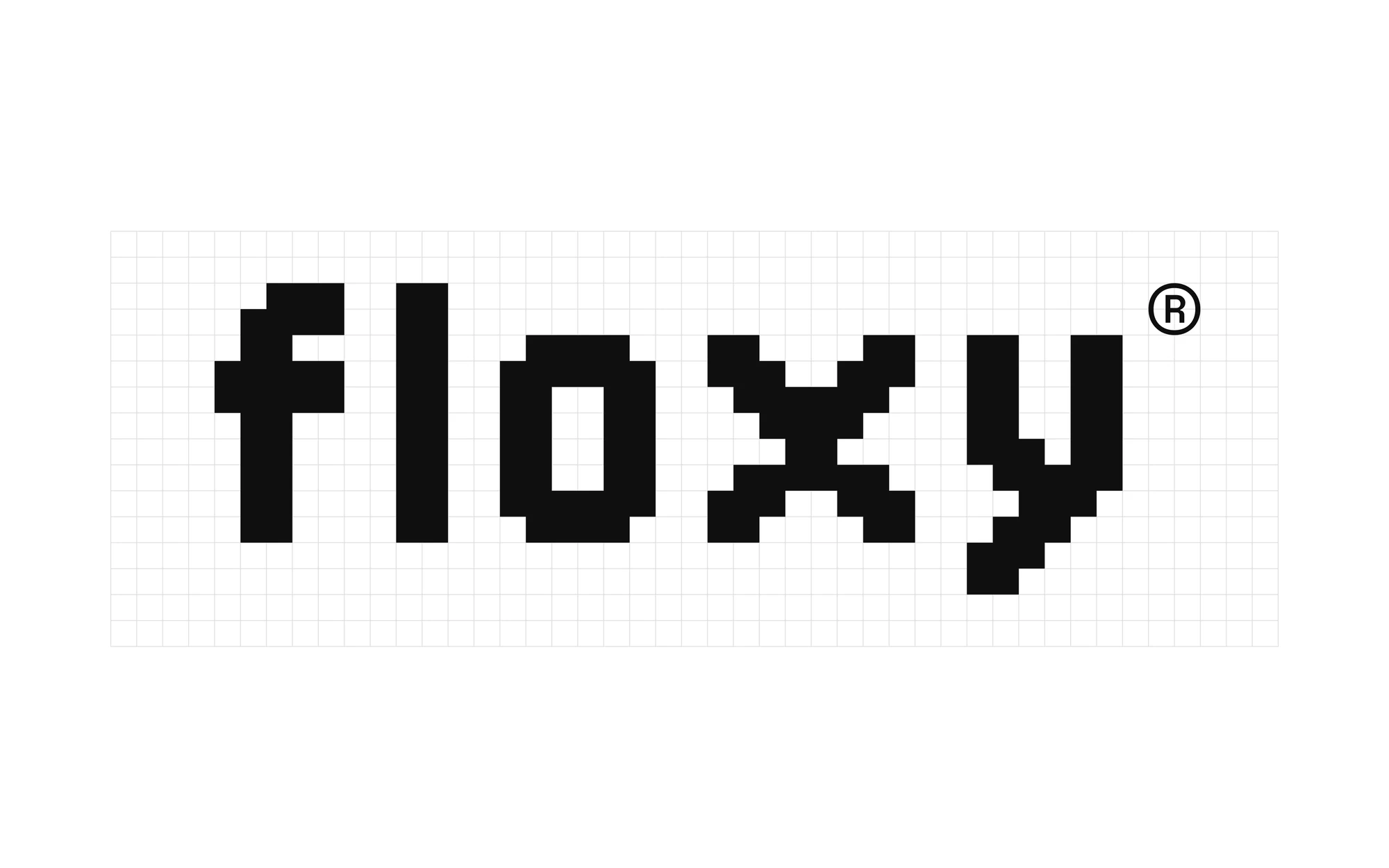 Case studyFloxy: Brand identityA pixel-built identity for a proxy infrastructure platform that communicates speed, trust and digital freedom without cybersecurity cliches.