The job of the first screen
The first screen of a SaaS landing page has one job: help the right visitor decide that scrolling is worth it. Not to explain every feature, not to tell the company story, and not to win the deal on its own. Just to answer the questions people silently ask in the first few seconds: what is this, is it for me, and why should I believe it?
If those three answers are clear, people scroll and read. If they are not, they leave, and nothing further down the page gets a chance.
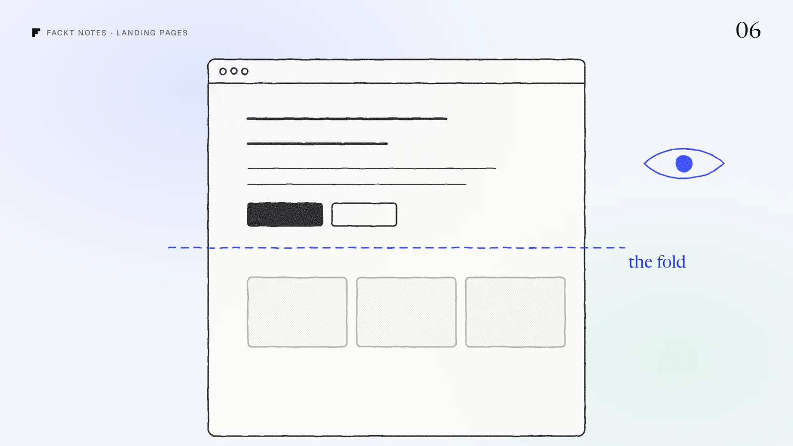
What goes above the fold
1. A headline that says what the product does
Lead with the outcome, in plain words. “Run every influencer campaign in one place” beats “The future of creator marketing”. A good test: could a stranger repeat what your product does after reading only the headline? If the headline needs the subheading to make sense, it is too clever.
2. A subheading that says who it is for
One or two sentences that name the audience and how the product gets them the outcome. This is where the visitor recognizes themselves: “For marketing teams who manage creators across Instagram and TikTok.” When people see their own situation described, they keep reading.
3. One primary action
Pick the single next step you want, like “Start free trial” or “Book a demo”, and make it the most visible button on the screen. A quieter secondary action is fine (“See how it works”), but two equally loud buttons split attention, and five links in a row make visitors choose before they understand.
4. The product itself
Show real product UI, not an abstract illustration. A clear screenshot or a short loop of the core workflow does more than any sentence to show that the product exists, works, and looks like something worth paying for. Crop it so the important part is readable, even on a phone.
5. A small piece of proof
A row of customer logos, a short quote from a real customer, a rating, or a number you can stand behind. One strong signal near the action is enough. It answers “why should I believe this?” before the visitor has to ask.
What can wait
Founders often try to fit the whole pitch into the first screen. These usually work better further down:
- Feature lists. Give each important feature its own section, with a screenshot, below the fold.
- Pricing details. A short “free trial” or “from $X a month” near the button can help; the full table belongs lower.
- Company story and mission. It matters, but after people understand what the product does for them.
- Every integration logo. Show the few your audience cares about, later on the page.
- Long animations before the content appears. If the headline arrives after a delay, many visitors never see it.
Check it on a phone
Most first visits from social media happen on a phone, where “above the fold” is much smaller. Open your landing page on a phone and look at the first screen only. The headline, the main button and at least a hint of the product should be visible without scrolling. If the button sits below an oversized hero image, people may never see it.
A five second test you can run today
Show your first screen to someone who has never seen the product for five seconds, then close it and ask: what does it do, who is it for, and what would you click? If they cannot answer all three, the first screen needs work, and no amount of content further down will fix it.
When we designed the landing page for Story-Story, an influencer marketing platform, we put real product UI at the center of the story and gave each of its four jobs its own color, so visitors understand what the platform does before they read the details. You can see it in the Story-Story case study.
If you would like a second pair of eyes on your landing page, it is part of the free audit: a video walkthrough and a written list of fixes, within 2 days.
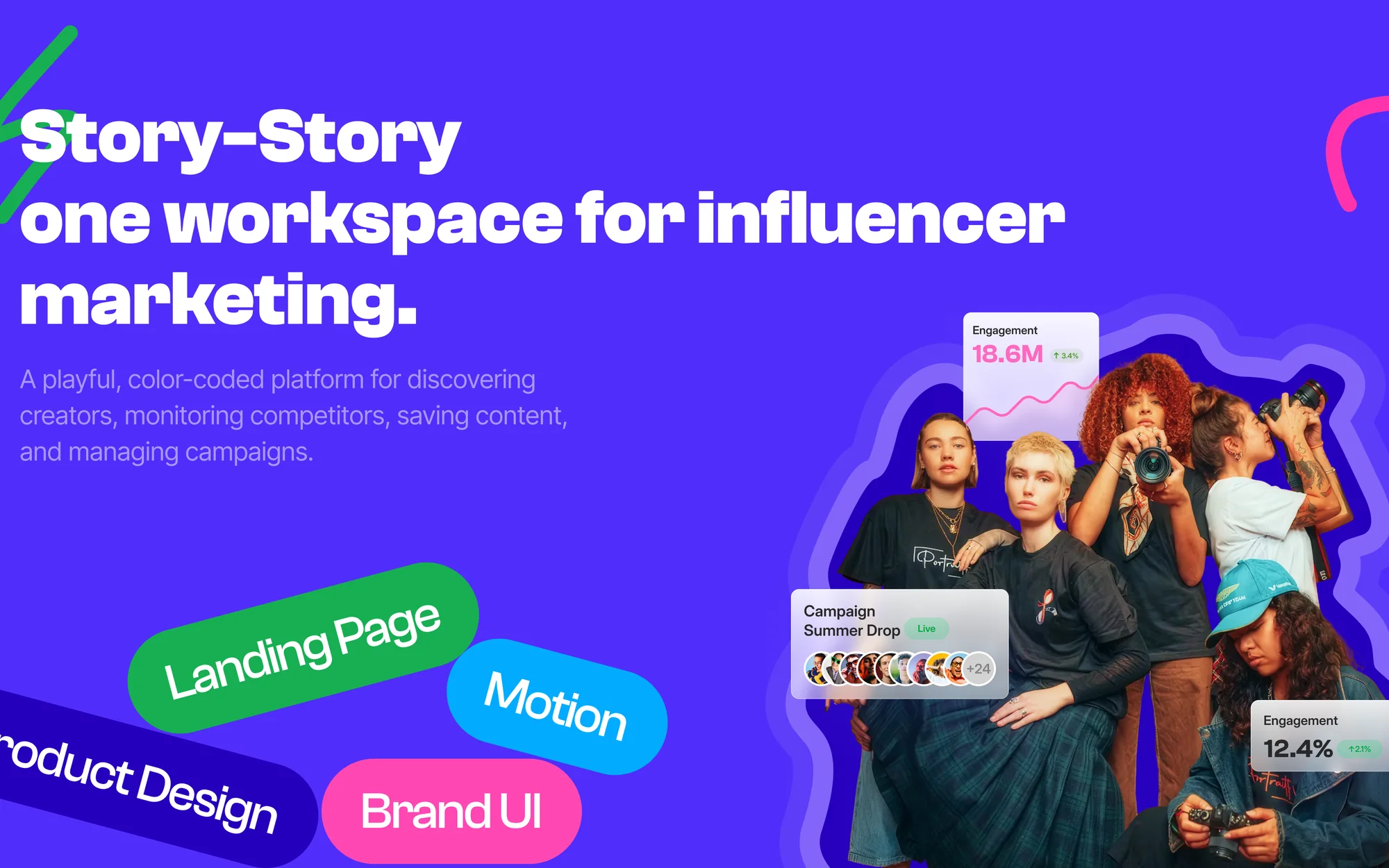 Case studyStory-Story: Web design and brandingA color-coded landing page and brand UI for an influencer marketing platform that brings discovery, monitoring, saved content and campaigns into one workspace.