SaaS dashboard design
For SaaS teams whose dashboard shows data instead of answers. We redesign it so users find the one number they came for, in seconds.
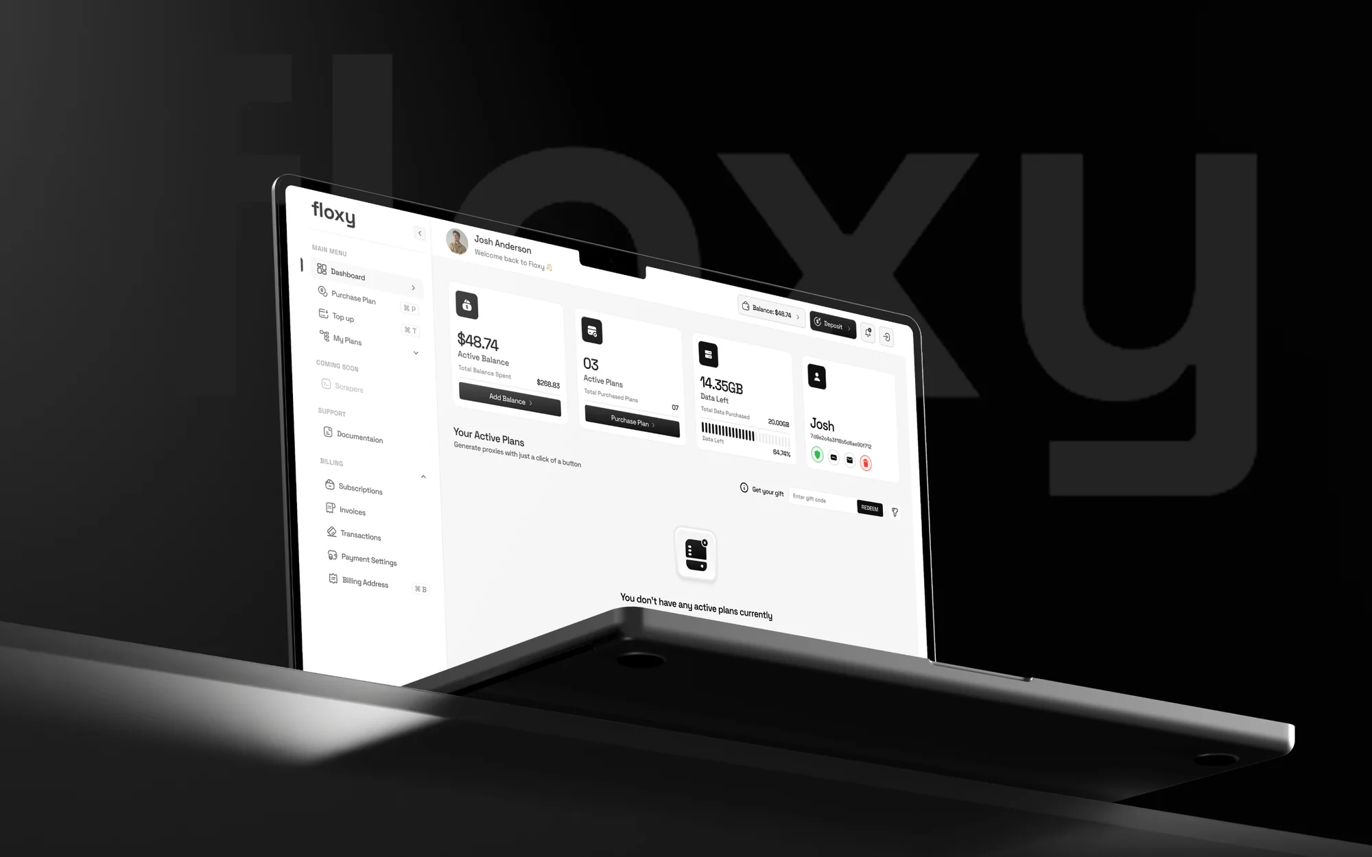 Floxy, proxy dashboardView case study →





Three reasons dashboards lose users
We see the same three in almost every audit.
Everything has the same weight Every card is the same size, so nothing stands out. We make the number people came for the biggest thing on the screen.
Numbers without context Is 2,340 good or bad? We add the change since last week and the limit, so a number becomes an answer.
An empty first screen New accounts see a wall of zeros. We design the empty state that explains what appears here and gives one first action.
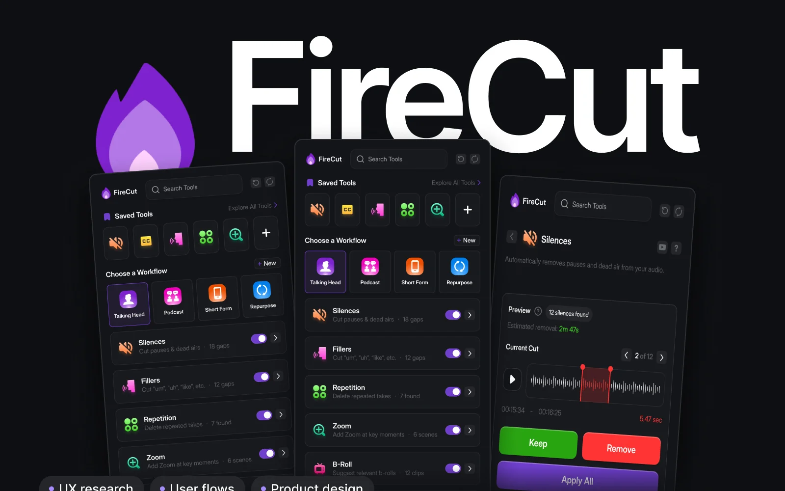
Recent dashboard work

From call to handoff in 2 to 6 weeks
- Week 0A 30 minute callWe find the one screen that matters most.
- Week 1Audit and flowsThe 12 checks, ranked by impact.
- Week 2 to 3First screensReal screens to react to, early.
- Week 4 to 6Full design and handoffStates, specs and files to build from.
Dashboard redesigns from $5,000A fixed project. Ongoing design is $6,900 a month, pause any time.
Book a 30 minute call SaaS dashboard design, answered
How much does a SaaS dashboard redesign cost?
Most dashboard redesigns are a fixed project from $5,000, done in 2 to 6 weeks. Ongoing design is $6,900 a month.
Do you work with our existing design system?
Yes. We extend what you have, or set up a small system as part of the project.
Can you start with an audit?
Yes. Send your product and within 2 days you get a video walkthrough and a written list of fixes, ordered by impact.
Will our developers be able to build it?
You get organised Figma files with specs and states, ready to build from.
The SaaS dashboard audit: 12 things we check firstRun it on your own product in an afternoon.
Read the note Let's look at your dashboard together.
30 minutes with Dom. You leave with clear next steps, whether we work together or not.