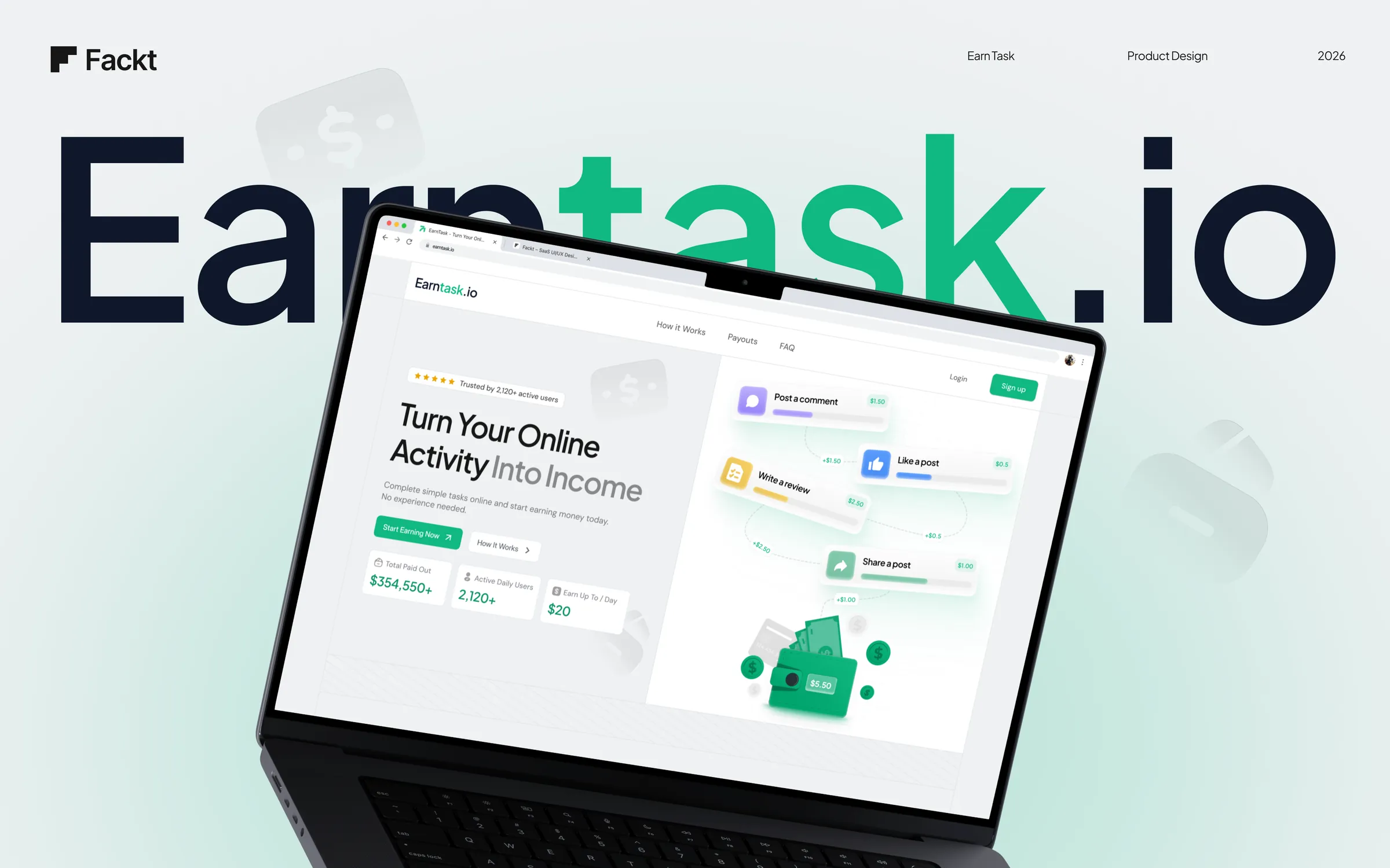
EarnTask
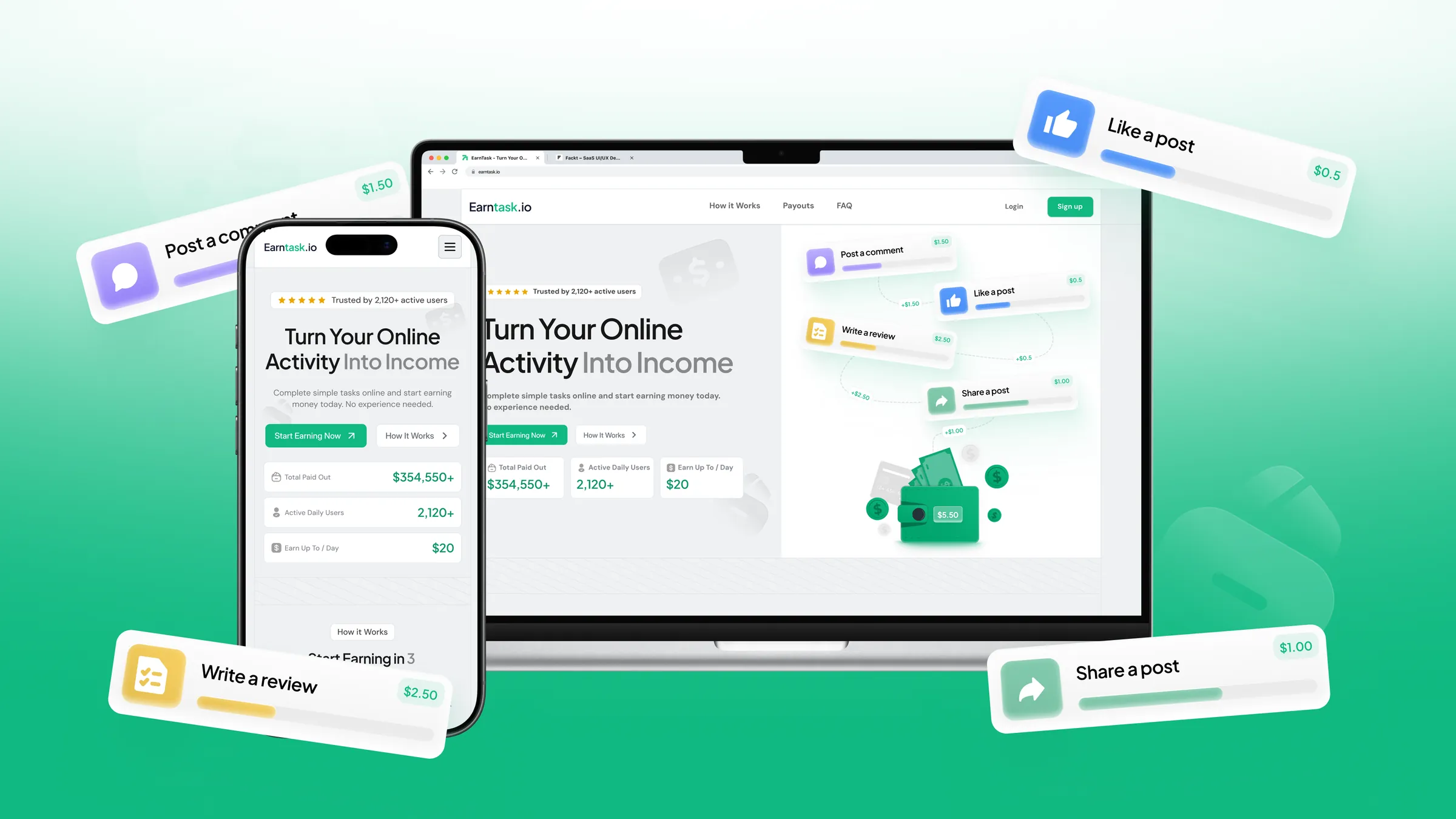
A landing page that makes paid social-media tasks feel approachable, transparent and easy to understand, designed in two weeks.
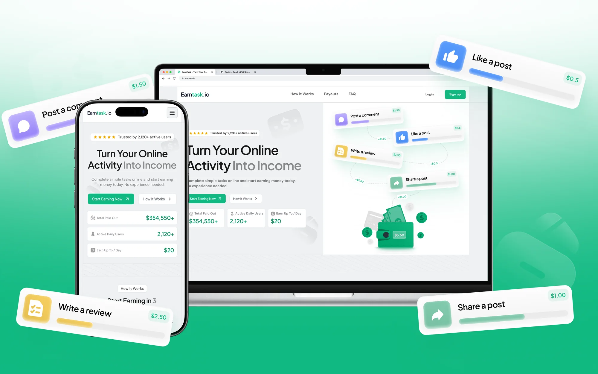
Paid tasks people can trust
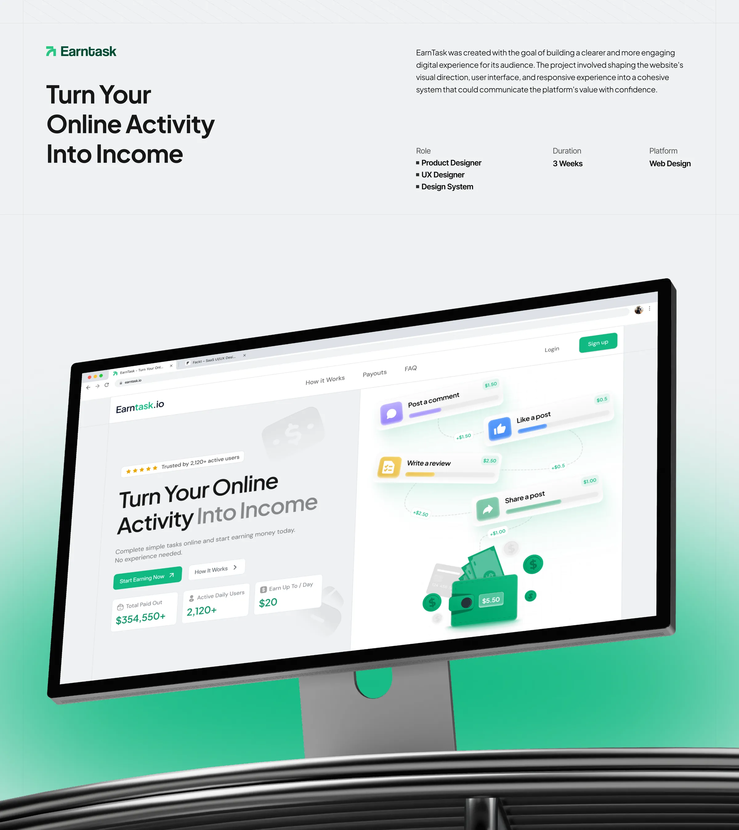
EarnTask set out to build a clearer, more engaging digital experience for its audience. The brief was a landing page that makes paid social-media tasks feel approachable, transparent and easy to understand.
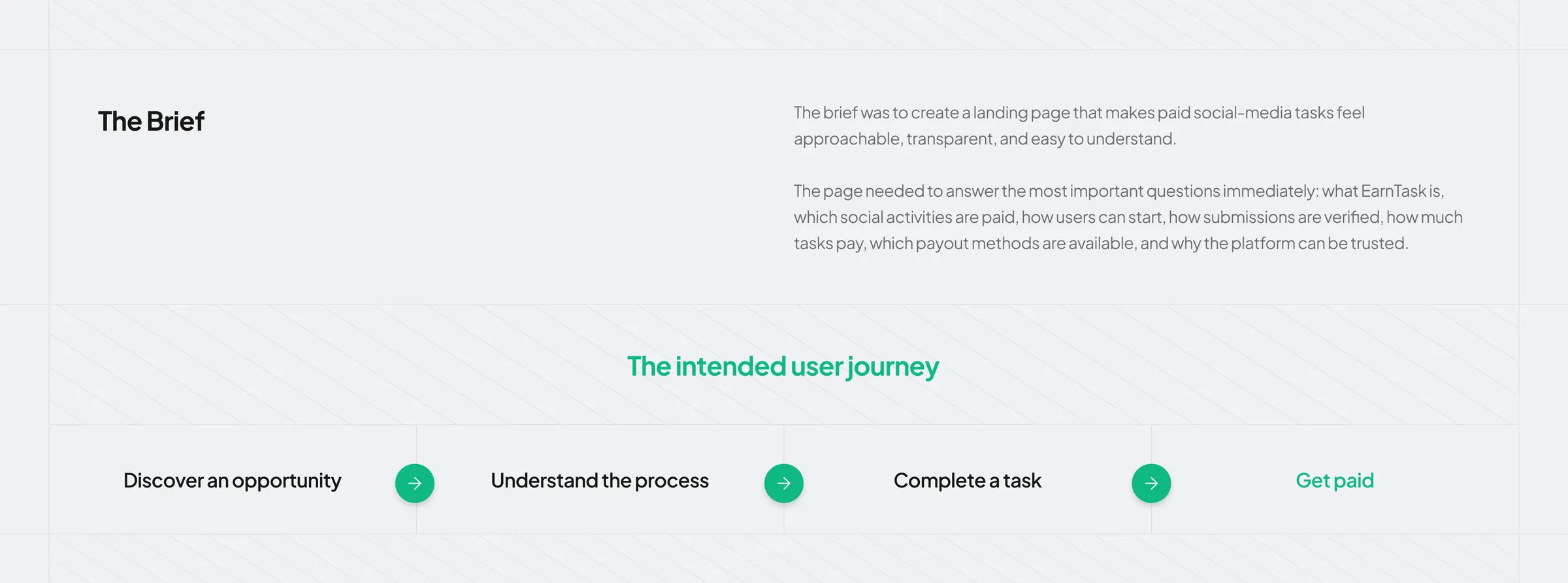
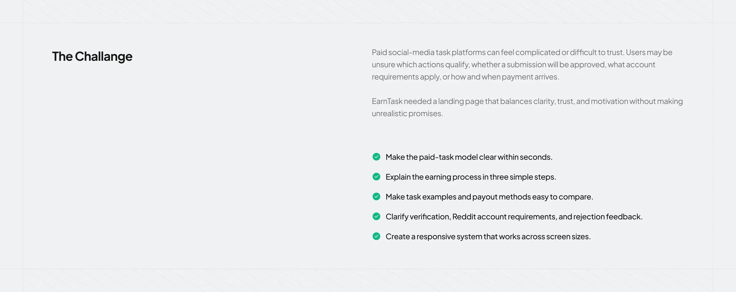
Paid social-media task platforms can feel complicated or hard to trust. Users may be unsure which actions qualify, whether a submission will be approved, what account requirements apply, or how and when payment arrives. The page had to answer the important questions immediately (what EarnTask is, which activities are paid, how to start, how submissions are verified, how much tasks pay, which payout methods exist and why the platform can be trusted) while balancing clarity, trust and motivation without unrealistic promises.
Clear in seconds, credible all the way down
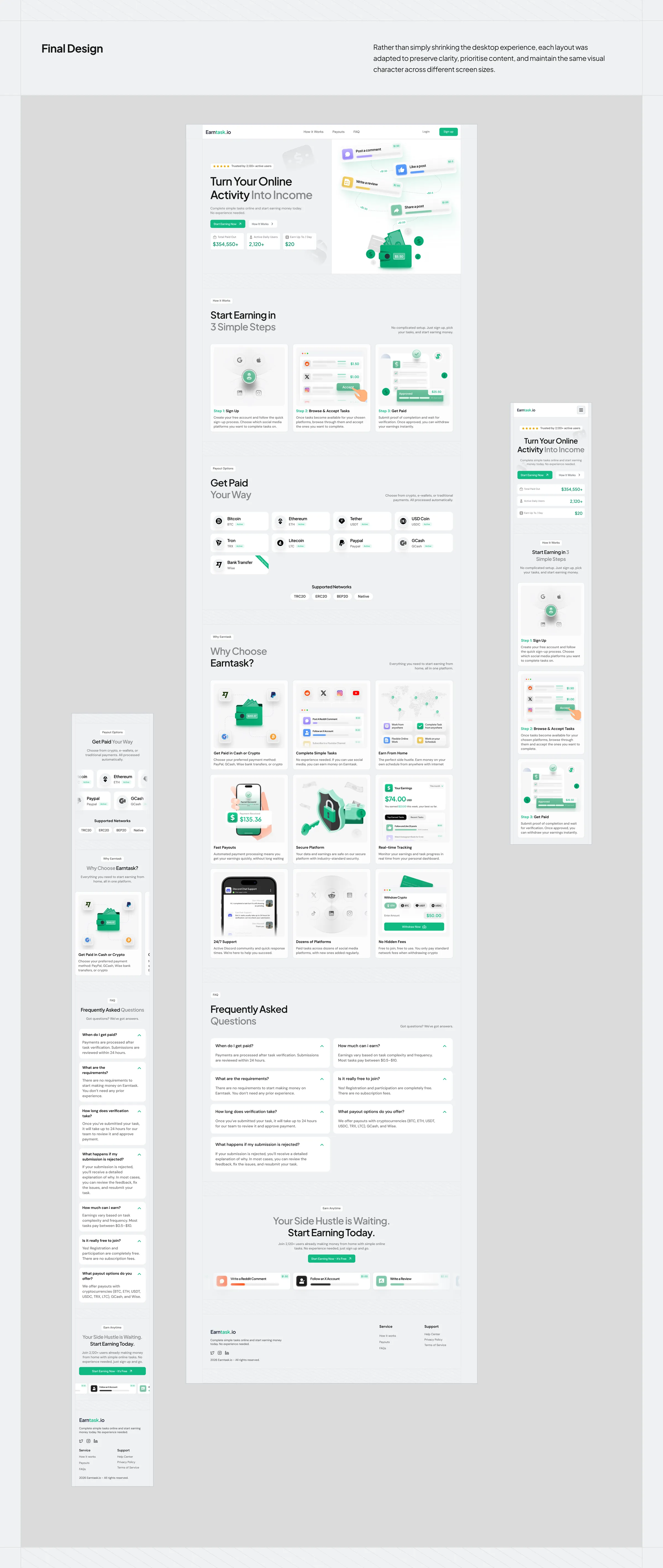
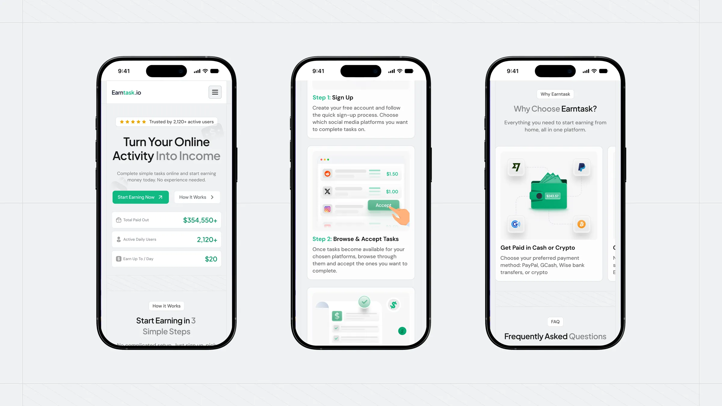
The goals: make the paid-task model clear within seconds, explain the earning process in three simple steps, make task examples and payout methods easy to compare, clarify verification, account requirements and rejection feedback, and build a responsive system that works across screen sizes.
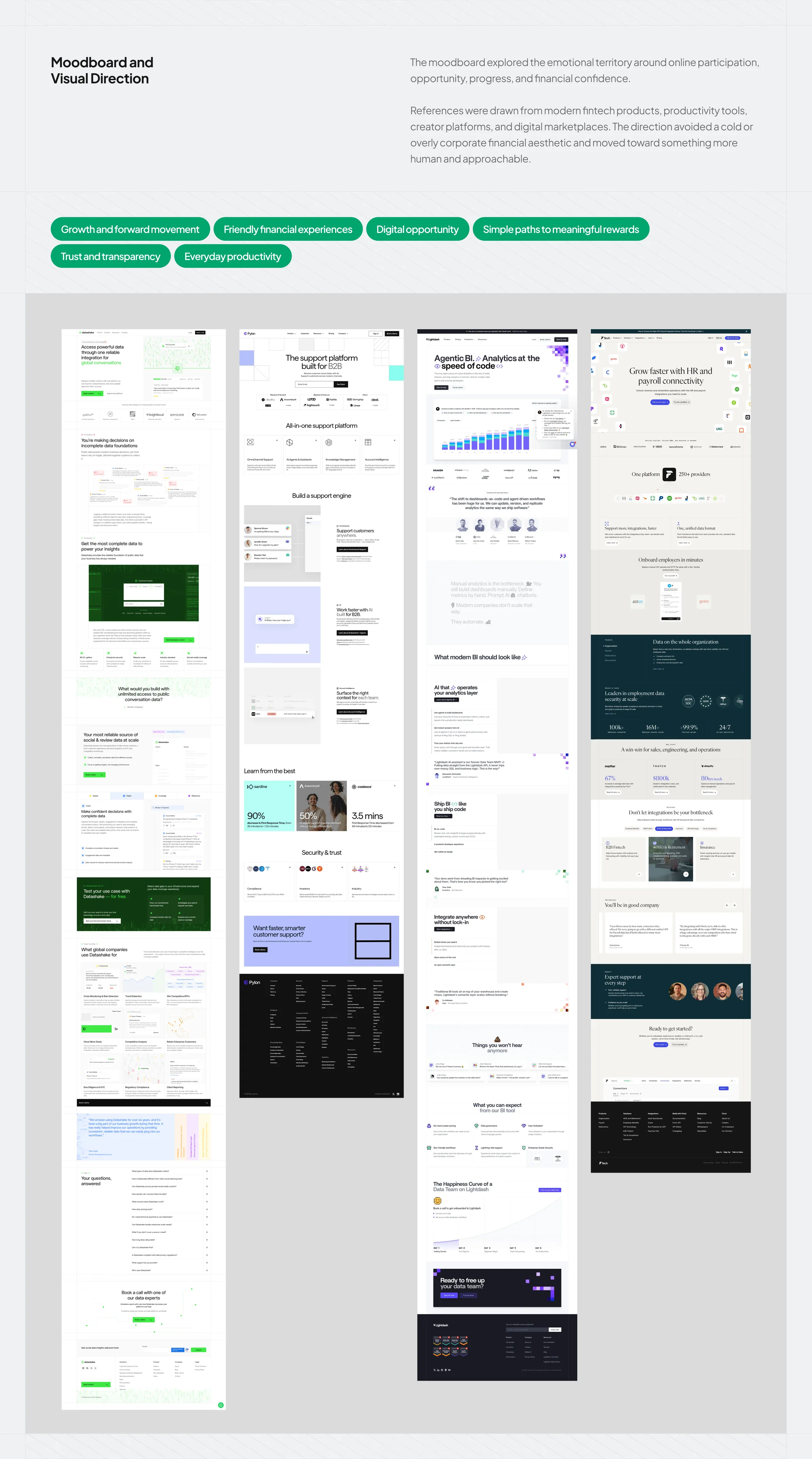
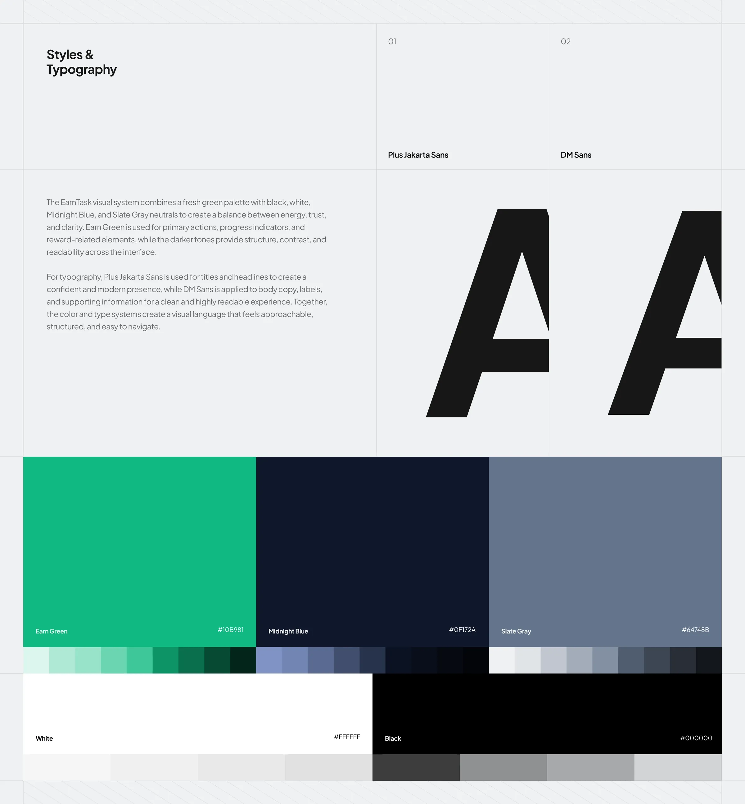
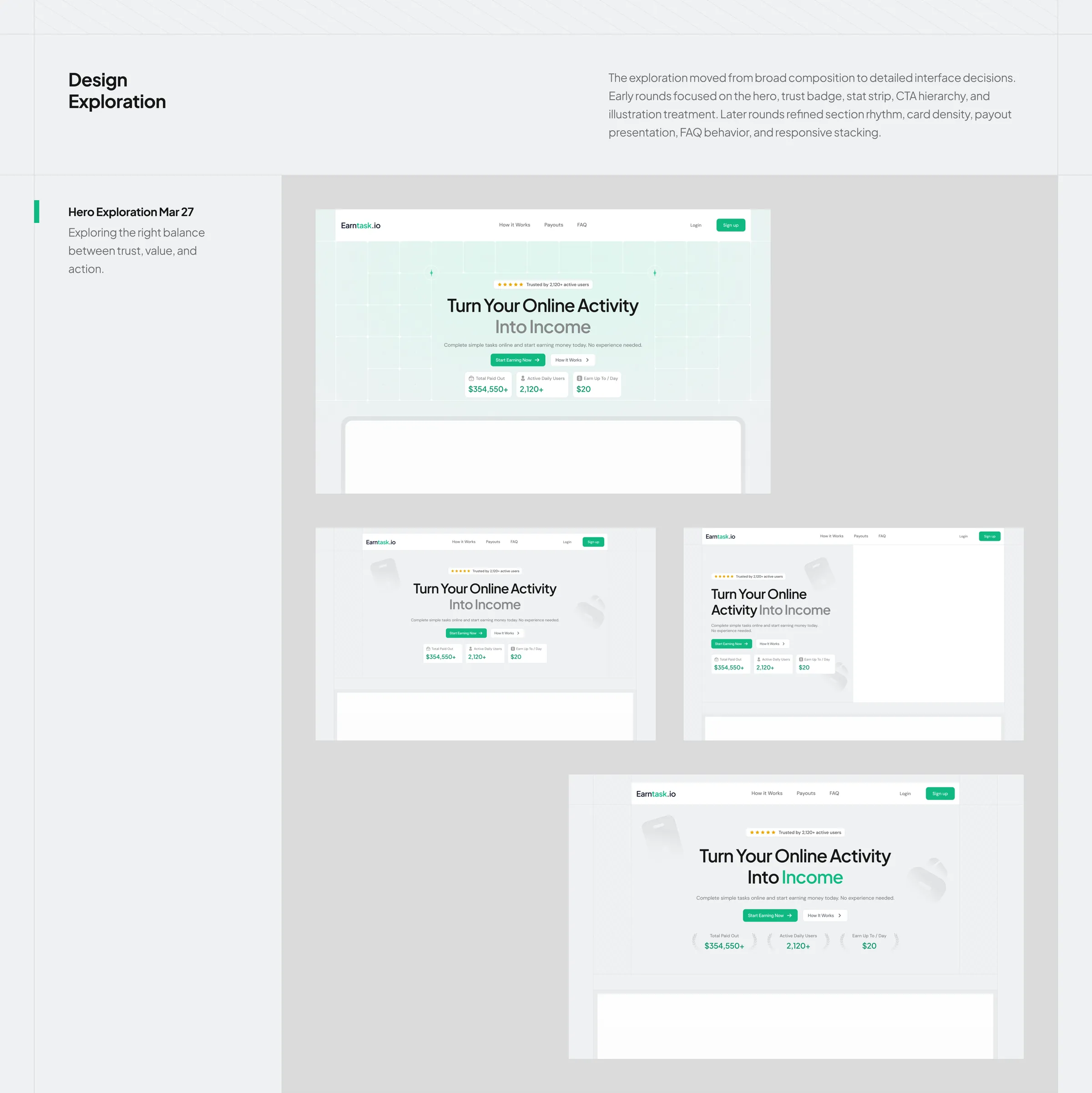
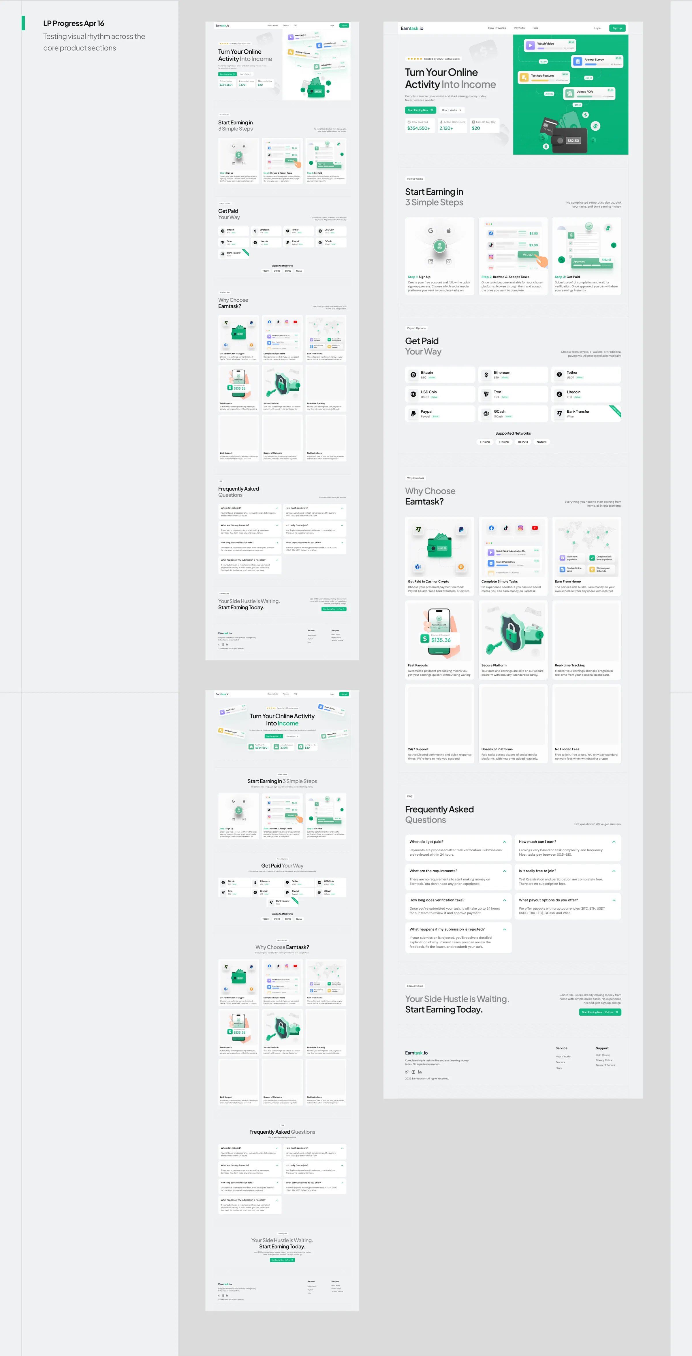
The work moved from the brief to a moodboard built around growth, friendly financial experiences and digital opportunity, then visual direction, UI exploration and the final responsive design. Plus Jakarta Sans and DM Sans carry the type, with a fresh green palette over Midnight Blue and Slate Gray, so the page feels confident without the coldness of a corporate finance product.
Want results like this?
Book a free 30 minute strategy call with Dom, or get a free audit of your product first.