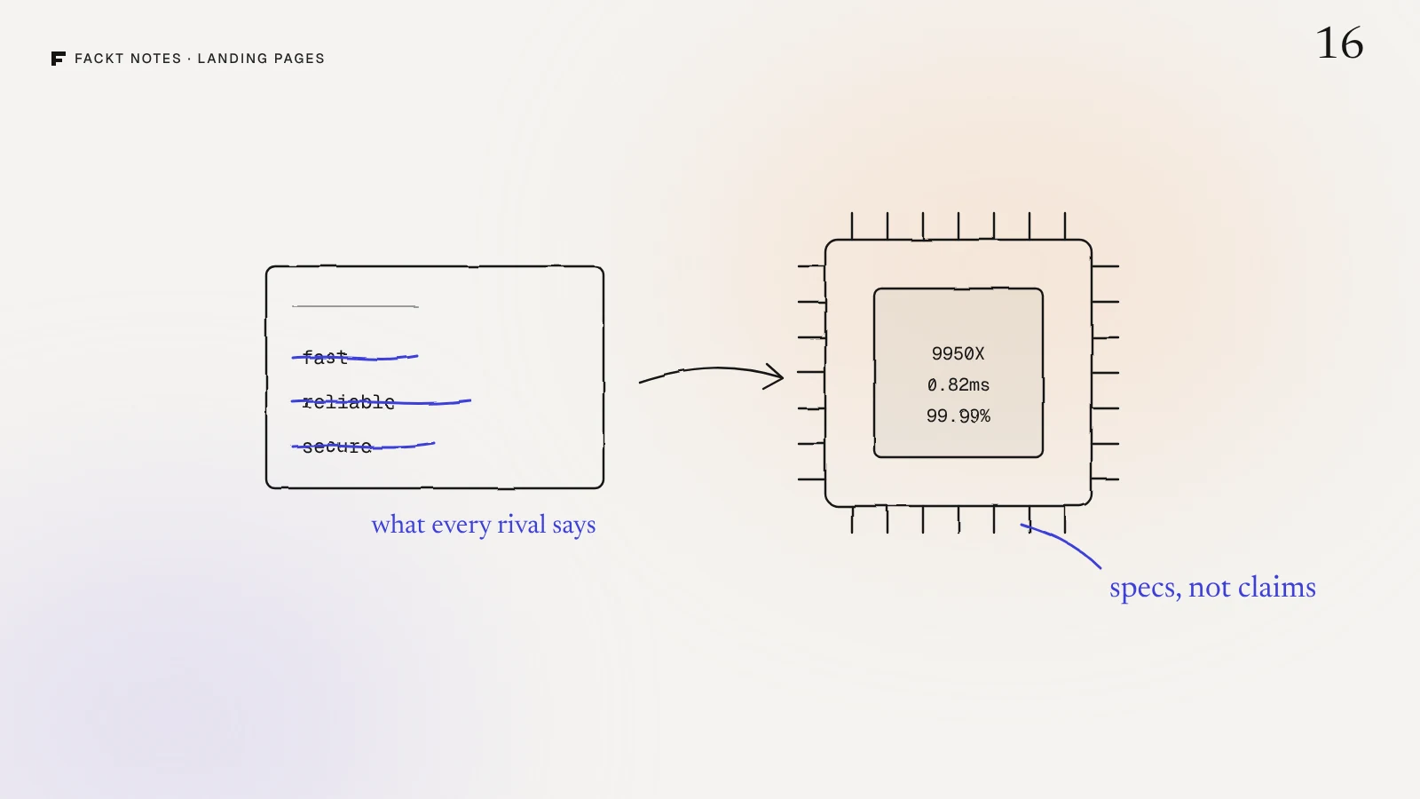
Every trading VPS page we looked at said the same three things. Fast. Reliable. Secure. TradoxVPS rents trading servers to people who move money for a living, and those people have read those words on every competitor’s page. They trust none of them.
TradoxVPS asked us to redesign its landing page. The new page leads with the one thing rivals could not claim, turns every adjective into a spec, and after it went live, the conversion rate tripled. Here is what changed, and how the same idea applies to any technical product.
The problem: claims everyone can make
The old page was technical, generic and hard to trust. The specs were there, but buried and hard to read. The layout did not guide anyone toward signing up. And traders are a skeptical crowd: without proof, they assume the worst.
The real issue was not the visuals. It was that the page made the same promises as everyone else, so there was no reason to choose it.
Find the thing only you can say
When we lined TradoxVPS up against five other providers, one difference stood out. Tradox was the only one running the AMD Ryzen 9 9950X. Every rival promised speed. Tradox could point at the hardware that delivers it.
So the chip became the hero, the proof and the thread through the whole page. The hero is drawn around the Ryzen chip, with two circuit traces framing the headline and a Radeon and a DDR module on the wire. It is built from five separate layers so it can move: every few seconds a blue pulse leaves the chip, lights each module and meets itself at the top.
Most products have a thing like this. A hosting company has its hardware or its network. A devtool has the one moment it exists for, like the spike and the deploy that caused it. An API has a latency number. The question to ask is simple: what can we show that a competitor cannot copy by changing a word?
Three directions in one day
Round one was three full page directions, designed in one day:
- A circuit loop around the headline.
- A left aligned layout with the hardware on the side.
- An isometric board.
Each one was a complete page, not just a header. Choosing on the full scroll matters: a hero can look great on its own and fall apart once the pricing and proof sections follow it.
Round two: every claim became a spec
The chosen direction then went through a second round, where the copy changed as much as the design.
- Claims became numbers. Fast became Ryzen 9 9950X at 4.3 to 5.7GHz. Low latency became 0.82ms average latency. Reliable became 99.99% uptime.
- Empty cards became hardware. The how it works section had generic icon cards. They became isometric renders of the chip, the board and the terminal, so each step shows something real.
- The last call to action became a decision point. The closing section turned into a framed card with a second button for pricing, for people who were convinced but still comparing.
A number does something an adjective cannot: it can be checked. A trader who sees 0.82ms knows what it means for their fills. A trader who reads ultra fast has learned to skip it.
Make comparing easy
Traders compare. Instead of hoping they would not, the page does it for them: a comparison table with five other providers, where Tradox is the one column lifted out in blue. If a visitor was going to open five tabs anyway, the page that saves them the trouble gets the credit.
One blue, one typeface
The system stayed deliberately small: Signal Blue in fifteen steps, Geist for every word, and a component set for buttons, nav and chips with hover states. With the hero doing so much, everything else had to stay quiet and consistent.
The result
After the new page went live, TradoxVPS’s conversion rate tripled. The full project, with all the slides and motion, is in the TradoxVPS case study.
How to apply this to your own page
- List every adjective on your landing page. Fast, simple, powerful, secure. Each one is a claim your competitors also make.
- Replace each one with a number or a thing. A measured result, a model name, a limit, a time.
- Find the one fact a rival cannot copy and build the first screen around it.
- Show the product working in the sections that explain how it works, instead of icons.
- If buyers compare, compare for them, honestly, in one table.
If you want a second pair of eyes on which of your claims should become specs, that is exactly what we look at in the free audit: a video walkthrough of your page and a written list of fixes, ordered by impact, within 2 days. You can also run your page through our landing page checklist first.
Quick answers
How do you make a technical product's landing page convert?
Replace adjectives with specs, lead with the one thing competitors do not have, and show the product working instead of describing it. Technical buyers have read fast and reliable on every page and trust none of it. A number they can check, like a chip model or a measured latency, does the convincing.
What should the hero of a hosting or infrastructure site show?
The thing that makes you different, drawn so it can be understood in a second. For TradoxVPS that was the AMD Ryzen 9 9950X chip, because no other provider in its comparison table ran it. The hero was built around the chip, not around a headline about speed.
How many design directions should you explore for a landing page?
Enough to choose between real alternatives on the full page, not just the header. For TradoxVPS we designed three complete page directions in one day, then refined the chosen one in a second round.
Do comparison tables help a landing page convert?
Yes, when the buyer is already comparing. TradoxVPS lists five other providers next to its own column, which is lifted out in blue, so a visitor can see the difference without opening five tabs.